The Design Edit: A Warm, Wellness-Driven Palette Inspired by Coastlines & Provence
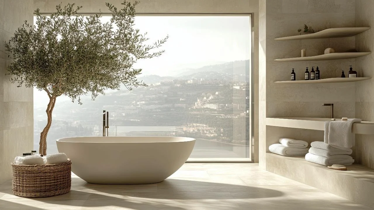
Stunning modern organic bathroom with a beautiful olive tree as a touch of nature.
For years, my East Coast roots heavily influenced my design aesthetic. But after moving to California, I embraced the laid-back West Coast vibes. And I have always loved the warmth and charm of Provence. It’s been a fascinating journey, blending these distinct styles into a space that feels uniquely me. And that, truly, is the heart of what I believe home should be. Not a slavish adherence to trends but a heartfelt curation of the things you love, the places that inspire you, and the feelings you want to evoke.
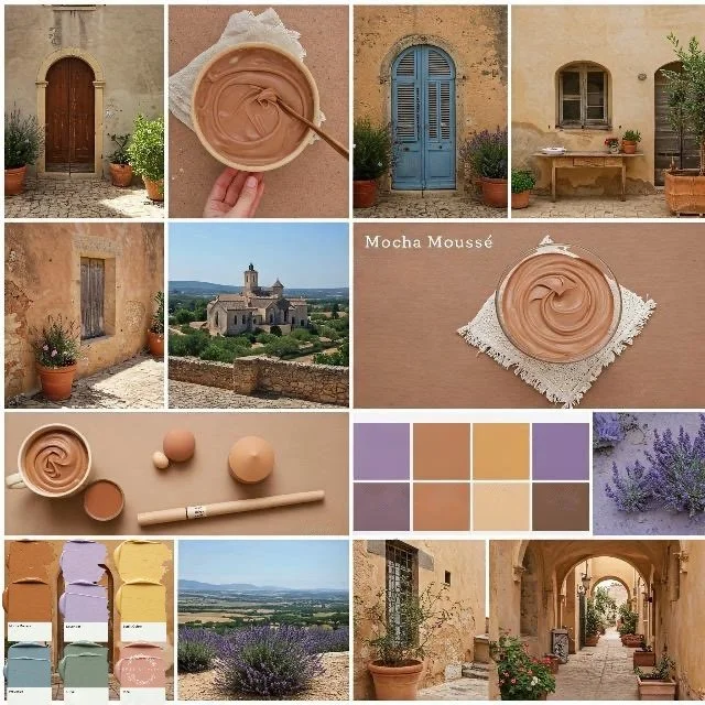
As we look ahead to 2025, we continue to see a shift in interior design, a yearning for spaces prioritizing ease, organic textures, and a profound sense of serenity. It's as if we're all craving more grounding and peace. Amidst this, I am repeatedly drawn to a color that perfectly embodies this feeling: Mocha Mousse (PANTONE 17-1230).
Trends in home design can be tempting, but chasing them often leads to costly and fleeting updates. Personally, I prefer a more enduring approach. That being said, I'm genuinely drawn to Pantone's Mocha Mousse this year. Its earthy, grounding quality feels especially relevant, offering stability within our homes. And, of course, you can always weave in trendier elements through smaller, less expensive accents—a smart way to stay current without a complete overhaul.
This rich yet reassuring brown acts as a beautiful bridge, connecting the airy lightness of bicoastal design with the sun-drenched warmth of Provençal interiors. Its color feels familiar and sophisticated, a grounding force that allows other elements to shine. It’s a color that speaks to the seamless fusion of styles I’ve come to adore. It echoes the natural beauty of both the Pacific and Atlantic shores while whispering of lavender fields and sun-warmed stone.
In my own home, I've found that this blend, this intentional curation, resonates so deeply. It aligns with the modern organic styles I gravitate towards, the biophilic design ideas that bring the outdoors in, and even the understated elegance of Japandi minimalism that I find peaceful and tranquil. It’s about creating a space that feels lived-in, loved, and yours. And I’m so excited to share that journey with you here.
Let’s dive deeper into the colors that have inspired this unique blend. It's not just about picking pretty hues but understanding the psychology behind them, how they interact, and how they contribute to a space's overall feeling. I've spent time crafting palettes that seamlessly combine the crisp, clean lines of East Coast design with the sun-kissed, natural tones of the West Coast, all while layering in the comforting warmth of Provence.
This color philosophy isn't about choosing one style over another; instead, it celebrates the art of uniting the most appealing shades found in nature to fashion a home that feels enduring, tranquil, and rich in warmth.
A Symphony of Earth, Sky, and Sea in Color
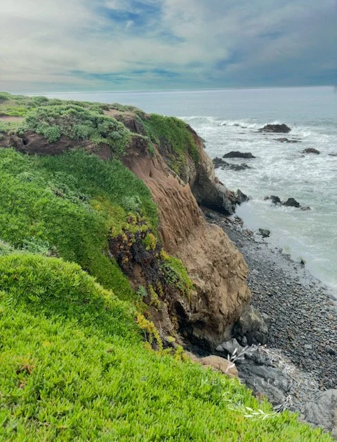
Photo by Mary Madore-Hickdey - West Coast Vibes
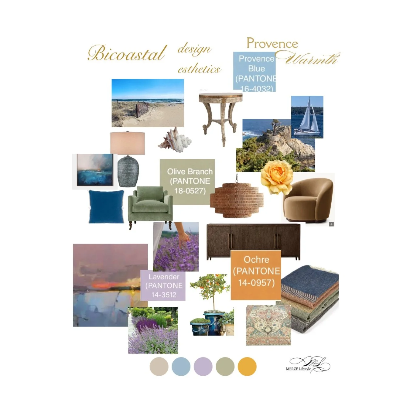
Bicoastal Mood Board With A Touch Of Provence
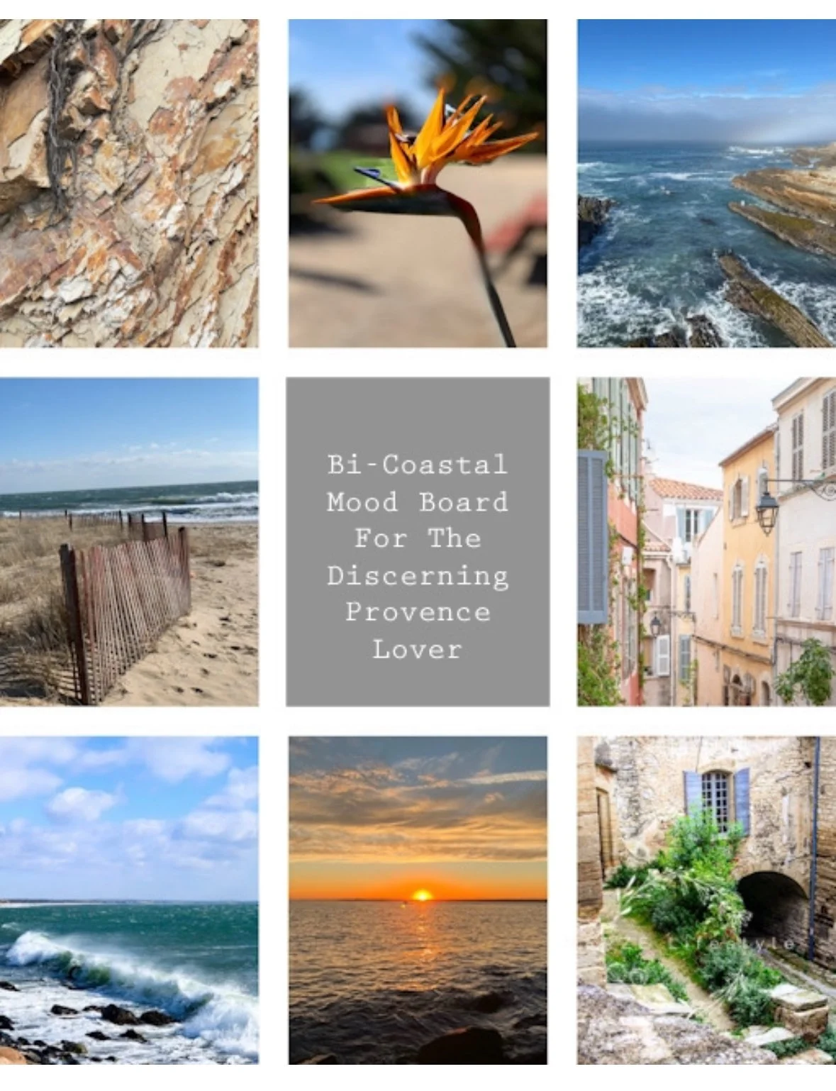
Design and Photo’s by MERZE Lifestyle
The true artistry of this approach lies in its fluid integration of tones inspired by the land, the sky, and the water. Envision the final rays of sunlight casting a golden hue across the Big Sur or New England coastline cliffs or the soft, faded blue shutters coverings of a Provençal farmhouse gently shaded by a lavender-tinged twilight. These are the very colors that come together to create a home imbued with both warmth and a feeling of well-being. If you will notice, one shared color in all photos is the beautiful warm color of brown.
Mocha Mousse (PANTONE 17-1230)
The Anchoring Shade
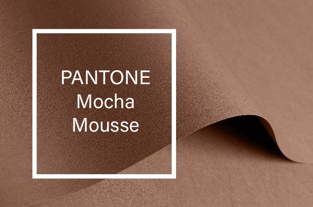
Image by Pantone
Mocha Mousse—isn't just a color; it's the foundation. This deep, warm brown grounds our design like the rich earth beneath a sun-drenched Provençal vineyard. It's the perfect starting point, a canvas upon which we layer the vibrant hues of our chosen aesthetic—a blend of coastal serenity and rustic charm.
Imagine a deep, chocolate brown sofa anchoring a room or a stunning coffee table crafted from rich, dark wood. It's a color that whispers warmth and sophistication, inviting you to linger and relax. It is ideal for accent walls, leather seating options, relaxed linen sofas, and unrefined wooden furniture reminiscent of the rugged shores of New England, the fertile lands of Provence, and the dramatic bluffs of California.

Photo by Mary Madore-Hickey - New England Dunes
This color fosters a sense of security and dependability, offering comfort and coziness while establishing a strong link to the natural world. Its depth also suggests elegance and sophistication.
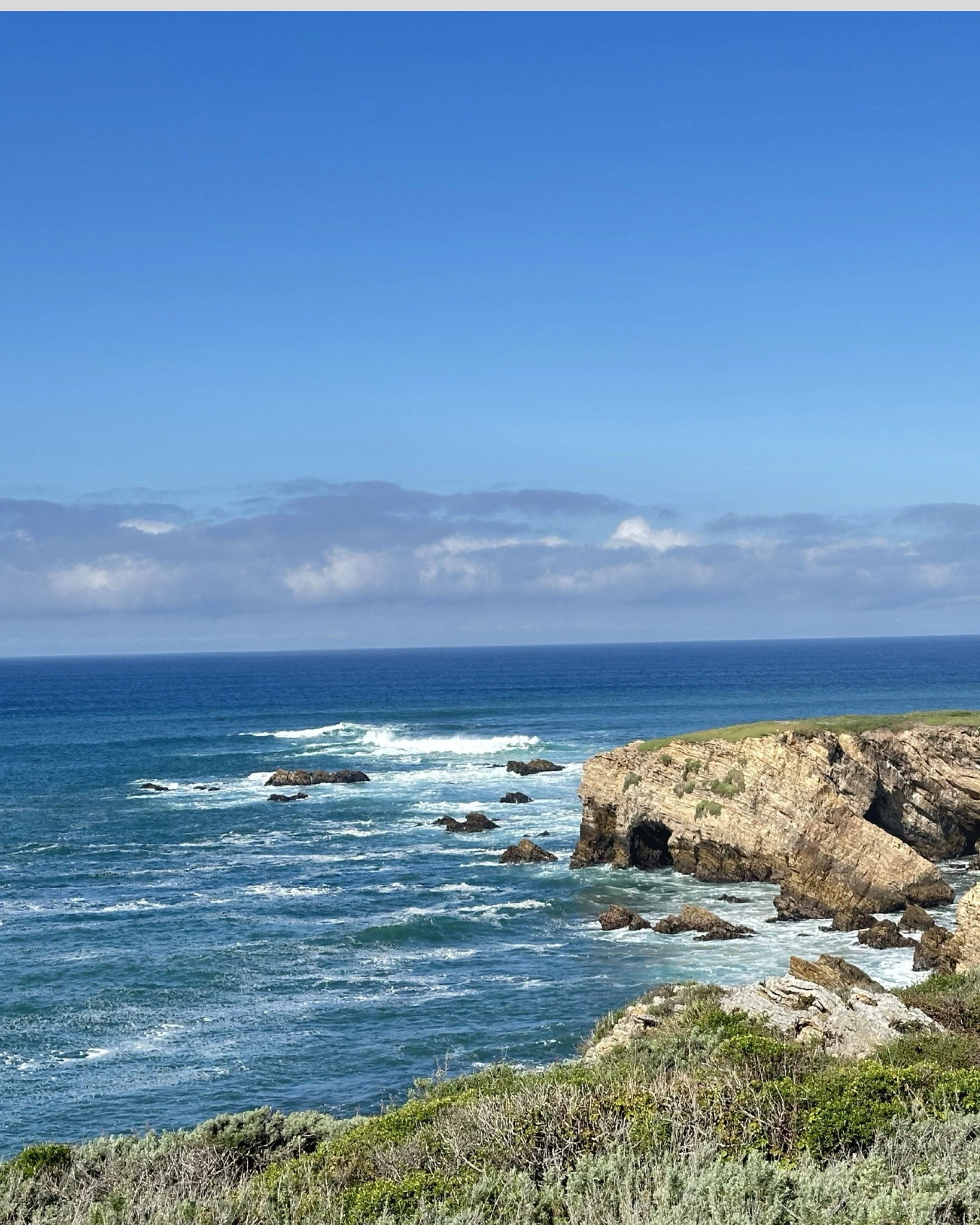
Photo by Mary Madore-Hickey - Pacific Ocean Cliffs
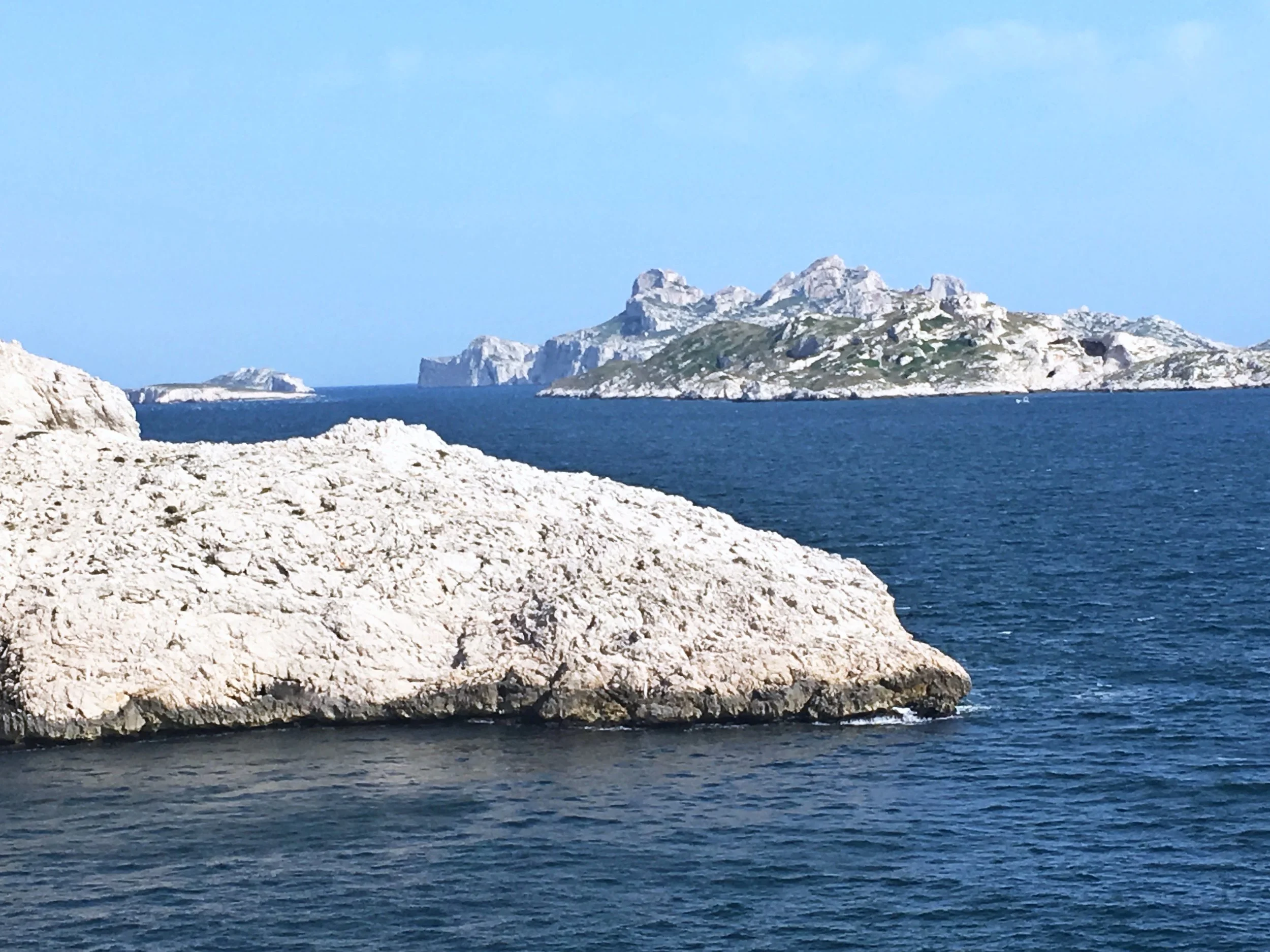
Photo by MERZE Lifestyle - Marseille, South of France
The Pacific Coast, with its olive and deep green cliffs and deep blue waters, whispers a story of earthy browns and warm greens. In New England, weathered fences in warm brown tones frame the path to the crashing waves. In Provence, sun-drenched stone houses in warm yellow, pink, and terracotta hues blend seamlessly with the surrounding landscape.
Though seemingly worlds apart, these diverse scenes share a common thread: a captivating interplay of earthy browns, olive greens, and soft blues. This shared language of color, infused with the warm yellows of Provence and the subtle lavender tones that evoke coastal fog, is the foundation of our exploration into the world of bicoastal living with a touch of Provençal charm.
Let’s explore the color palettes often seen in a bi-coastal design, where I show how each relates to our anchoring color, Mocha Mousse.
Provence (PANTONE 16-4032)
Accent Color Palettes
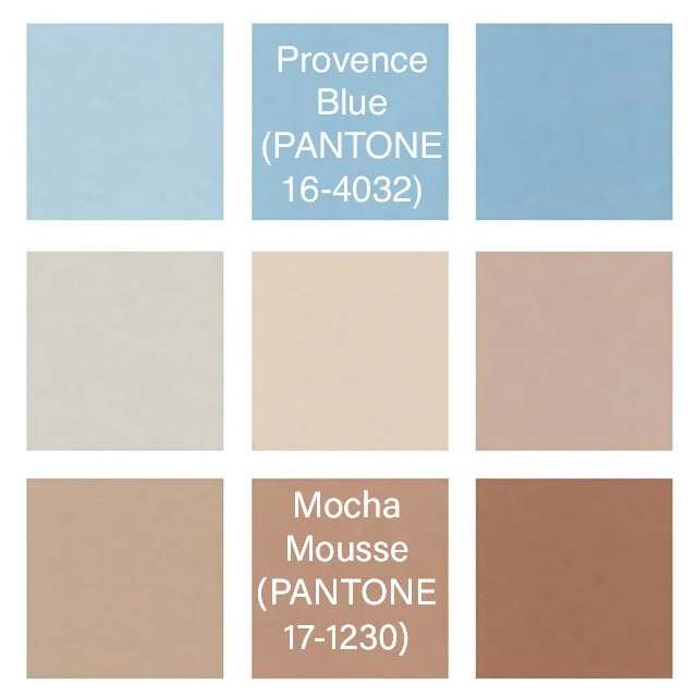
Image by MERZE Lifestyle—I love blue, and although this is considered Provence blue, I use it for any New England or Provencal vibes needed in a home.
Drawing inspiration from the hazy mornings along the Atlantic and the timeworn shutters of Provence, this muted blue introduces a feeling of peacefulness. It works beautifully for kitchen cabinetry, plush velvet cushions, or a painted ceiling, providing a subtle yet impactful statement.
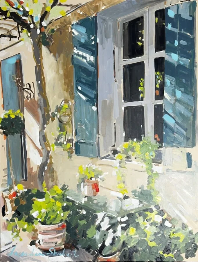
Art by Laura Lacambra Shurbert - Blue French Shutters - What a fun piece to have in your home to bring Provence in to your space. The color palette is quintessential Provence with hints of bi-coastal hues.
Blue is widely recognized for its calming and serene qualities, helping to alleviate stress and encourage relaxation. It conveys trustworthiness and reliability, evokes a sense of peace and quiet, and is often associated with intellect and wisdom.
Ochre (PANTONE 14-0957)
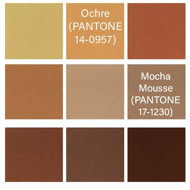
Image by MERZE Lifestyle
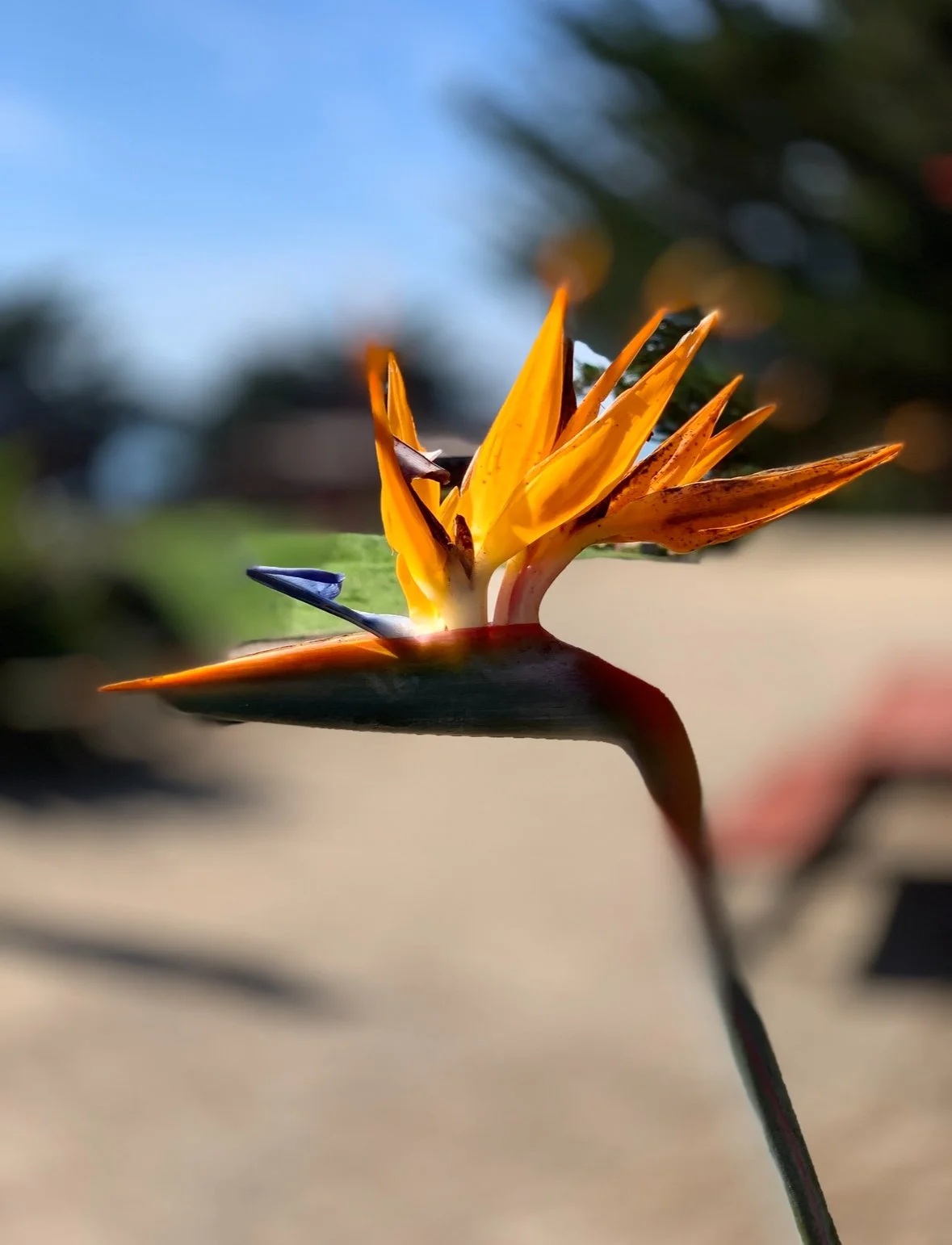
Photo by Mary Madore-Hickey
We found this flower at one of the stops in Carmel-by-the-Sea as we explored the US 1 Pacific Highway along the California coastline. What a great example of the Ochre Color Palette. The hues are found in this photo, along with Mocha Mousse and Provence Blue. Perfect for a home in any coastal area.
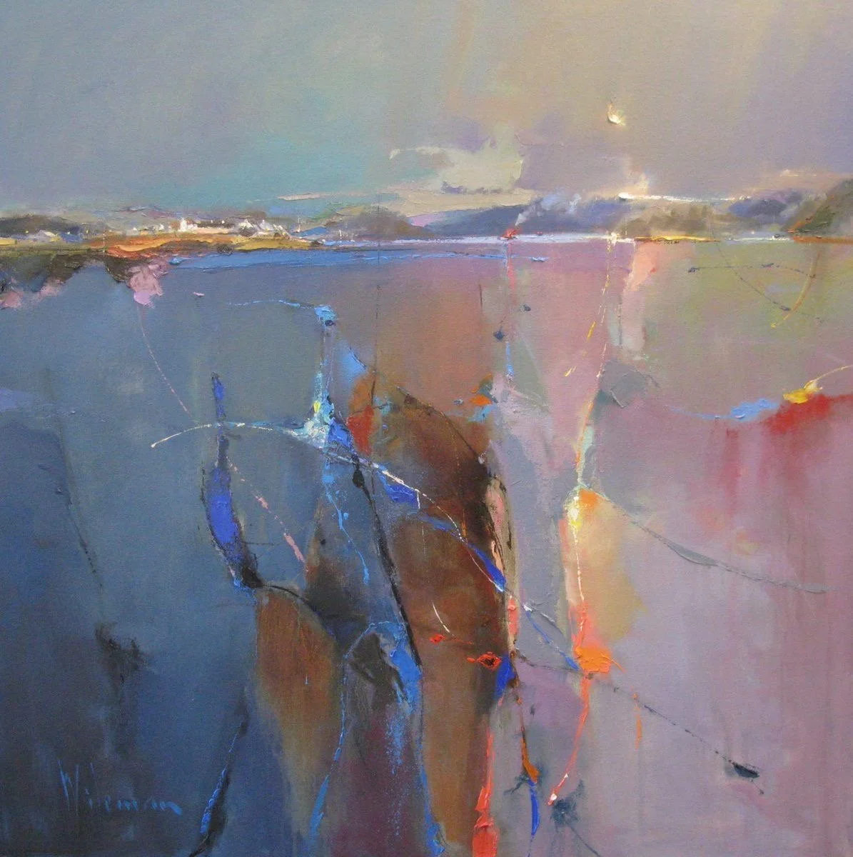
Art by Peter Wileman
This artwork combines many of the colors found in our bicoastal palette. The hints of Ochre are enough to bring a pop of color to your home. It is a tribute to the glowing dunes, the sun-drenched stucco of Southern France, and the warm hues of an autumn sunset on the Pacific Coast. This golden yellow adds a touch of vibrancy to ceramic pieces, relaxed linen throws, or a textured feature wall.
Yellow is inherently optimistic and uplifting, radiating positivity and energy. Golden yellows like Sunlit Ochre generate warmth and happiness, spark creativity and inspiration, and enhance mental clarity and focus.
Olive Branch (PANTONE 18-0527)
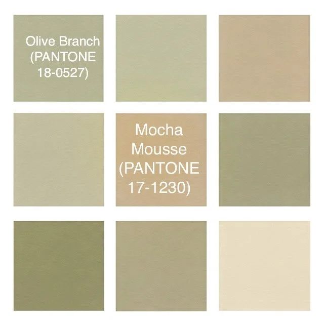
Image by MERZE Lifestyle
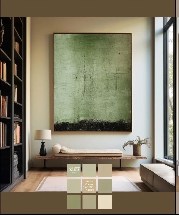
Photo by Art.com - This lovely piece of art is a huge design statement. The colors bring harmony into the space a feels organic in nature.
The quintessential green, observed in the coast's windswept grasses, the Mediterranean's olive orchards, and the aged seaweed carried ashore. Integrate this shade into your home through natural linen upholstery, kitchen backsplashes, or the introduction of indoor plants.
Green is strongly connected to nature and growth, promoting a sense of equilibrium and harmony, supporting health and vitality, and fostering a tranquil and serene atmosphere.
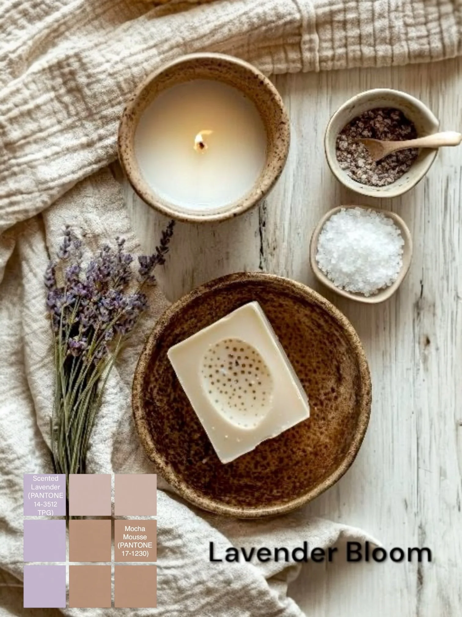
Scented Lavender (PANTONE 14-3512 TPG)

Image by MERZE Lifestyle
A soft lavender that echoes the rolling fields of Provence and the gentle purple tones of twilight by the sea. Perfect for bedroom fabrics, scented candles, and sachets, or delicate floral patterns.
Art by Ann Kincaid
Stunning artwork with colors of Mocha Mousse with hints of lavender, Olive, and Provence Blue.
Lavender is well-known for its soothing and relaxing effects, which reduce anxiety and promote calmness. It is often linked to intuition and heightened awareness, stimulates imagination and innovation, and carries an air of grace and femininity.
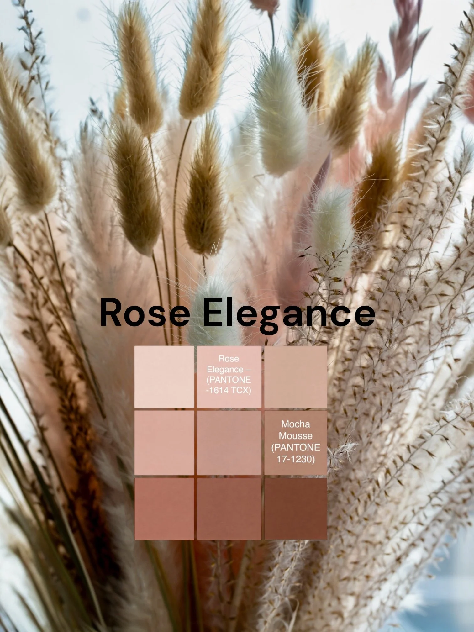
Rose Elegance – (PANTONE -1614 TCX)
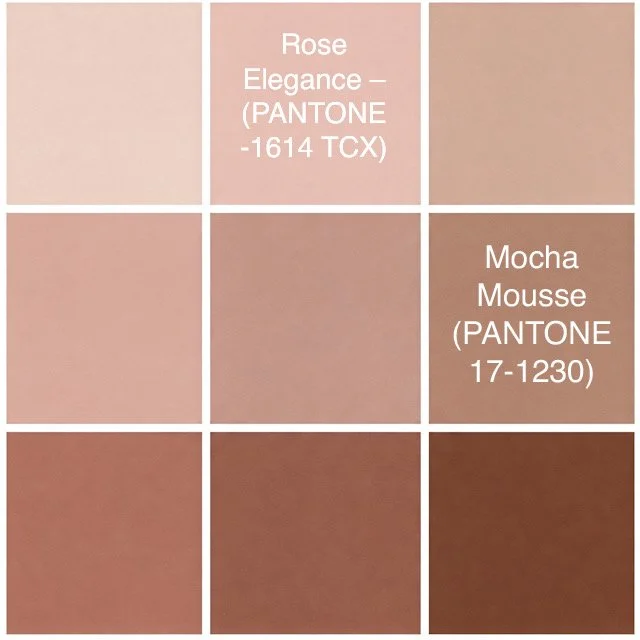
Image by MERZE Lifestyle
Found in aged driftwood, sun-baked terracotta, and antique woven textiles, this tender, warm rose hue adds richness and softness to rugs, painted furniture, and aged brass accents.
Roses evoke feelings of affection and tenderness, provide comfort and warmth, convey elegance and a gentle touch, and can inspire feelings of hope and positivity.
Provence Mood Board with Bicoastal Hues by MERZE Lifestyle
Weaving the Palette into Your Living Space
Designing for Comfort and Well-being
This color selection is more than just aesthetically pleasing—it cultivates a specific ambiance. The convergence of earthy, aquatic, and botanical tones directly addresses the key design trends of today:
Modern Organic & Biophilic Design: Natural materials like linen, clay, wood, and a beautiful handpainted mural can harmonize beautifully with these colors, inviting the outdoors in and supporting a sense of well-being.
Japandi Influence: Gentle neutrals with subtle hints of color create a feeling of refined simplicity without appearing stark or unwelcoming.
Effortless Layering: Rather than strict matching, these colors encourage a more thoughtfully assembled and personalized aesthetic. Imagine a vintage Provençal cabinet painted in Provence Blue set against a wall in Mocha Mousse, adorned with Olive Grove-toned ceramics.
Ways to Incorporate These Colors into Your Home
Walls & Statement Furniture

Image and Design by Susan Harter Wallpaper - www.susanharter.com - Stunning wall mural that captures the color of all of our color palettes in one scene.
Create a feature mural wall with beautiful Provence Blue or Olive Branch botanical tones to highlight your design. Use Mocha Mousse or a deep-toned linen sofa to ground the space. Provence Blue works wonderfully for kitchen units, while Olive Grove can add depth to an entryway seat or shelving.
Textiles & Decorative Items
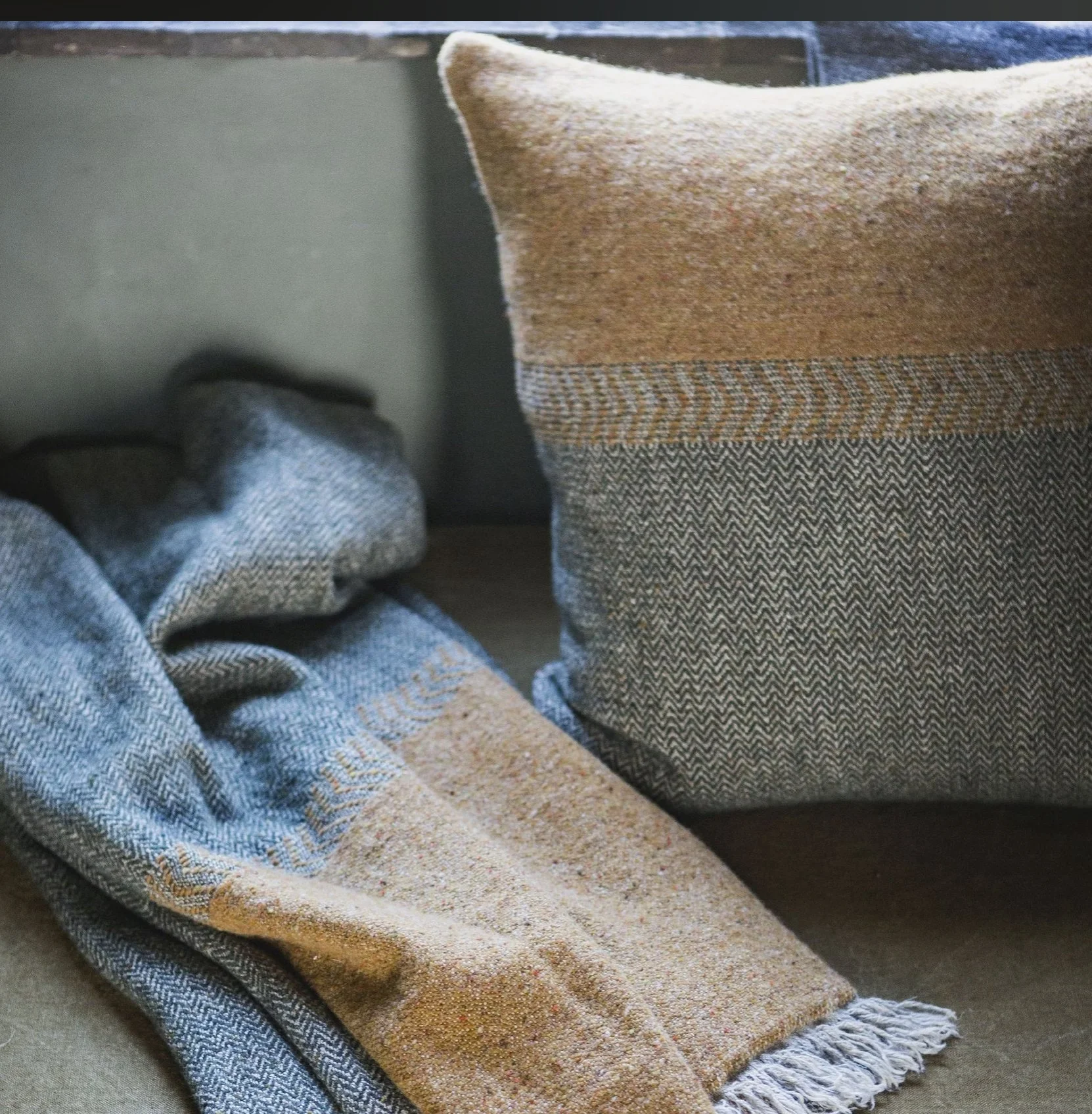
Image by Libeco Home Linens
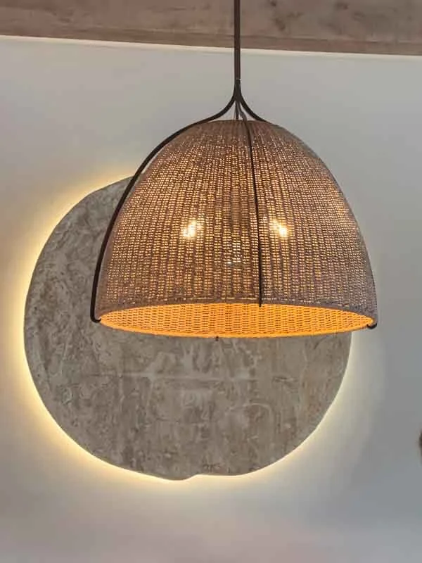
Image by MERZE Lifestyle
A mix of Provence Blue and Sunlit Ochre linen throw casually draped over a Provence Blue armchair, organic lighting with backlighting, cushions in Rosewood Blush tones or a Lavender Bloom area rug can all soften the overall palette and introduce warmth.
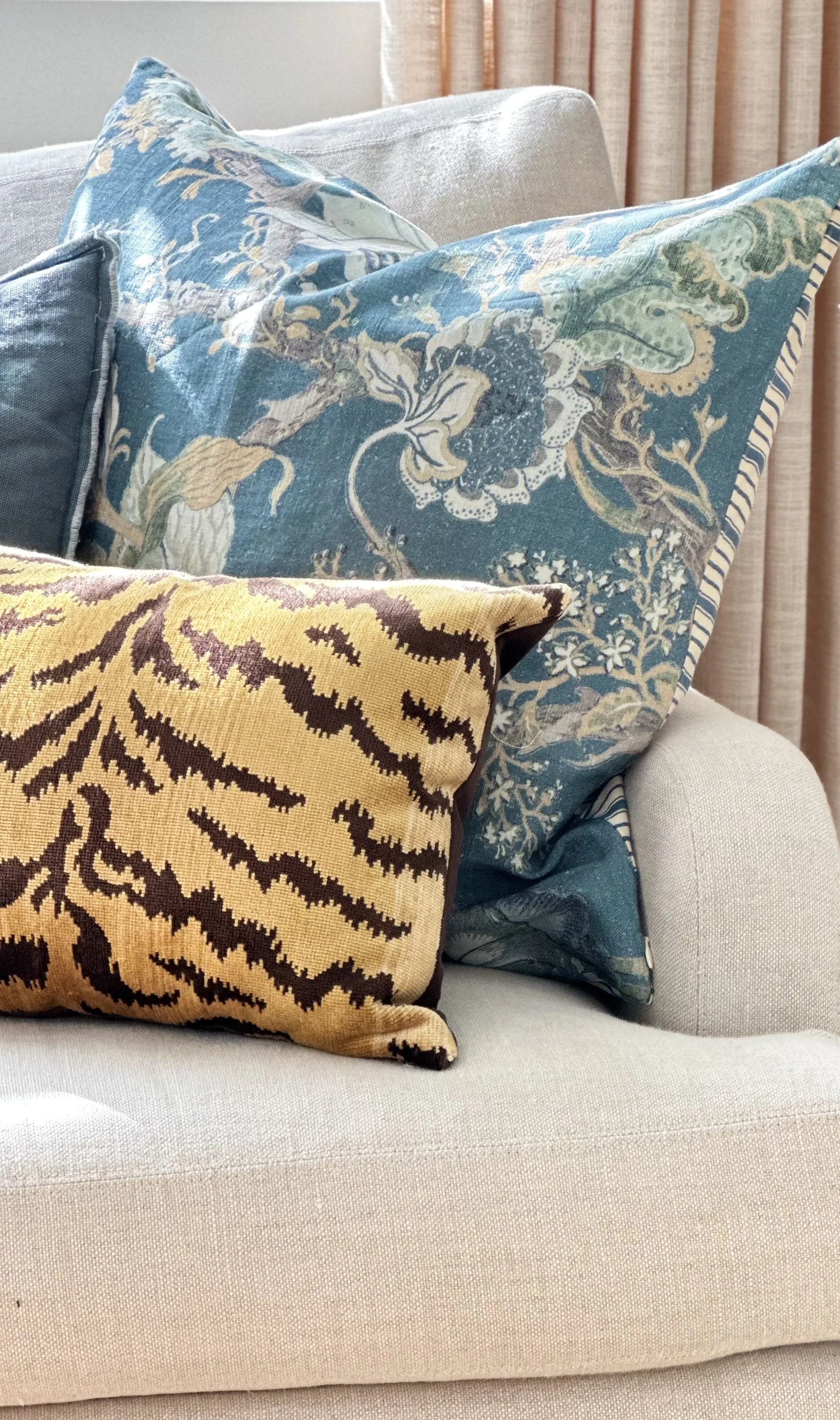
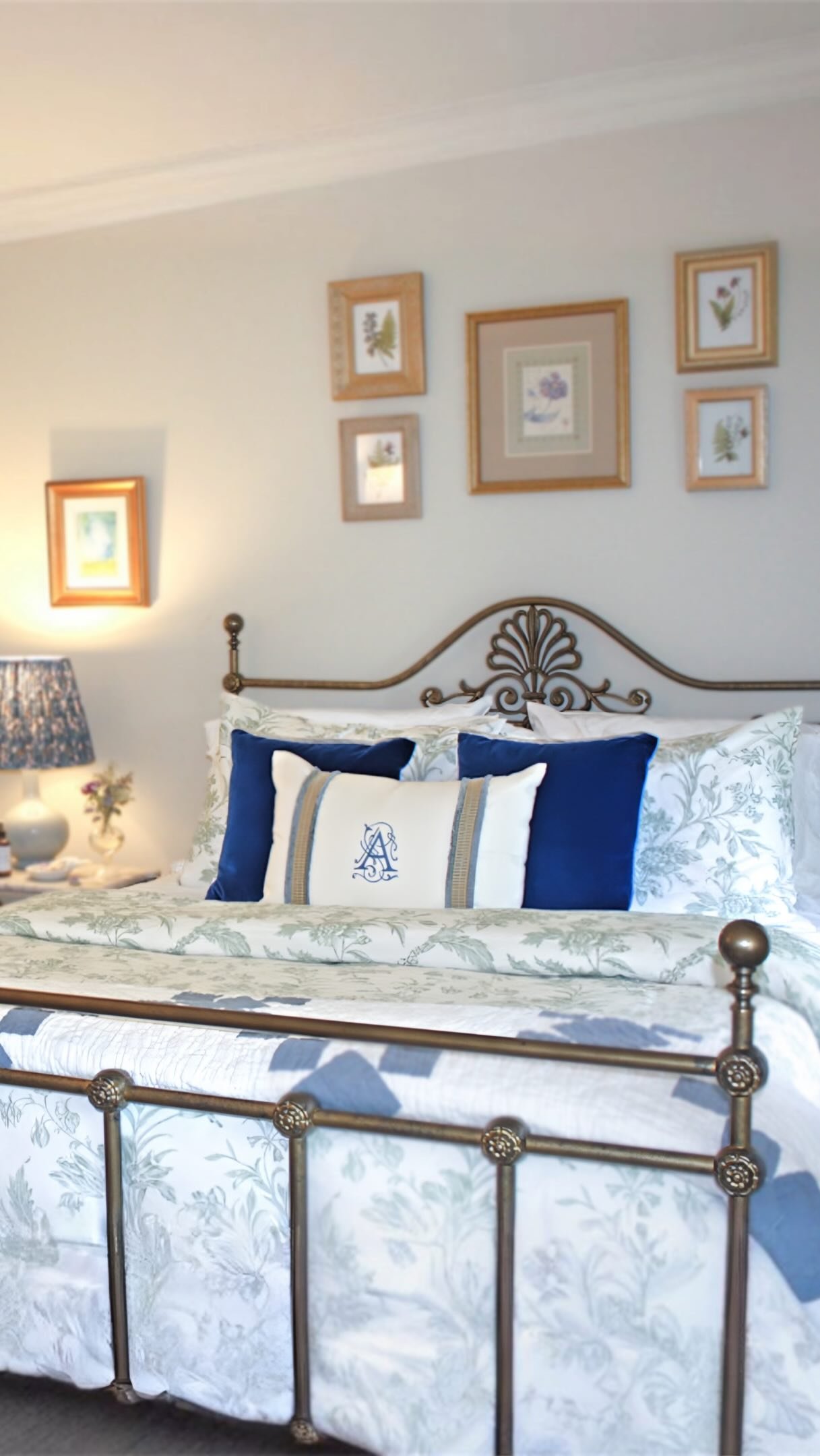
Design and Photo by MERZE Lifestyle - Pillows from Pottery Barn and House of Scalamandre
In my California home, I've layered throw pillows that speak to different places and moods. A linen pillow in a Provence blue and ochre combination brings in a touch of New England's coastal serenity, a subtle nod to my roots. Then, for a West Coast elegance, I've added smaller velvet pillows in an ochre and brown leopard design. The rich texture and organic pattern elevate the overall look, adding a touch of sophisticated flair.
Natural Touches
Shutterstock Images
Introduce a beautiful grouping of dried flowers for texture and color, an organic antique French terra-cotta vessel, vintage brass light fixtures, or furniture crafted from unfinished wood to impart an effortless, lived-in quality.
Botanicals & Floral Arrangements
Getty Images
Lavender plants in rustic clay pots, small olive trees in woven baskets, or dried flower displays in neutral-toned vases will enhance the design's Provençal and biophilic aspects.

Gorgeous color palette to use in any room in your home.
To learn more about the Psychology of Color in Interior Design, read my blog: Color Psychology Behind Interior Design: How to Choose the Right Colors for a Relaxing Space.
The Outcome: A Home Evoking a Seaside Retreat
By weaving together these varied inspirations, you can craft a home that feels easygoing and refined, cozy yet spacious. This collection of colors naturally fosters a link to the outdoors, supports a sense of calm, and honors the quiet beauty of natural textures. Whether you're drawn to the easygoing vibes of the Atlantic coast, the sun-kissed landscapes of the Pacific, or the enduring allure of Provence, these shades work in harmony to build a deeply comforting and simply elegant dwelling.
Which element speaks to you most? Is it the anchoring presence of Mocha Mousse interior design, the refreshing touch of Provence Blue home accents, or the inviting warmth of Sunlit Ochre decor? Let's delve into how to tailor this bicoastal interior design and Provençal interior design palette to create your own unique and personal spaces, ensuring your home reflects a beautiful blend of coastal Provence design and promotes designing for wellness at home.
“This isn’t just about decorating; It’s about cultivating a feeling - A sense of sun-drenched serenity and relaxed sophistication that welcomes you home, no matter which coastline pulls at your heart.”
For more about how I incorporated bi-coastal design in my California home, read my blog: Creating Wellness Through Design: A Coastal California-Inspired Home
“May your home be a place where friends meet, family gathers, and love grows.
”
Enjoy the bicoastal vibes with a hint of scented lavender. Let me know which color palette appeals to you!
Design with your heart™️
Have a beautiful day, my friends!
Mary
Shop our Boutique


14in X 20in
This durable and well appointed Belgian Linen Towel is designed to be multipurpose, it can serve as a guest towel, kitchen towel, place mat…you get the idea. This complete collection has a gorgeous hand and look about it and will be great for town and country as well as lovely for a Organic look in a Modern Home.. The sateen weave is also very absorbent, making it both beautiful and practical.
These towels are so versatile. When my husband first saw them he thought they were place mats. I use mine as a kitchen towel. They are a strong well appointed linen that will not let you down. They are simply gorgeous. The quality is just amazing and seriously has an organic feel to them…and is a sustainable product.
A perfect holiday gift for the person who has sophisticed taste and of course yourself.
100% linen
This linen becomes softer as you use it through time. It is a very sturdy high quality linen made with long fibers. Just a beautiful product for everyday use.