Color Psychology in Interior Design: Choosing Colors That Restore, Ground, and Reflect Who You Are

Getty Images
Color is not decoration. It is energy. It is memory. It is the quiet language that speaks long before a room is furnished.
In every space I design or study, color is never an afterthought. It is foundational. It shapes how we feel when we wake in the morning, how we gather at the table, how we exhale at the end of a long day. If we care about authentic design, sustainable living, and creating homes that nurture rather than impress, then we must care deeply about color.
Form, Function, and Feeling
Frank Lloyd Wright once wrote that form and function should be joined in a spiritual union. That principle extends naturally to color.
Color is not separate from purpose. It supports it.
A stop sign is red because red commands attention. A hospital often leans toward soft blues and greens because those tones soothe the nervous system. A dining room wrapped in warm earth tones encourages conversation and comfort.
In thoughtful interiors, color does the same work as architecture. It guides emotion, perception, and even behavior.
Color can:
• Emphasize the function of a space
• Create harmony or meaningful contrast
• Adjust our perception of scale and depth
• Communicate subtle emotional cues
When we understand color psychology, we begin designing spaces that feel as good as they look.
Why Color Psychology Matters in the Home
Interior designers use color psychology not to follow trends, but to support well-being. The tones that surround us influence stress levels, focus, creativity, and rest.
In homes led by intention rather than impulse, color is chosen carefully.
Designers use it to:
• Shape atmosphere, whether calm or energizing
• Balance proportions in large or small rooms
• Create cohesion through complementary tones
• Reflect the personality and story of the woman who lives there
A home should not feel staged. It should feel aligned. And alignment often begins with color.

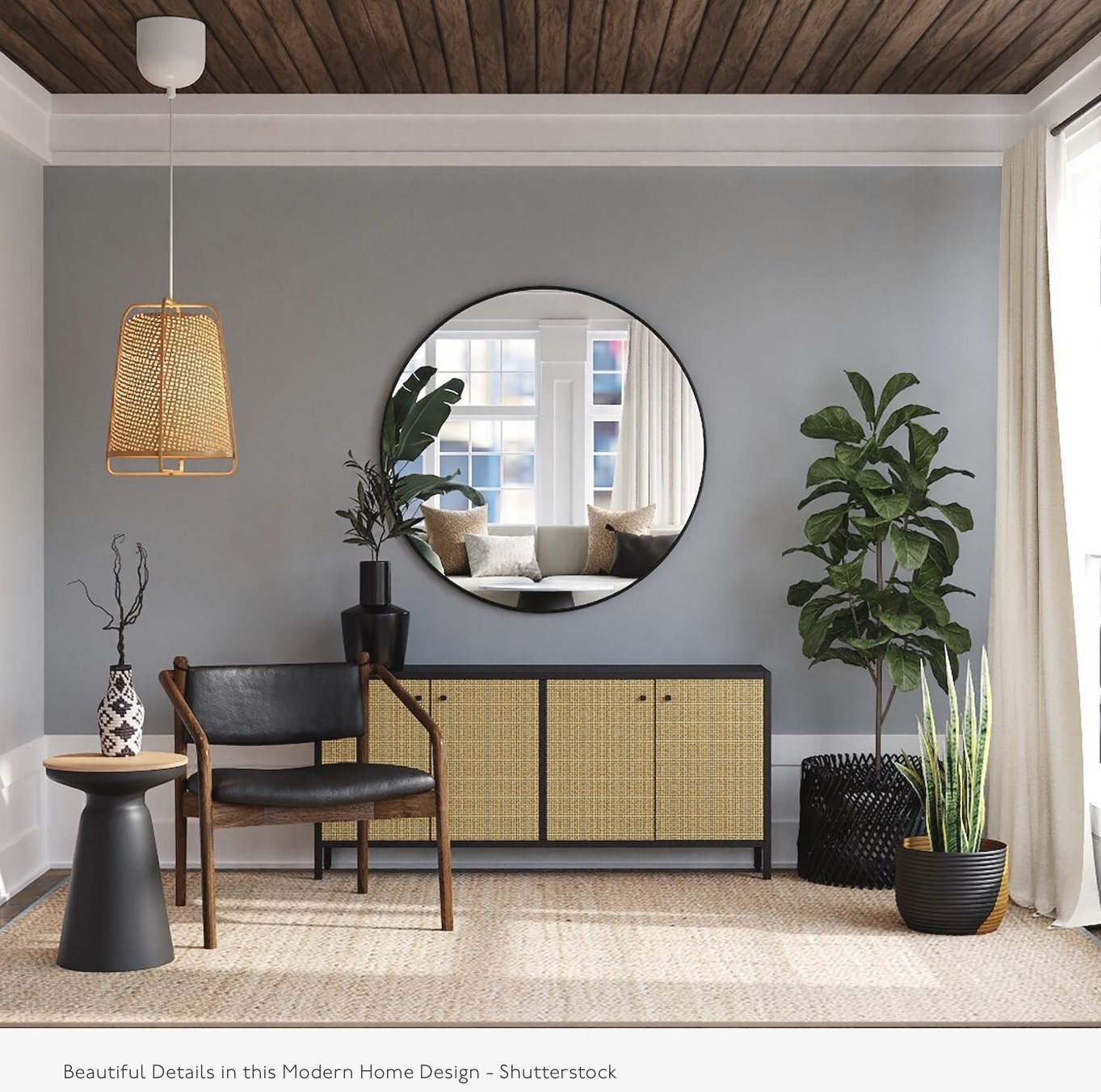
P.hoto by Mary Madore-Hickey / Merze Lifeestyle
In this photo, you will see examples of all the colors of nature such as blue, green, white, purple, yellow, and brown. It no wonder we talk about these as screen colors to be used in the home.
The Colors of Nature and Why They Calm Us
When we speak about relaxing interiors, we nearly always return to the same palette. Blue. Green. Soft white. Warm brown. Muted yellow. Gentle violet.
That is not a coincidence. These are the colors of nature.
Biophilic design, which centers our connection to the natural world, reminds us that the body recognizes these tones as safe. Familiar. Restorative.
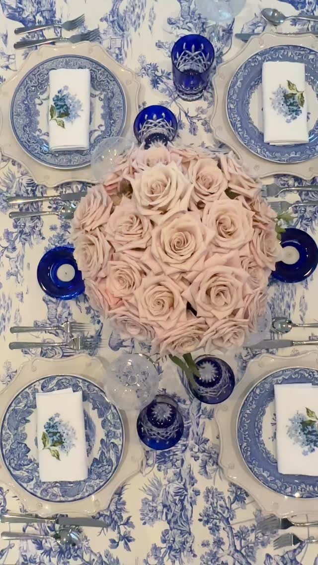
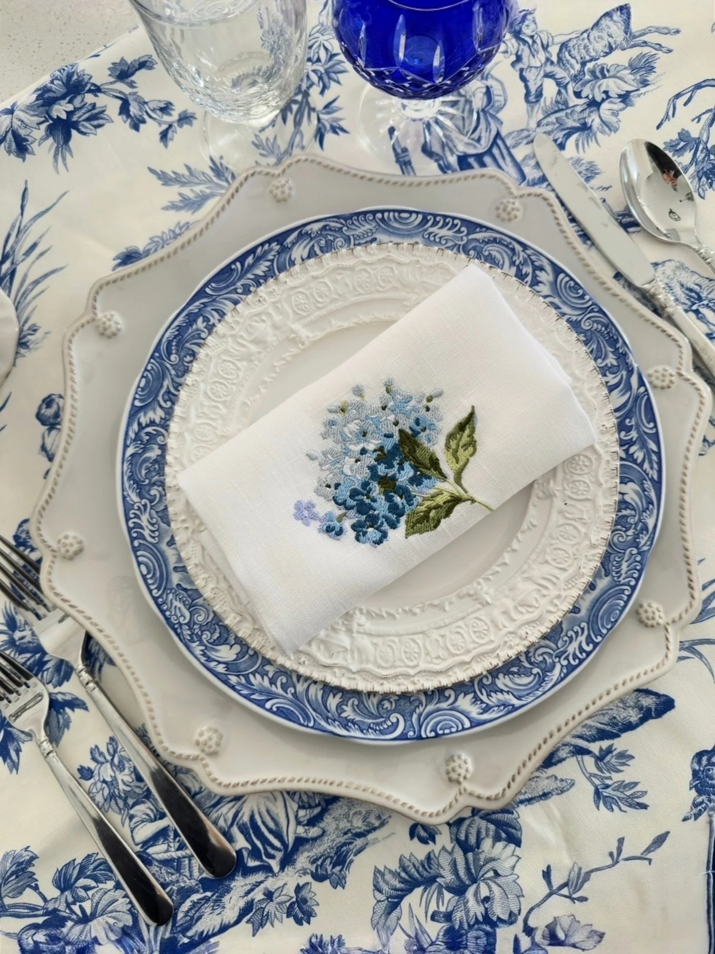
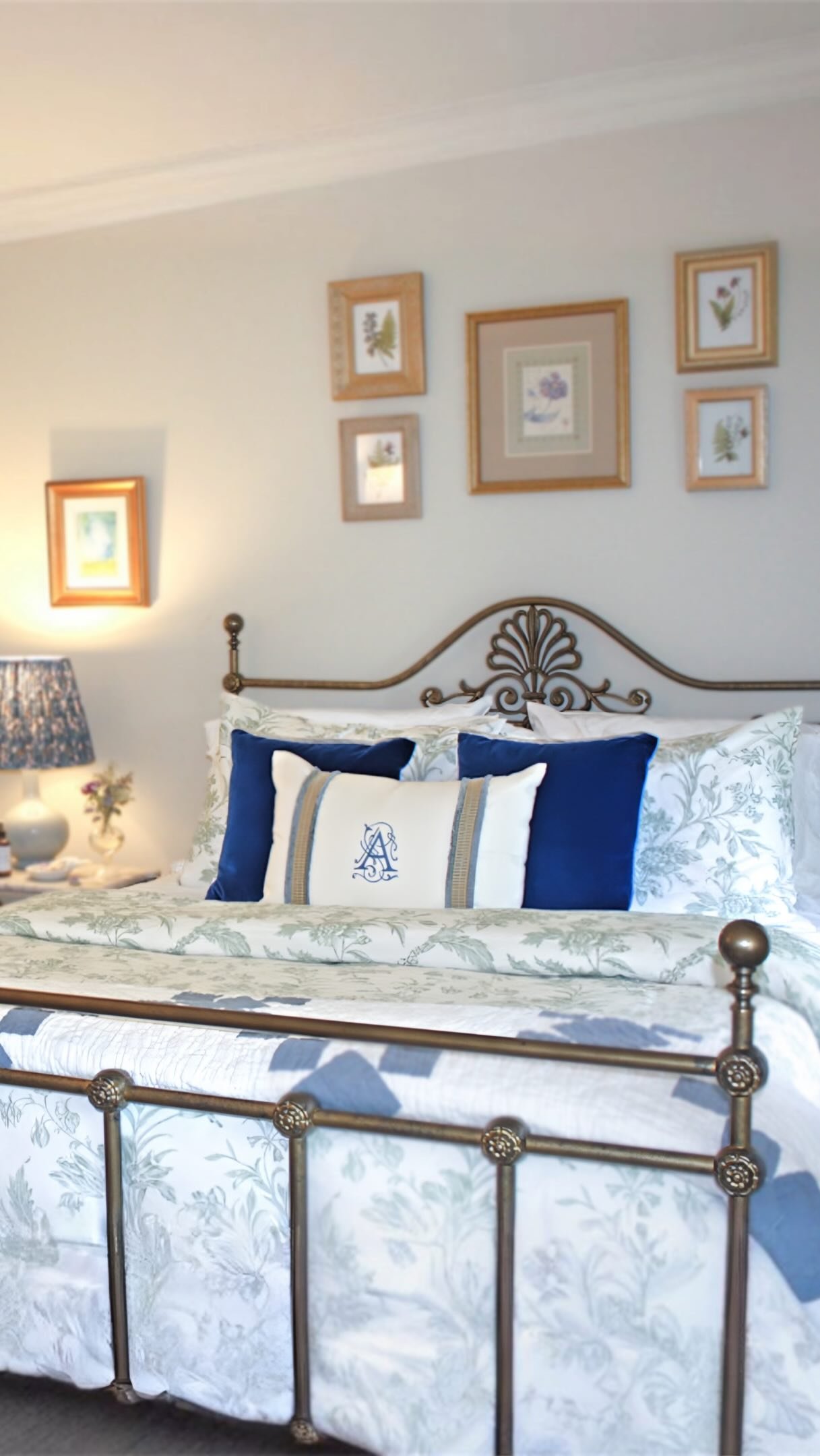
Blue
Blue evokes peace and quiet. It lowers visual tension and softens the edges of a space. In bedrooms and reading rooms, blue encourages slower breathing and mental stillness.
Pairing blue with warm wood or natural fibers keeps it from feeling cold and instead makes it grounded and livable.
Green
Green represents renewal and balance. It promotes clarity and focus without overstimulation.
Sage, olive, and muted moss tones are especially powerful in workspaces and kitchens where you want both calm and clarity. Adding live plants strengthens that effect, reinforcing a connection to the living world.
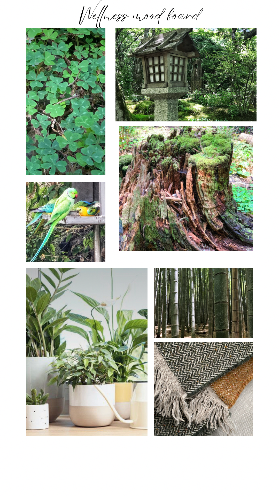
Green hues of nature
Purple
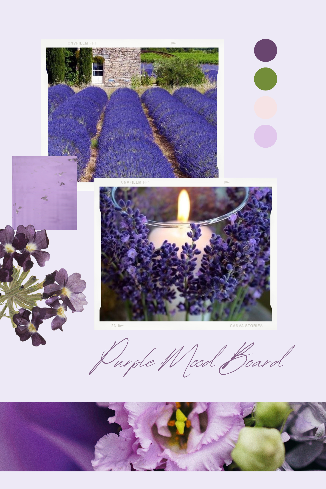
Different hues of purple
Soft purples such as lavender or dusty plum encourage reflection and creativity. Used gently, they add depth without heaviness. They are wonderful in creative studios or quiet sitting areas where imagination needs space.

Photo courtesy of Baker Furniture / Barbara Barry Design
White and Pale Yellow

Design and photo by Francis Sultana / Photo by Manolo Yllera
White, when layered thoughtfully, offers light and clarity. It expands smaller rooms and gives the eye a place to rest.
The key is warmth. Crisp white alone can feel sterile. Cream, ivory, and layered neutrals paired with texture create softness and depth.
A muted yellow feels like morning light. It brings gentle optimism into a room without overstimulation. It is particularly lovely in bedrooms, breakfast nooks, and intimate gathering spaces.
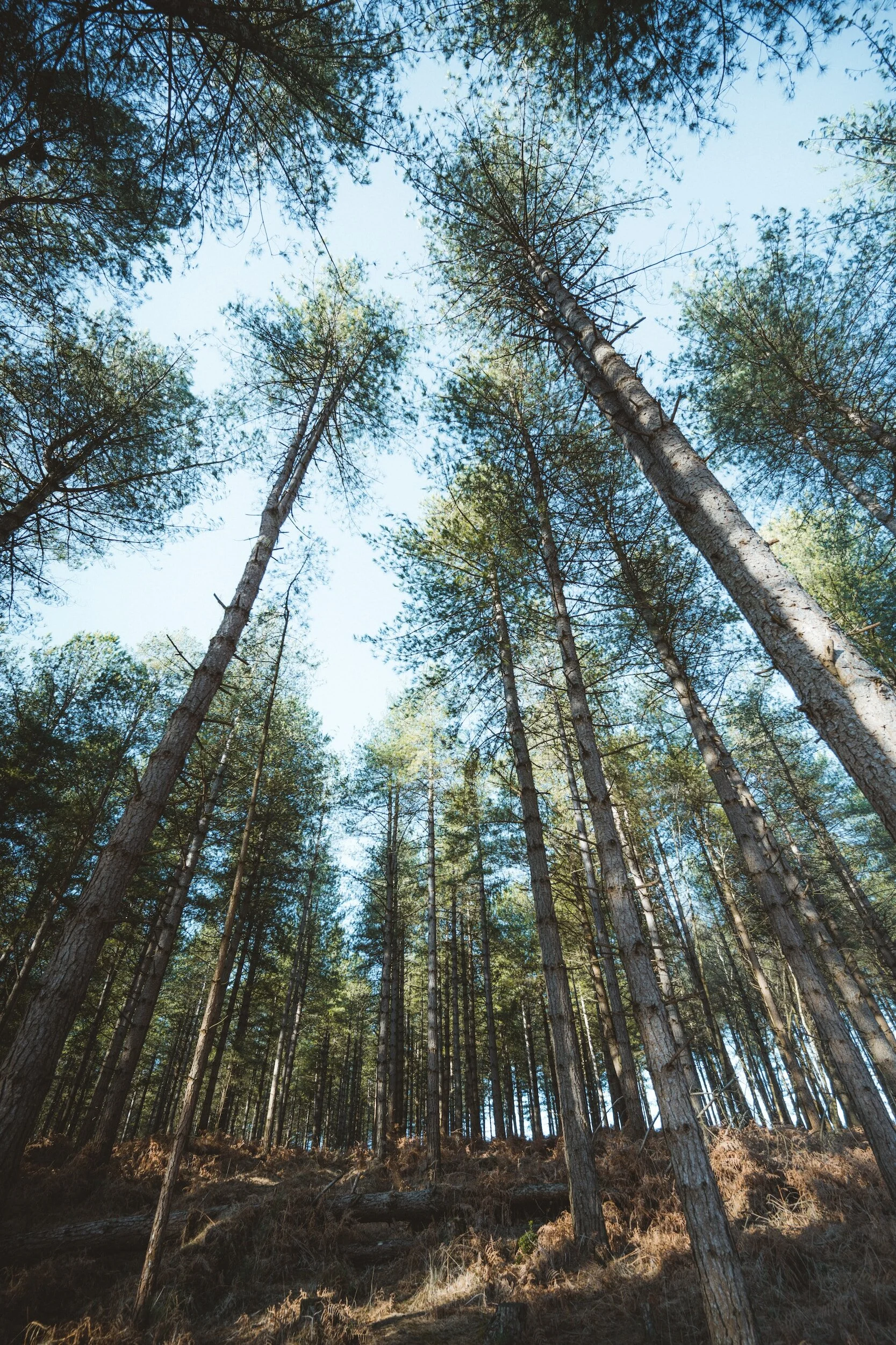
Brown and Earth Tones

Photo by Mary Madore-Hickey / Merze Lifestyle
In this photo, I was interested in all the shades of brown in this rock formation as well the greens and very light blue sky.
Brown is grounding. It speaks of soil, wood, stone, and stability.
In color psychology, brown conveys reassurance and security. Dark woods anchor a room. Lighter earth tones soften it. Organic wooden bowls, antique side tables, woven textures, and handcrafted pieces reinforce resilience and warmth.
In a world that often feels unsteady, earth tones create emotional footing.
Colors of blue, brown, yellow, and green
Designing With Intention
When choosing colors for a relaxing space, consider:
• Room size and ceiling height
• Natural light and seasonal light shifts
• Existing furniture tones
• Emotional purpose of the space
Small rooms benefit from light, layered tones. Large rooms can absorb sound, making them feel less intimate.
Balance matters. If your furnishings are dark, lighten the walls. If your walls are saturated, soften the textiles.
Botanical prints, natural wood, linen, stone, and handcrafted pieces strengthen any calming palette. Sustainability is not separate from beauty. It enhances it.
Composition and Emotional Harmony
“Everything is composition...your face, my face, a room...any room.
The skyline is a composition as is the view from the plane window. Food on your plate is a composition as is the work on your desk. Everything is composed in a way that is pleasing...or not.
”
Color is part of that composition. When chosen with care, it creates harmony that is felt rather than announced.
Beautiful interiors are not about perfection. They are about alignment. They reflect a woman’s creativity, resilience, history, and hope for the life unfolding inside those walls.
If your home feels unsettled, begin with color. Ask yourself how you want to feel in that space. Calm. Energized. Grounded. Inspired.
Then look to nature. It rarely leads us astray.
With thoughtful planning and a willingness to experiment, you can create rooms that restore rather than exhaust.
“May your home be a place where friends meet, family gathers, and love grows. ”
As with everything I post on my blogs, please feel free to comment, or if you have any questions, please email me through my contact page. I welcome it anytime!
Design with your heart™️
Happy designing, my friends!
Mary