

This blue and white color palette is timeless and classic, perfect for any occasion. Its combination is elegant and inviting, and it can be easily dressed up or down to fit the mood of your event.
Here are a few tips for using blue and white decor to create a beautiful and welcoming atmosphere for your next gathering:
Use a variety of blue and white elements, such as tablecloths, napkins, plates, cups, and candles.
Add some greenery to your décor to bring in a touch of nature.
Add flowers for a pop of color and additional texture.
Set up a buffet or snack table so guests can help themselves. Don’t forget to use blue and white décor throughout your space for a more cohesive look.
Don’t forget to play soft music in the background to create a relaxing atmosphere.
With some planning, you can easily create a beautiful, inviting blue-and-white design for your next gathering.
“Blue and White is considered Chinoiserie Chic.”
I love hosting gatherings for my friends and family. It's always so much fun to get together and enjoy good food, COMPANY, AND conversation. One of my favorite themes for gatherings is French-inspired. There's something so elegant and sophisticated about French style, and it's easy to create a French-inspired atmosphere with just a few simple touches.
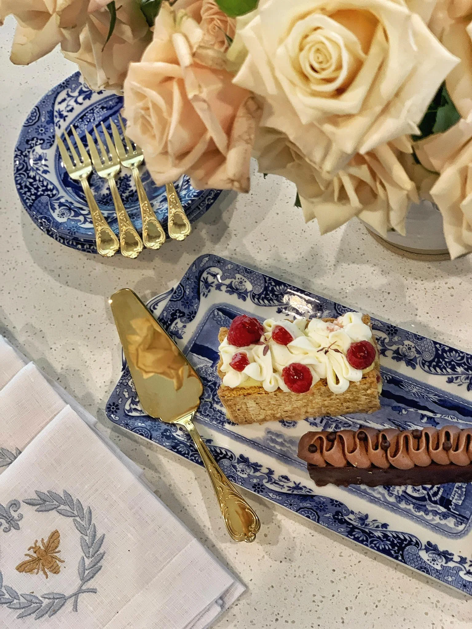
I chose a blue and white color palette for this design and then added a French-style vase. The confit pot is a great way to add a touch of French flair to your space. The confit pot has been around for ages in France as a useful way to store meats. They have become a prized possession for many antique collectors and are still reproduced in a more modern style, as I have used THEM for my bouquet. I love the way blue and white contrast with the pink roses. It's a beautiful and elegant combination.

Another easy way to create a French-inspired atmosphere is to use flowers. Pastel pink roses are a classic choice, and they pair perfectly with blue and white china.
Flowers are a beautiful and simple way to add a pop of color to your table. They can be used in various ways, from simple bud vases to elaborate centerpieces. Here are a few tips for using flowers to add color to your table:
Choose flowers that complement the colors of your table setting. For example, if you have a white tablecloth, you could use bright flowers like red roses or yellow tulips. Use pastel flowers like pink peonies or lavender hydrangeas if you have a more neutral table setting.
Use flowers to create a focal point on your table. This could be a large centerpiece or a smaller arrangement of flowers on each place setting.
Don't be afraid to mix and match different types of flowers. For example, you could mix roses, lilies, and tulips in your centerpiece.
Use flowers to add height and interest to your table setting. This could be done by using flowers in a vase or arranging flowers in a tiered display.
Consider the occasion when choosing flowers. For example, if you are hosting a formal event, you might want to choose more elegant flowers like roses or lilies. If you are hosting a casual event, you might want to choose more fun and festive flowers like daisies or sunflowers.
Think about the overall mood you want to create with your table setting. For example, if you want to create a romantic mood, you might want to choose flowers in soft, muted colors. If you want to create a festive mood, you might want to choose flowers in bright, bold colors.
Don't be afraid to experiment with different types of flowers and arrangements. The more you experiment, the more you learn about what works best for you and your style.
With a bit of creativity and effort, you can use flowers to create a beautiful and memorable event.

I used this blue and white color palette for my last impromptu gathering. I added two other complementary colors and different hues of each color to create a consistent color theme throughout the space. It is also a versatile color palette that can be used for various occasions. For my gathering, I wanted to create a relaxed and inviting atmosphere. My guests were able to relax and enjoy the company of each other without being distracted by the décor.
To learn more about blue and white decor and how to pull it ALTOGETHER, go to my blog, “Impromptu Gathering Made Easy With Blue and White Decor.”
Here are a few tips on how to choose a color palette for your next event:
Use color for emphasis. Use a bright or contrasting color to emphasize different aspects of your design.
Use color to create a mood. The colors you choose can create a certain mood or atmosphere. For example, warm colors can create a sense of excitement or energy, while cool colors can create a sense of calm or relaxation.
Choose a color scheme. A color scheme is a group of colors that work well together. There are many different color schemes to choose from, so you can find one that fits your style and the occasion.
Use color to group related items. For example, you could group all of your blue or green items, which will help create a sense of order and organization.
Use color to create a visual hierarchy. You can use color to make specific objects stand out more than others. For example, you could use a bright color for your focal point or a darker color for your background.
Use color to draw attention to specific objects. If you want to draw attention to a particular object, you can use a contrasting color to make it stand out. For example, you could use a bright red vase to draw attention to a centerpiece.
By following these tips, you can design a color palette that will help you create a more effective and visually appealing presentation.

This is an event I designed using lilacs in May. If you want to go to the blog, just click on the color palette, and it will take you there.

This is the color palette and mood board FOR my Mother’s Day With Love Blog. It is my most popular blog. If you would like to read it please click on the color palette.
Here is a more detailed explanation of how each color affects feelings:
Red is associated with passion, excitement, love, anger, and danger. Its very stimulating color can increase heart rate and blood pressure. Red is often used in marketing to create a sense of urgency or excitement.
Orange is associated with joy, creativity, enthusiasm, and stimulation. It is a warm and cheerful color that makes people happy and optimistic. Orange is often used in advertising to create a sense of fun and excitement.
Yellow is associated with happiness, optimism, energy, and clarity. It is a bright and cheerful color that makes people happy and alert. Yellow is often used in advertising to create a sense of fun and excitement.
Green is associated with peace, harmony, growth, and freshness. It is a calming and relaxing color that can make people feel at ease. Green is often used in interior design to create a sense of peace and tranquility.
Blue is associated with calmness, trust, loyalty, and sadness. It is a cool and calming color that can make people feel relaxed and at peace. Blue is often used in interior design to create a sense of serenity and relaxation.
Purple is associated with luxury, power, mystery, and creativity. It is a sophisticated and elegant color that can make people feel powerful and confident. Purple is often used in fashion and interior design to create a sense of luxury and sophistication.
Pink is associated with love, romance, femininity, and gentleness. It is a soft and delicate color that can make people feel happy and loved. Pink is often used in fashion and interior design to create a sense of romance and femininity.
Brown is associated with earthiness, stability, reliability, and warmth. It is a natural and earthy color that can make people feel grounded and secure. Brown is often used in interior design to create a sense of warmth and coziness.
Black is associated with elegance, sophistication, power, and mystery. It is a sophisticated and powerful color that can make people feel confident and in control. Black is often used in fashion and interior design to create a sense of luxury and sophistication.
White is associated with purity, innocence, cleanliness, and simplicity. Its bright and clean color can make people feel refreshed and energized. White is often used in interior design to create a sense of spaciousness and cleanliness.
“Life is a painting, and you are the artist. You have on your palette all the colors in the spectrum - the same ones available to Michelangelo and DaVinci.
”
As with everything I post on my blogs, please feel free to comment, or if you have any questions, please email me through my contact page. I welcome it anytime!
Design with your heart™️
Happy entertaining, my friends!
Mary
“May your home be a place where friends meet, family gathers, and love grows. ”


