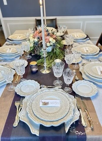
Quiet Grandeur Traditional Design
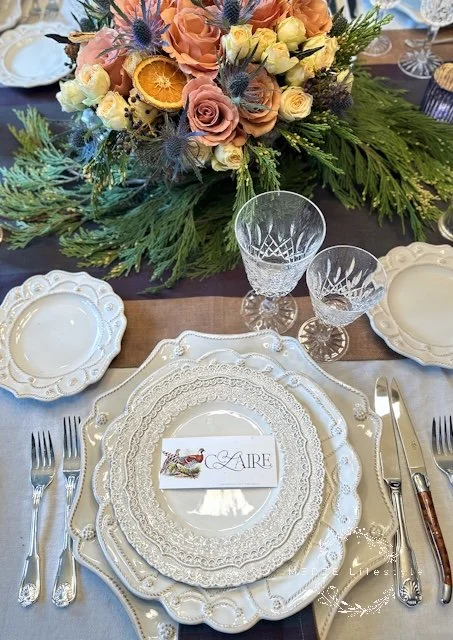
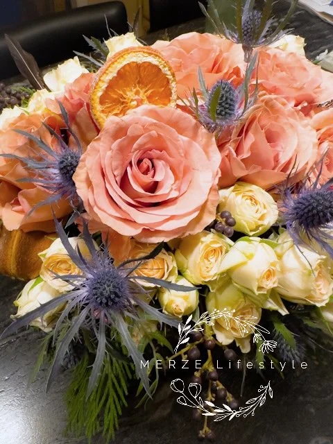
Photo and Design by MERZE Lifestyle - A close look at how the florals quietly breathe color into the place setting, echoed through texture, pattern, and light rather than bold pigment.
For years, color has dominated the modern table. Bold palettes. Saturated chargers. High contrast linens. Designers have leaned into vibrancy as the primary voice of a tablescape. However, a quieter shift is now underway, one that values restraint, heritage, and materials that speak softly yet carry weight.
This table was designed from that philosophy. Instead of using color to define each place setting, the color lives gently at the center and is echoed quietly throughout. The foundation is built on cream, silver, crystal, texture, and light—a return to old-world elegance, interpreted through a modern lens.
Pantone’s 2026 Color of the Year: Cloud Dancer
The Power of Cream
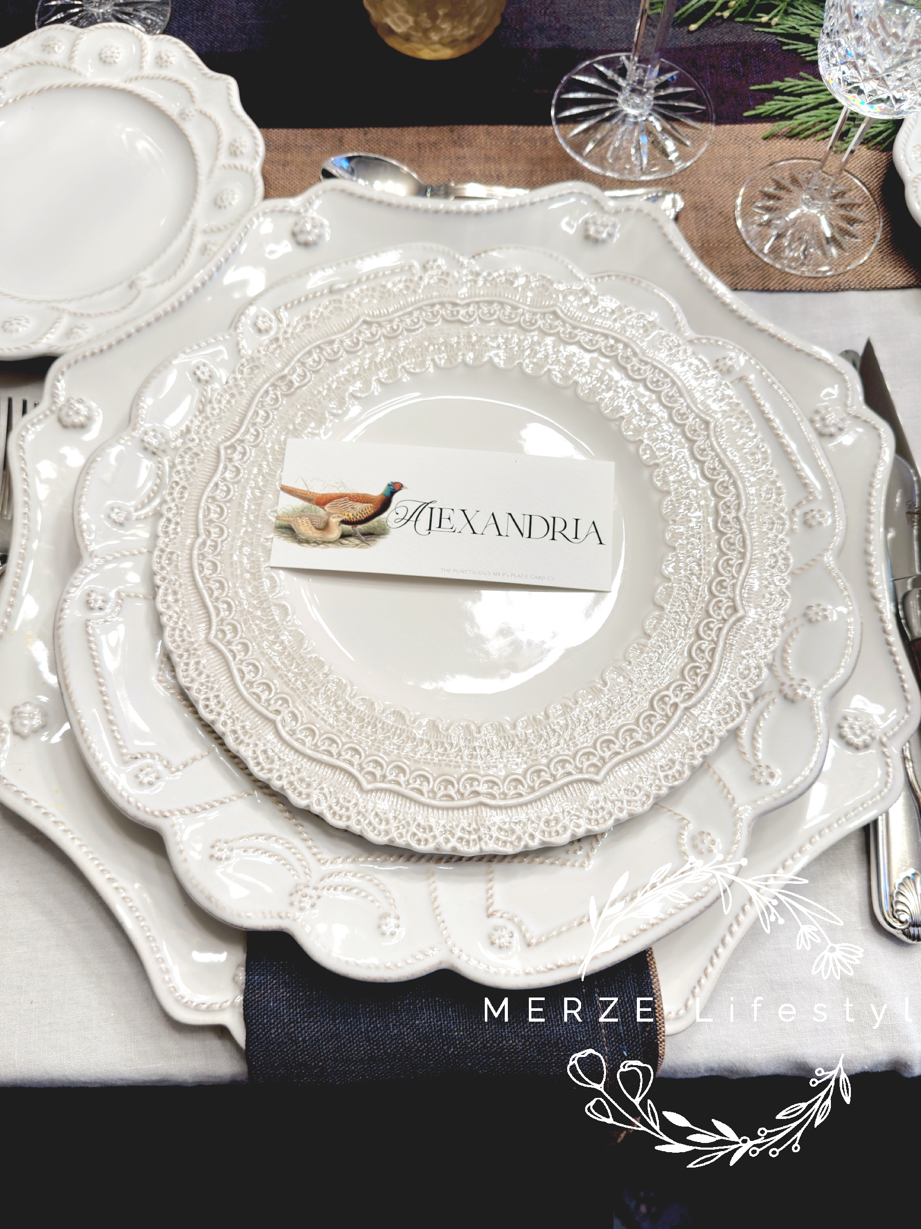
There is a growing trend toward softer neutrals in design, tones that evoke a sense of calm rather than starkness or severity. The shade guiding this table is not a pure, crisp white. It falls somewhere between white, ivory, and cream, allowing for gentle variation and warmth. That softness is what gives the table its sense of ease. In a world that feels increasingly loud and visually crowded, this kind of quiet foundation feels deeply needed. Your home becomes a place to settle, to breathe, to feel held. On this table, cream becomes more than a color. It becomes the mood. It allows light to travel freely across the surface. It softens edges. It creates space for everything else to exist without competition.
Photo and Design by MERZE Lifestyle - Soft neutrals creating calm, space, and light at the table
I explored other directions before arriving here. I played with deeper tones, stronger contrasts, and bolder combinations. But again and again, I returned to texture and pattern rather than color as the true voice of the table. The layered plates, each with subtle character, began to speak more beautifully when they were allowed to remain quiet in tone. Cream against ivory. Pattern beside pattern. Texture resting against texture. The elegance emerged not from pigment, but from the way these surfaces played off one another. In the end, restraint created more presence than saturation ever could.
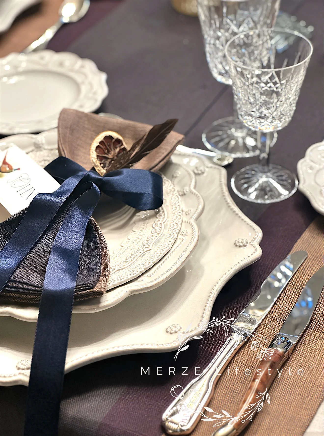
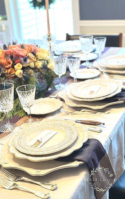
Photo and Design by MERZE Lifestyle - A woven linen napkin tied with satin blue ribbon echoes the soft color story of the florals and runners, allowing color to appear without overtaking the place setting.
Heirloom Minimalism, Where Old and New Meet
Photo and Design by MERZE Lifestyle
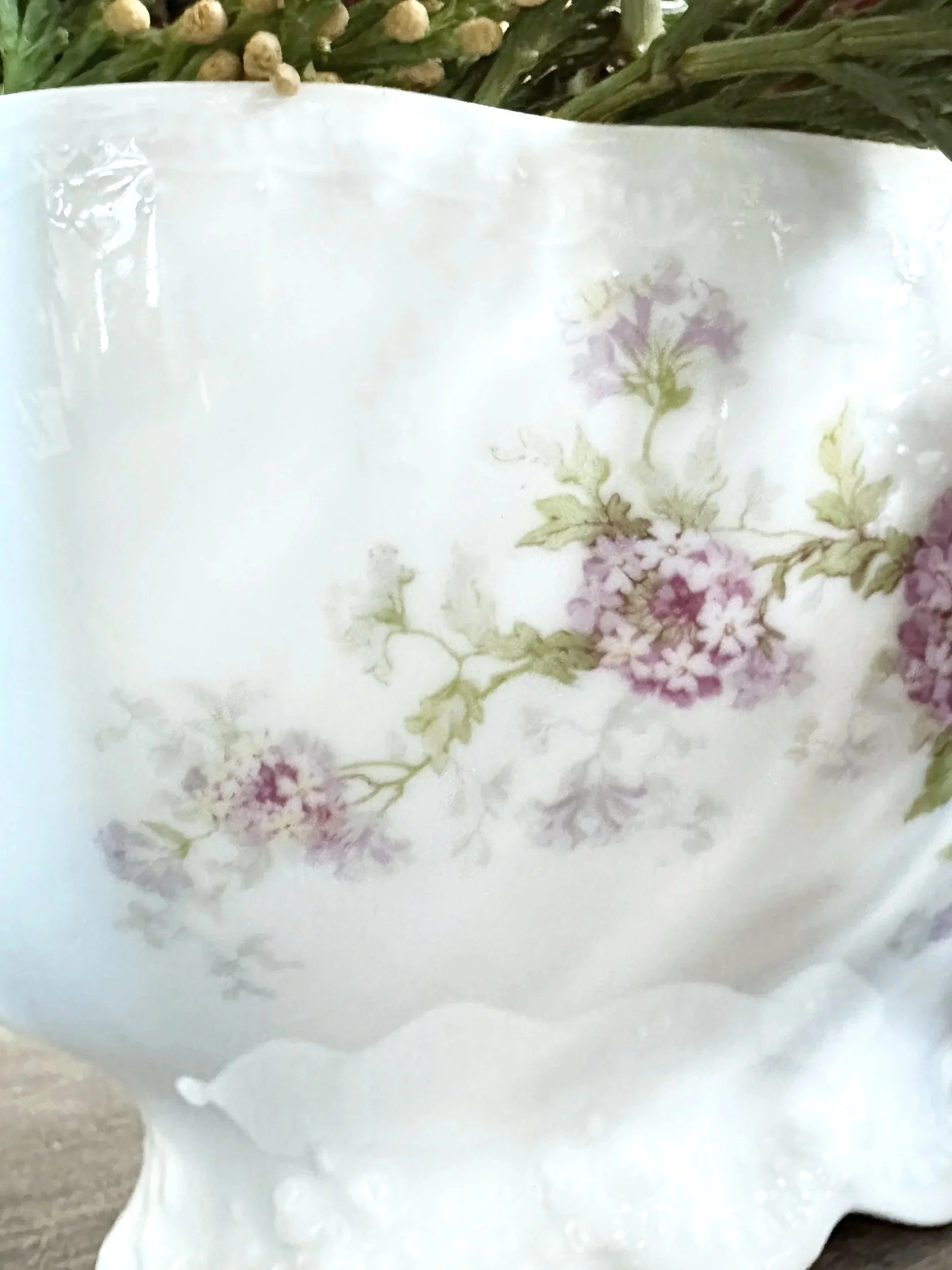
At the heart of the table sits a white soup tureen from the 1800s, a piece gifted through the family and rich with meaning. Once intended for service, here I used it as a centerpiece vessel. Repurposing special pieces is an art form and should be embraced when possible. Filled with florals that mirror the hues of the linens and place cards, it becomes the emotional anchor of the table.
This is heirloom minimalism. A single historic object holding its place with dignity. Around it, vintage and new items live comfortably. Modern cream plates. Sustainable woven runners. Contemporary linens. Tradition does not disappear. It evolves.
Texture as the New Decoration
Instead of relying on bold pigments, this table relies on texture. Fair Trade sustainable hand-woven runners with subtle variation. Matching linen napkins that cascade down from the charger and adjoining plate above. Their quiet color introduces depth without distraction.
Photo and Design by MERZE Lifestyle - Texture becomes the statement as sustainable woven napkins and runner fall gently between the layered plates, adding depth without adding noise.
The textures do the work that color often tries to do on its own. They invite the eye to slow down and move gently across the table. The effect is layered yet composed.
Sterling, Crystal, and the Language of Light
Sterling silver flatware and candle holders introduce a reflective quality rather than color. Waterford crystal adds clarity and refinement without weight. These elements speak through light. Flickering candle flame moves through the glass. Silver catches the glow. Nothing competes. Everything contributes.
This is the essence of modern classic restraint. Luxury that does not announce itself. It simply exists.
Photo and Design by MERZE Lifestyle - Silver and crystal speaking through light rather than color
Where Color Lives Quietly
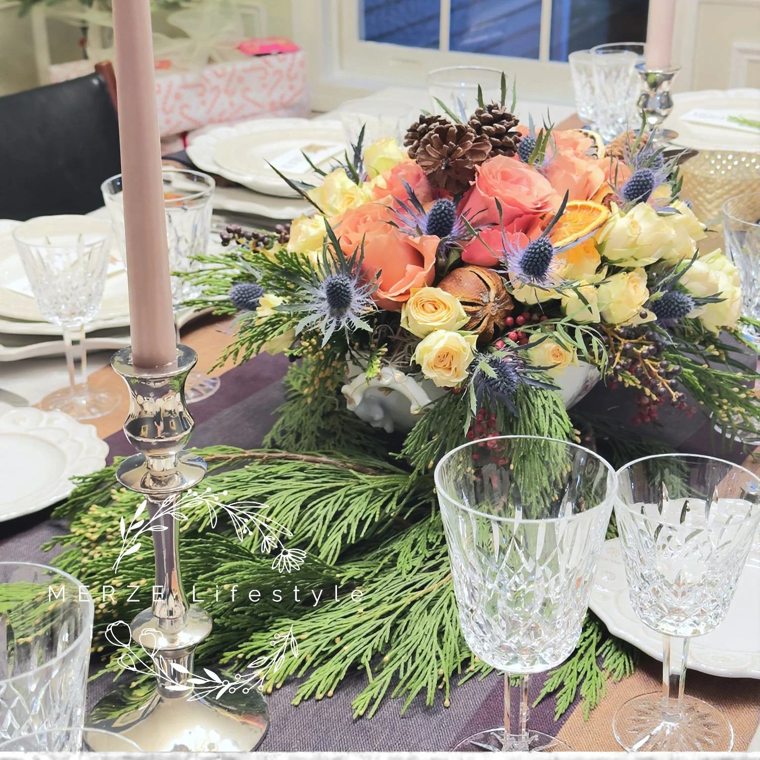
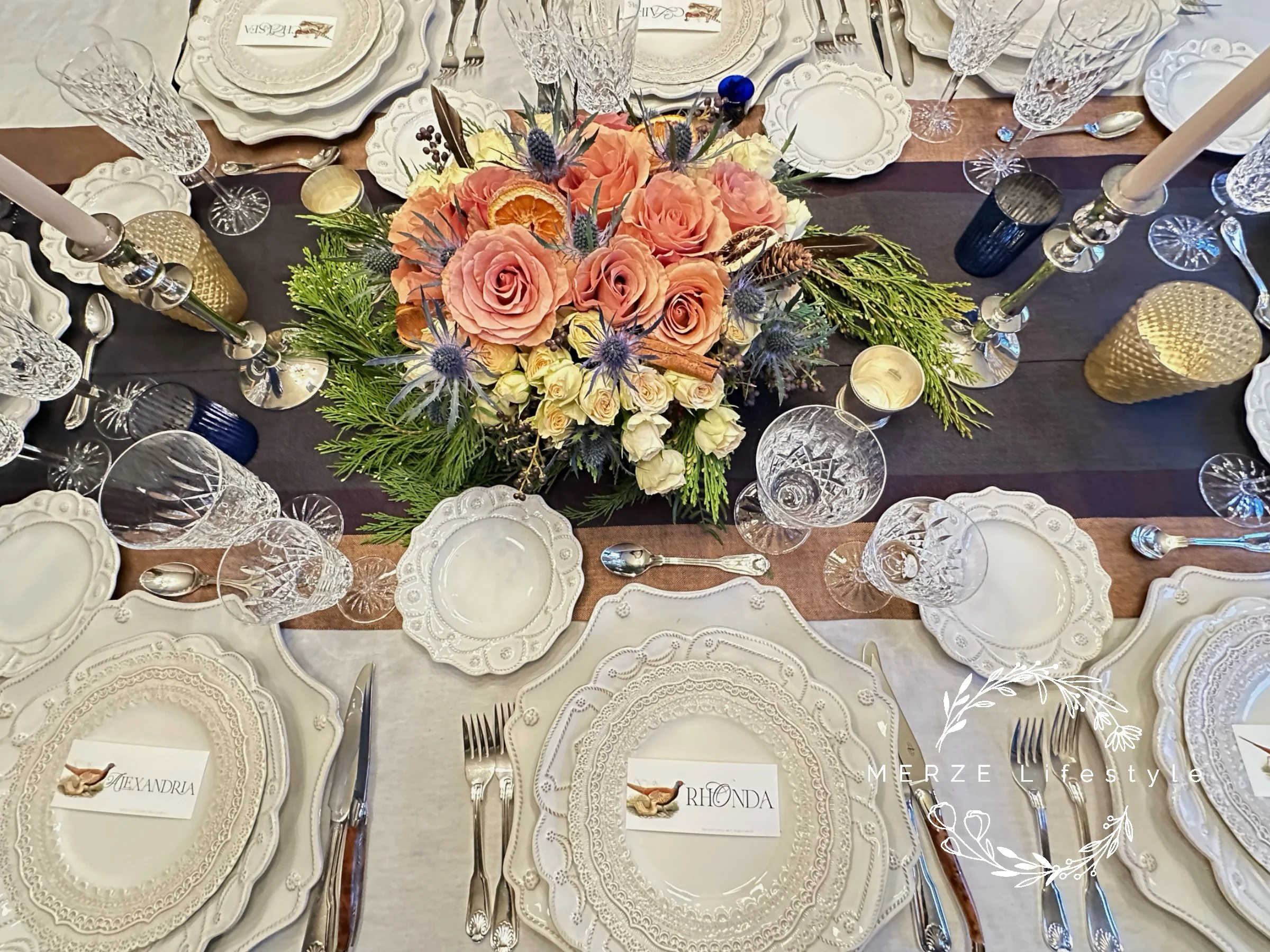
The life of the table lives at the center. The florals breathe color into the design without overtaking it. Their tones are echoed in only a few places. The detailing on the antique soup tureen. The woven runners and napkins. The place cards. The blue votives.
Photo and Design by MERZE Lifestyle - The center of the table carries the warmth, where florals, dried citrus, and spice breathe life into the calm foundation.
This repetition allows color to travel quietly rather than shout. The deep blue votives offer contrast and depth, playing gently off the thistle and the subtle blue woven into the runners. The color does not dominate. It whispers.
Photo and Design by MERZE Lifestyle - From above, the full language of restraint, texture, and quiet color comes into view.
The Style Name and What It Represents
This tablescape lives in three identities at once
Quiet Grandeur speaks to restrained luxury. Nothing excessive. Nothing loud. Everything intentional.
Heirloom Minimalism honors the past without clutter. One historic piece placed with purpose.
Modern Classic Restraint reflects today’s desire for sophistication without overstatement.
Together, they define a new traditional approach. One that feels rooted yet forward.
““True elegance does not compete for attention. It settles into the room quietly and allows everything else to breathe.””
Why This Approach Feels Right Today
In a time when homes are becoming more intentional, and design is shifting away from excess, this style feels deeply current. It proves that you can use newly made, sustainable products and still create a table that feels traditional and elegant. You can honor heritage without recreating the past. You can use color without letting it overpower the design.
Photo and Design by MERZE Lifestyle - Quiet grandeur revealed from every angle.
The cream foundation becomes calm. The silver becomes the light. The crystal becomes the clarity. The florals become the breath.
Closing Reflection
This table is not defined by season. It is defined by restraint. It reminds us that elegance does not require volume. That color does not need to dominate to be felt. Heritage and modern living can coexist at the same table.
Quiet grandeur is not a trend. It is a return.
“May your home be a place where friends meet, family gathers, and love grows.
”
Design with your heart™️
Have a beautiful day, my friends!
Mary

