
The Art of Layering a Table: Create a Beautiful and Meaningful Tablescape for Any Occasion
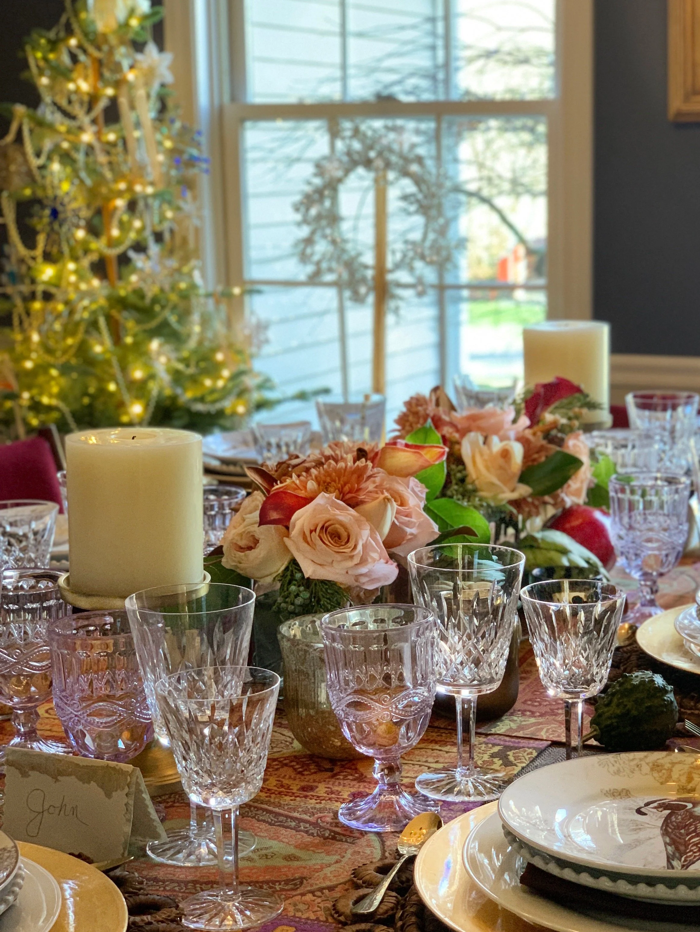
Setting a table can feel intimidating. There are so many moving parts. Plates, linens, florals, flatware, glassware, color, mood. It is easy to believe it should look complete the moment you begin.
It rarely does.
A well-layered table comes to life through editing. Through adjustment. Through stepping back and asking what feels right. Designing a table is not about placing objects in perfect order. It is about creating an atmosphere where people feel welcomed and at ease.
That is where the art begins. Once you have gathered all your supplies, follow these steps to set your table.
Lay It Out Before You Set It
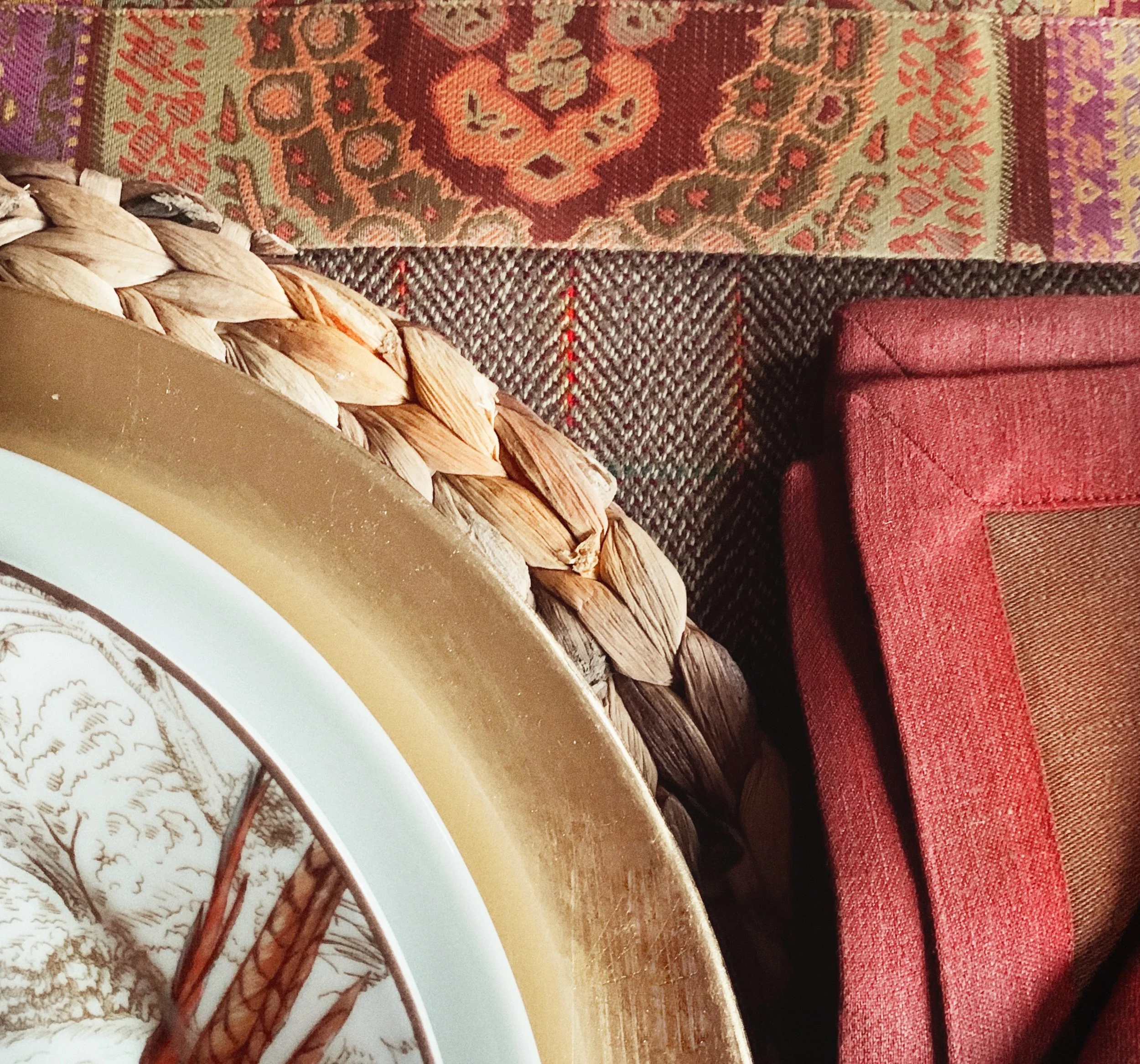
This is the first of my foundational and theme mood board. It’s always a good idea to bring the colors and other items you are thinking of using to see if they will all go together.
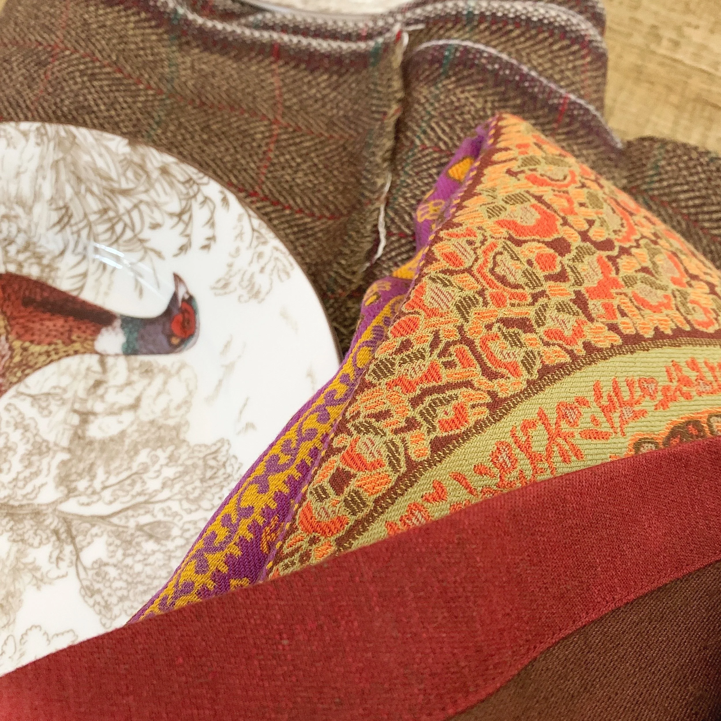
Initial Thanksgiving theme for this holiday table. I chose autumn colors and fowl salad plates to highlight the theme.
Before I set a single place setting, I put the pieces together on the table and look at them. The linen next to the charger, the plate on top of it, and the napkin beside it. Nothing arranged. Just the pieces side by side so I can see how the colors affect one another.
I am asking two things. Do these colors work together, and is the texture right?
That much I can see before anything is set, and most of the time it gives me my starting point for the flowers.
Every so often, I photograph it. Not for anyone else. A picture flattens what you are looking at, and you see it differently, and things that seemed fine standing at the table can look wrong on a screen.
When it goes well, I walk away from that table knowing exactly what I want, and I buy my flowers with confidence.
Begin With Intention, Not the Centerpiece
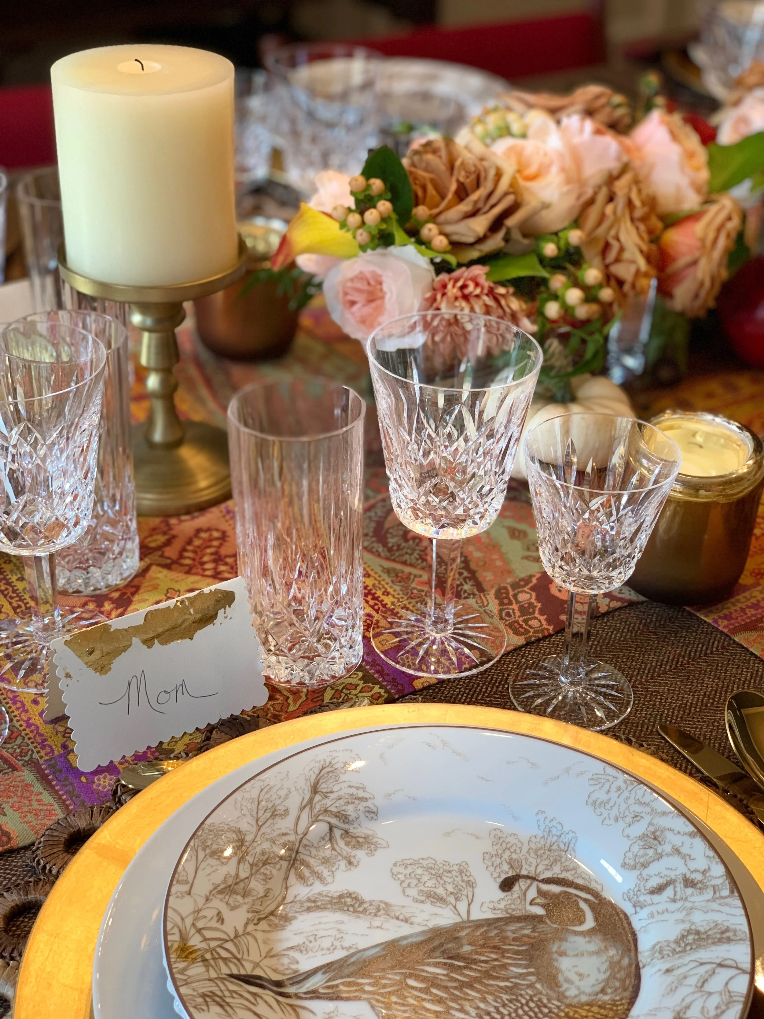
One of the biggest mistakes people make is placing the centerpiece first.
Do not do that.I know many designers disagree with this, but trust me, after years of designing tables, I follow this tried and true methology.
Once your plates, chargers, glassware, flatware, and linens are set, you will see how much space actually remains in the center. It is almost always less than expected. That negative space tells you how large or small your centerpiece should be.
Ok, yes, if you have set your dining room table so many times that you know what works with your own china and decorative elements, then, of course, you know what to do. This is for that person who changes up the chargers, dishes, and other dining elements.
The centerpiece carries the emotional tone of the table. If your design feels too heavy, the florals can soften it. If it feels too quiet, they can introduce color. I often use flowers to echo the palette of the plates or linens, keeping the entire table cohesive without feeling rigid.
Designing this way keeps you from forcing an arrangement that does not belong.
How To Layer A Table and Create A Themed Design
This table did not go that way, and I will tell you the truth about it.
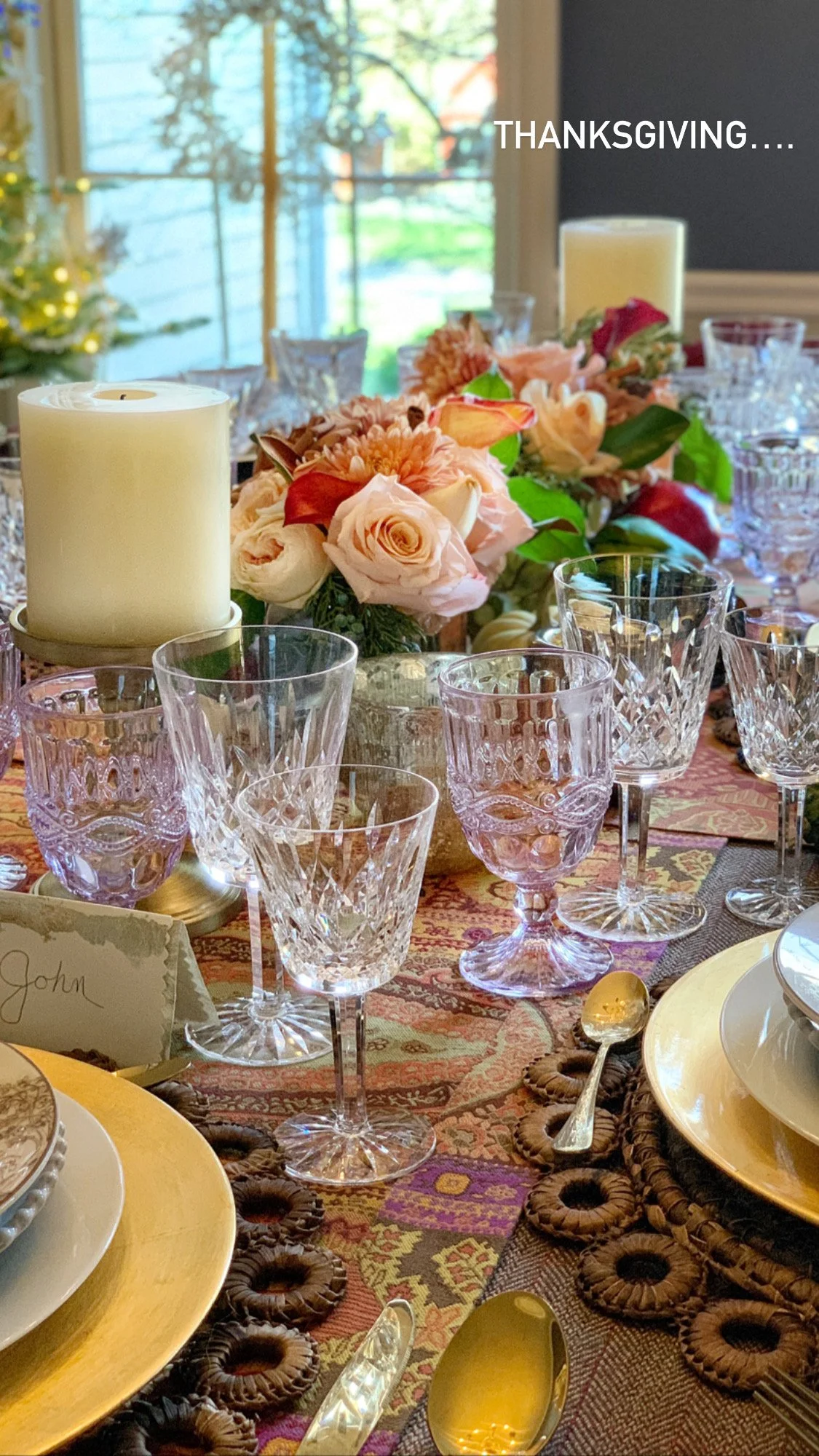
I was not sure it was going to work. The colors were bolder than I usually reach for, and there is a great deal of brown in it, which made it dark. I love a light table. This one worried me while I was building it.
I had laid the pieces out beforehand, as I always do, and the colors looked fine together. What I could not see from that was how dark the whole thing would read once it was actually set, with the brown carrying all the way down the tablecloth.
So I waited for the flowers.
Had I bought them first, I would have bought bold ones. I would have looked at those linens and chargers and thought the table wanted more of the same, and it would have gone darker still.
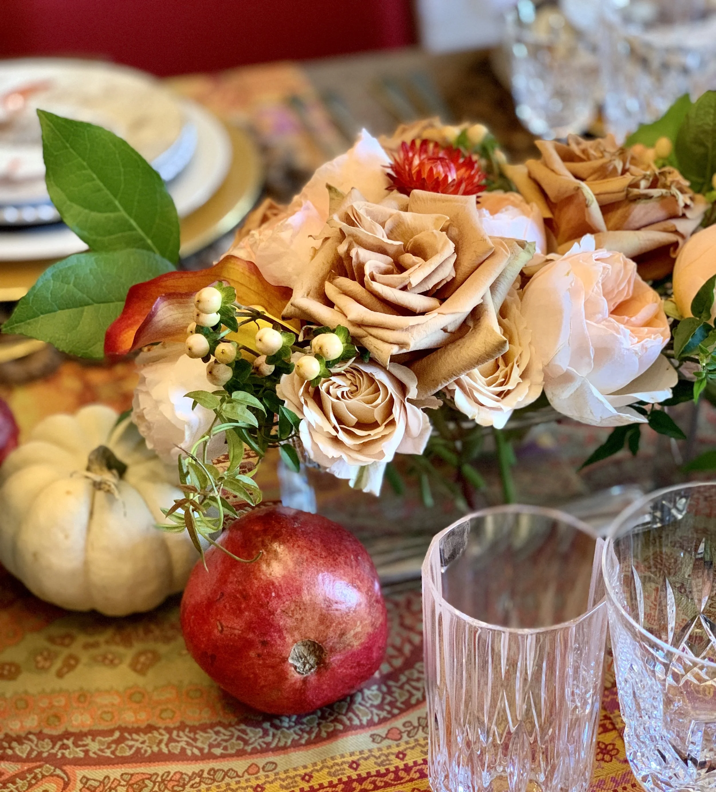
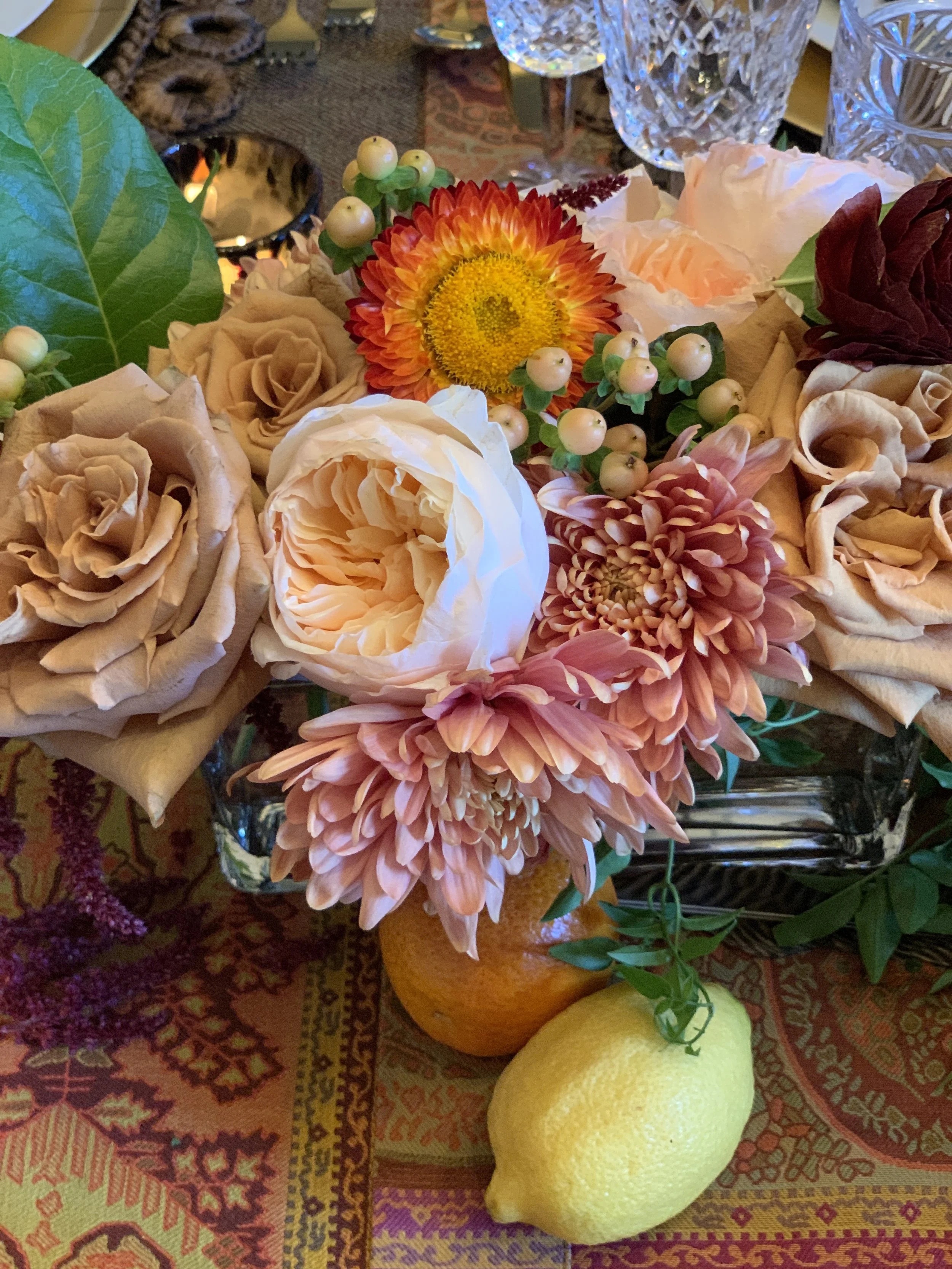
Because I waited, I could see it needed the opposite. I went to the florist and worked out the colors with her until they were exactly where I wanted them. Softer than the table. Muted enough to pull the whole thing back. The flowers did that, and so did the few small things I set in the middle among them.
How to set a table - negative space in the middle
Where the Flowers Come From
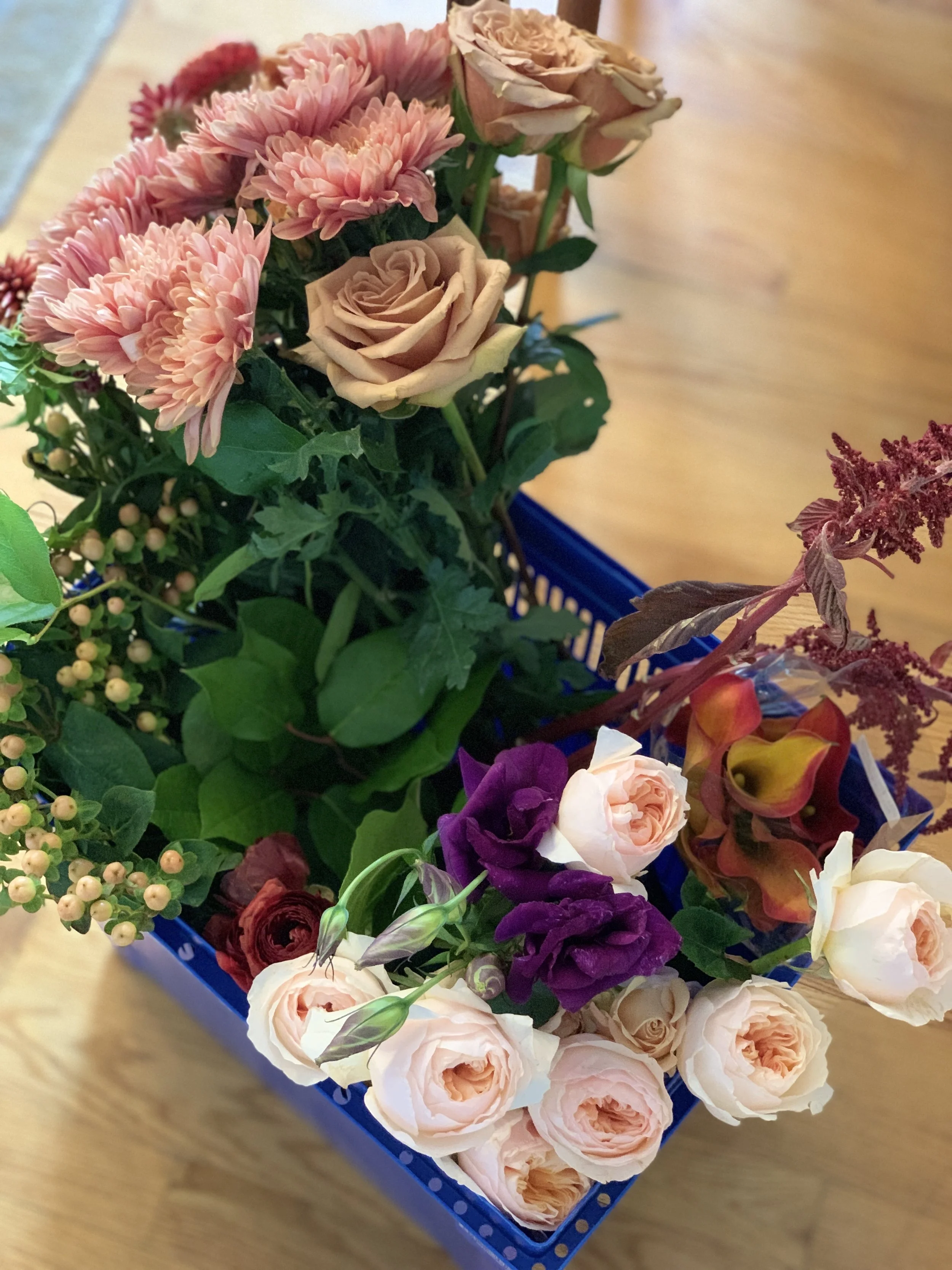
By fall, my garden will be mostly finished. The blooms are done or nearly done, so I go to the nursery and buy what I need.
But I only buy flowers there by the stem and create the arrangement myself. The greenery comes from outside my own door. Winterberry, evergreens, whatever is growing. It costs nothing, and it is what keeps an arrangement from looking like it arrived in a box.
If the arrangement comes out small for the table, I go outside and cut branches. Greenery or winterberry, laid along the tablecloth so it reaches out from the vessel in both directions. The arrangement has not grown. It simply covers more table, and the eye reads it as a single extended design rather than two small ones.
The flowers set the palette. The greenery gives me room to fix it.
Set the Foundation: Linens and Theme
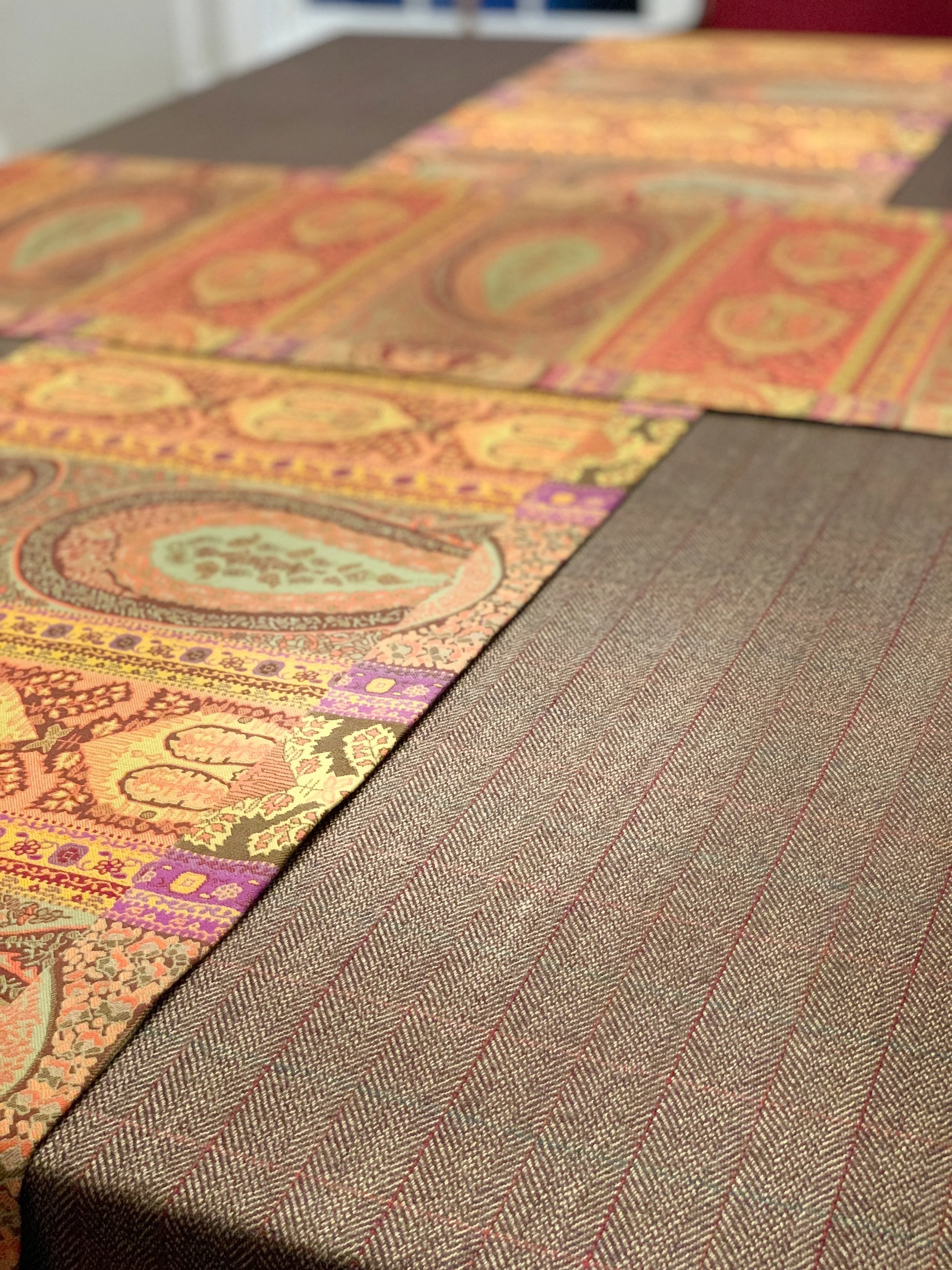
Every table begins with a foundation. This is your tablecloth, runner, or layered textile combination.
Texture matters here. Linen, cotton, embroidered heirlooms, or a simple woven runner all communicate something different. A white or ivory base creates structure. Pattern introduces movement. Layering two tablecloths or using a runner can soften formality and add depth.
A theme does not have to be seasonal or literal. It is simply the guiding idea behind the table. It may be autumn tones. It may be French countryside simplicity. It may be blue-and-white porcelain with hints of cream. A theme keeps you focused, so the table does not drift into visual noise.
“Dining with one’s friends and beloved family is certainly one of life’s primal and most innocent delights, one that is both soul-satisfying and eternal.
”
Add a Charger for Structure and Warmth

Chargers anchor the place setting. They provide visual weight and help the table feel finished.
A woven charger adds organic texture. A metallic charger introduces refinement. You can layer chargers if the occasion calls for it. A textured mat beneath a subtle gold plate creates dimension without overwhelming the design.
Linen placemats in color, or edged in color, placed on your tablecloth are among the easiest ways to bring another hue into a place setting. They also lift it. A plain white plate over a placemat bordered in the same tone as your napkins reads as considered rather than casual, and you have done nothing more than lay something underneath.
This is one way to bring color in from outside the centerpiece, and the color has to travel. A palette that lives only in the flowers looks like an arrangement someone set down on a table. The same color picked up in a placemat, a napkin, a votive, and the table reads as one thing.
The balance is delicate, though. Too little and the color looks accidental. Too much and the table gets loud. You are aiming for the color to be present in several places and dominant in none.
Layering is not about excess. It is about balance.
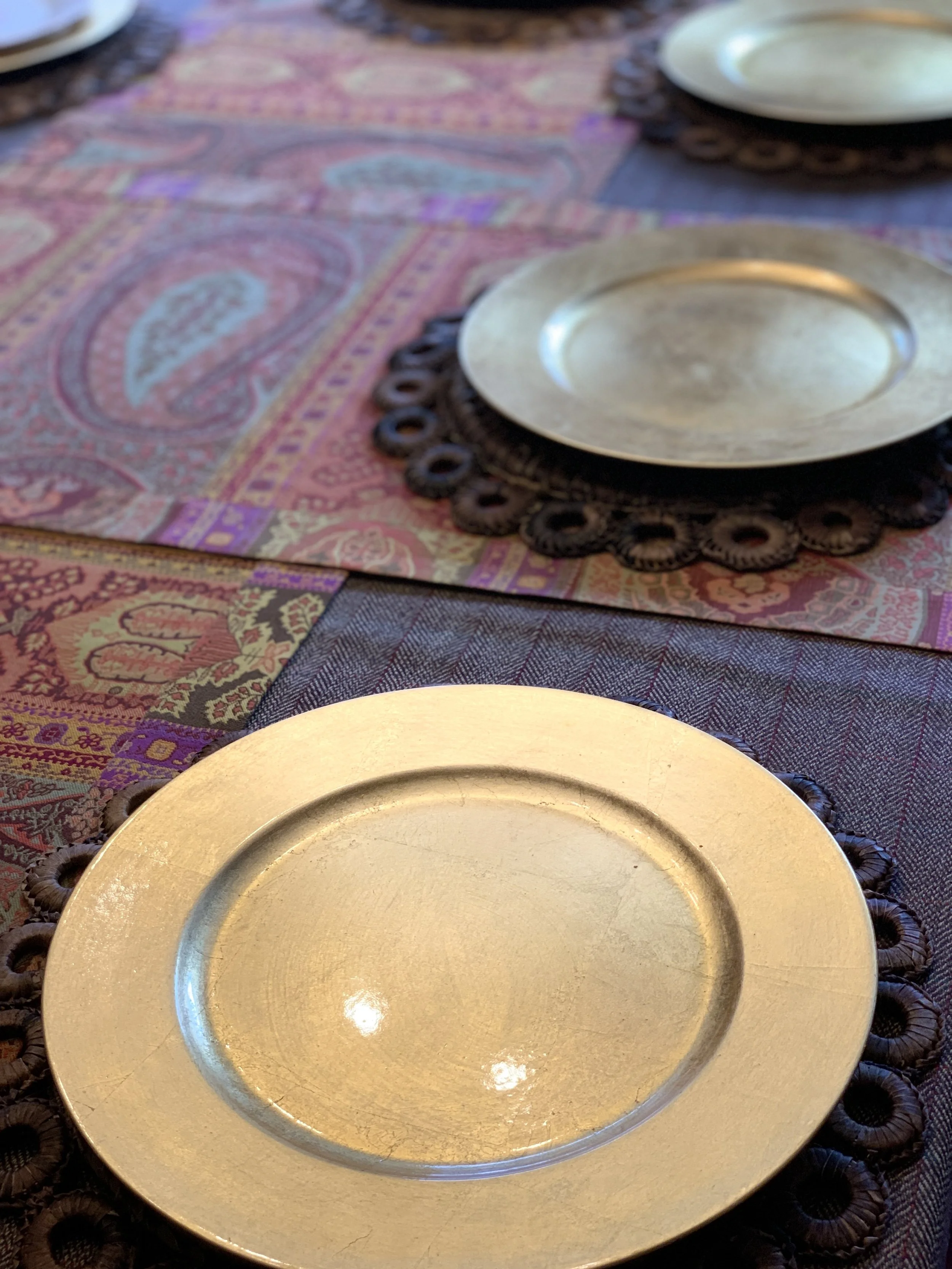
The emotional influence of color plays just as strong a role in entertaining as it does in interiors, something I explore further in The Psychology of Color in Interior Design.
Layer the Plates Thoughtfully
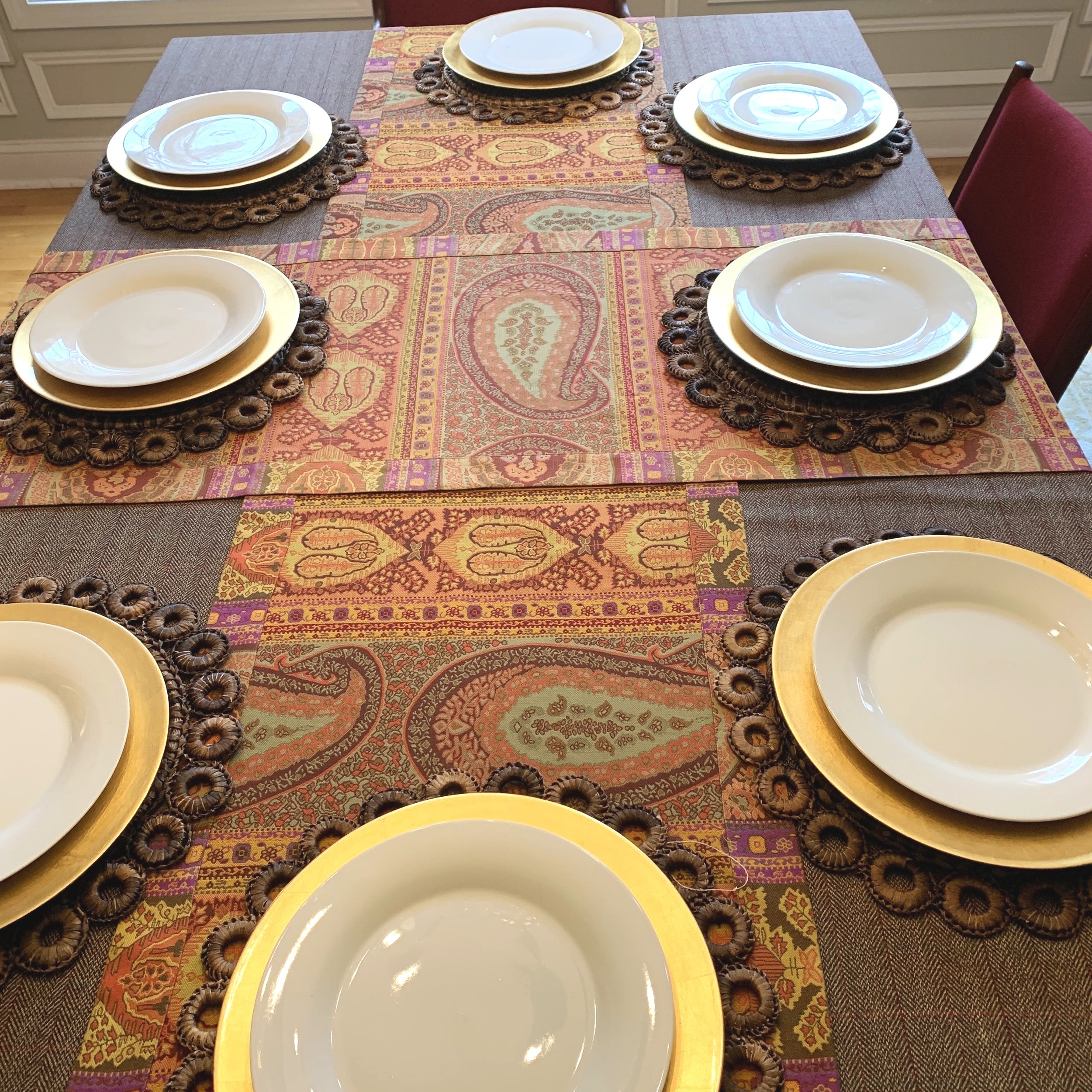
Plates are where your color story often begins.
For a formal setting, a dinner plate anchors the base. A salad plate follows. An accent or dessert plate can sit atop to add personality. For casual gatherings, fewer layers may be appropriate.
Accent plates are an opportunity to express character. Perhaps they carry a vintage pattern. Perhaps they reflect the season. In my own tables, I often allow the plates to guide the entire palette. The colors in the china quietly inform the flowers, linens, and even candles.
This is how cohesion forms naturally.
I wrote about that Thanksgiving table in full, from the light green linen to the ornamental kale in the tureen, in designing a tablescape around a single antique.
Napkins and Personal Detail
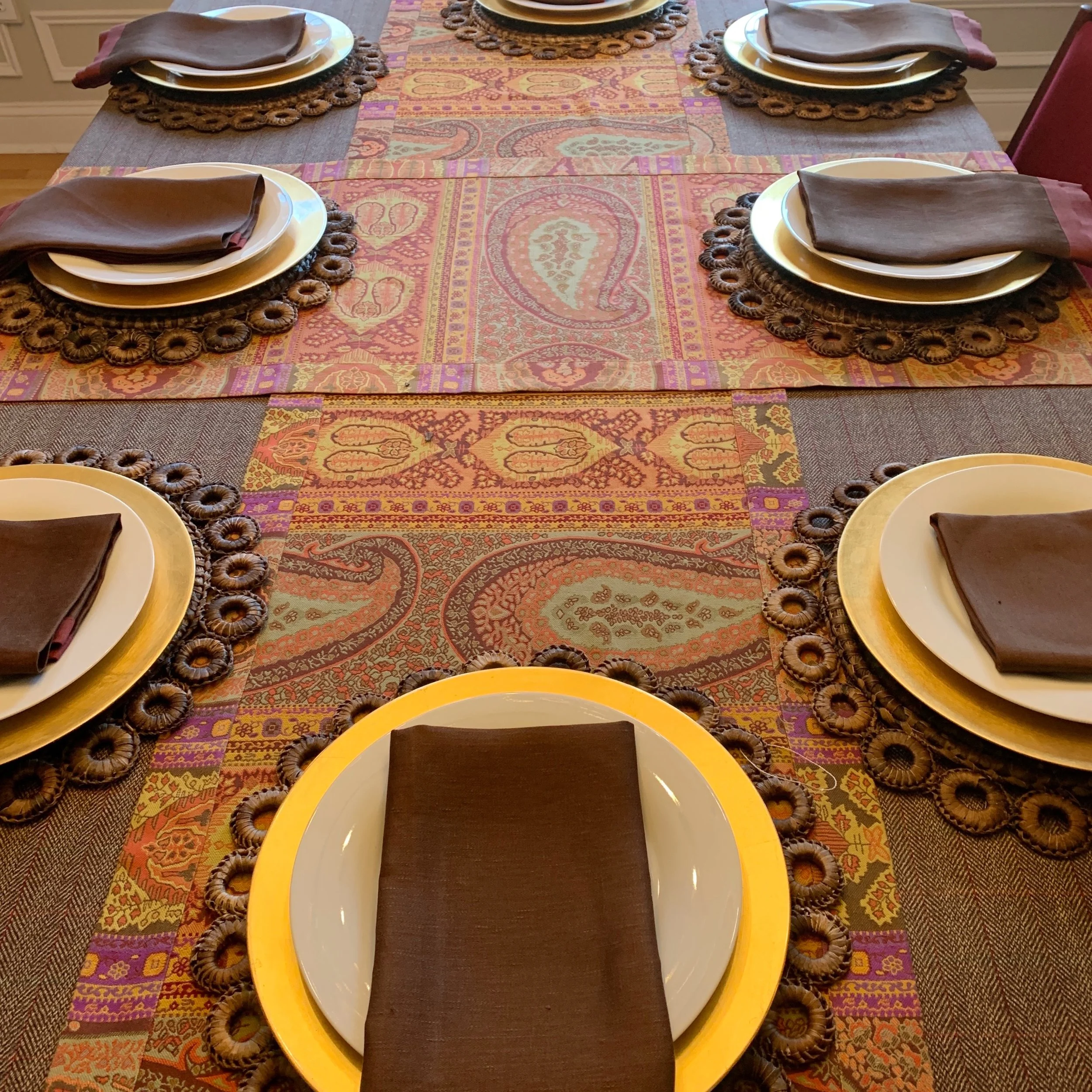
Cloth napkins soften a setting immediately. Placing them beneath the top plate adds dimension. Folding them simply keeps the look relaxed.
This is also where heritage can enter the table. A monogrammed linen napkin does not need to feel formal. It can simply represent belonging. A sense that this table is part of a lived home, not a staged display.
Details like this create warmth without excess.
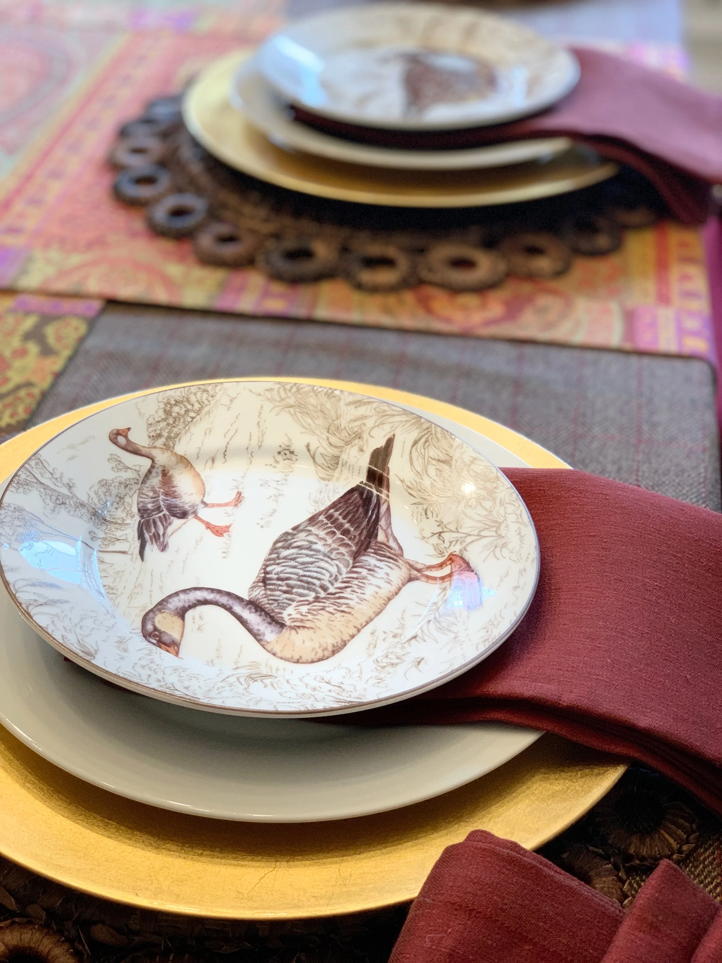
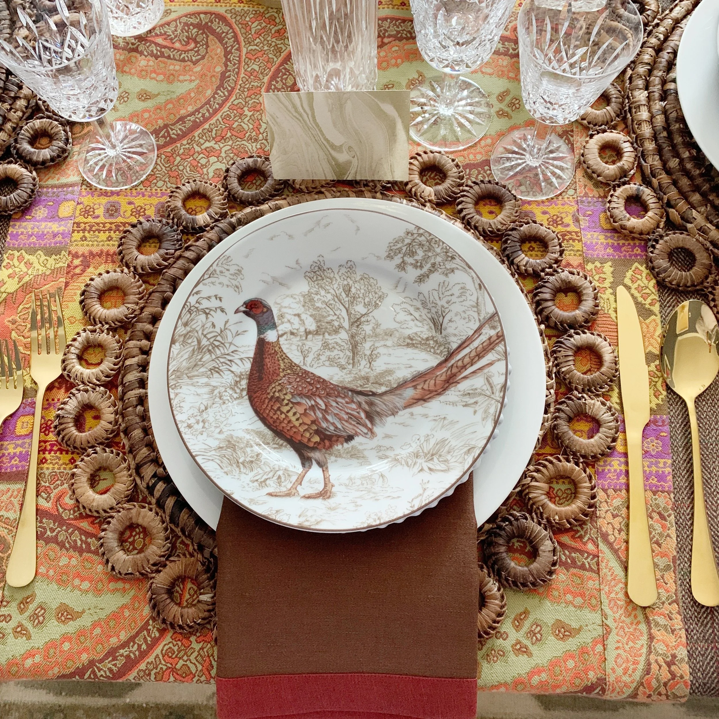
Accent plates are a great way to highlight a theme. Here I added a plate along with an additional accent plate.
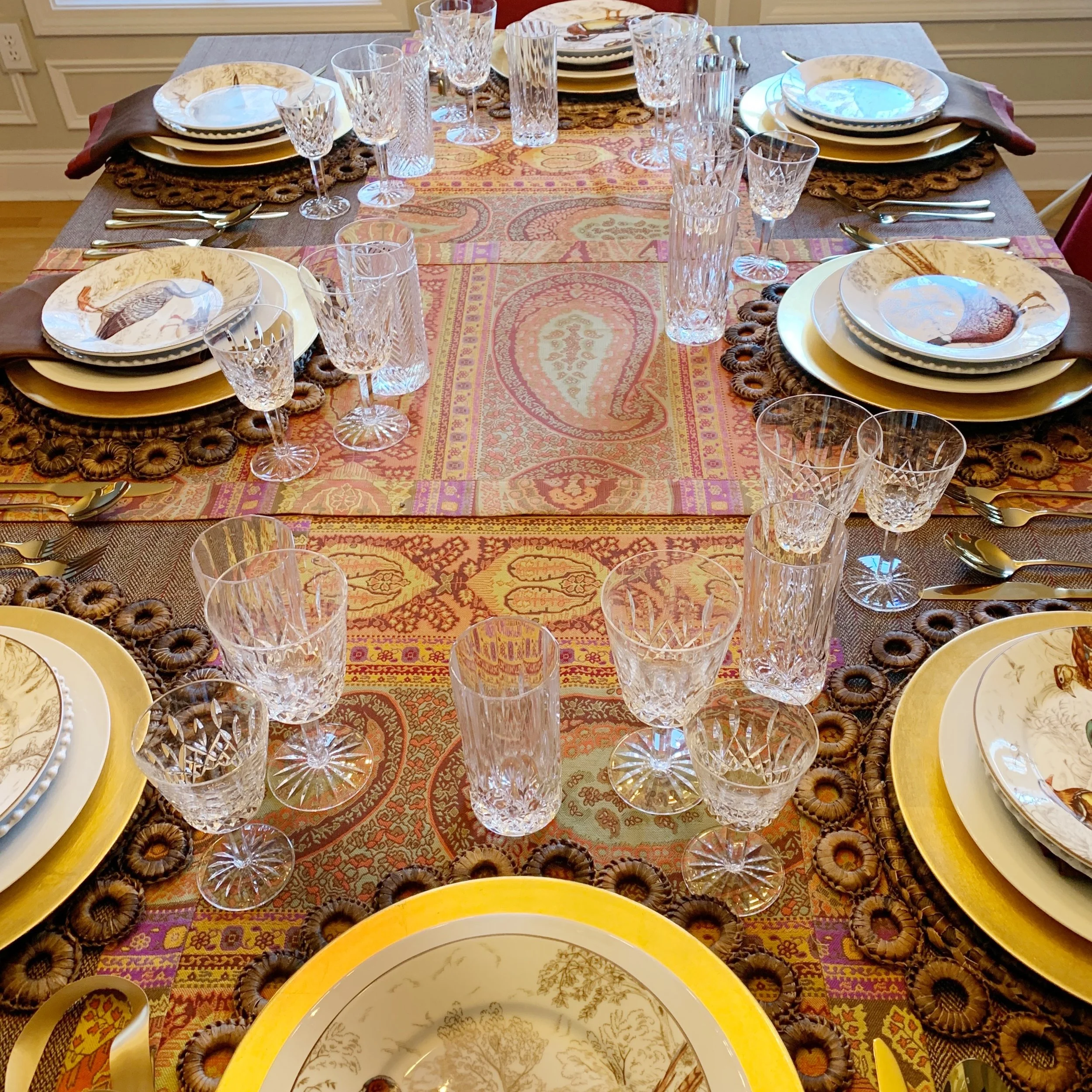
There are three sets of plates. There is a dinner, salad, and dessert plate. The dessert plate is used as my accent plate. These fowl designs were my initial inspiration for this table. You find most of the colors on this tablescape come from the colors of the plates.
“The art of dining well is no slight art, the pleasure not a slight pleasure; neither the greatest captains nor the greatest philosophers have disdained the use or science of eating well.
”
Place Flatware and Glassware With Ease
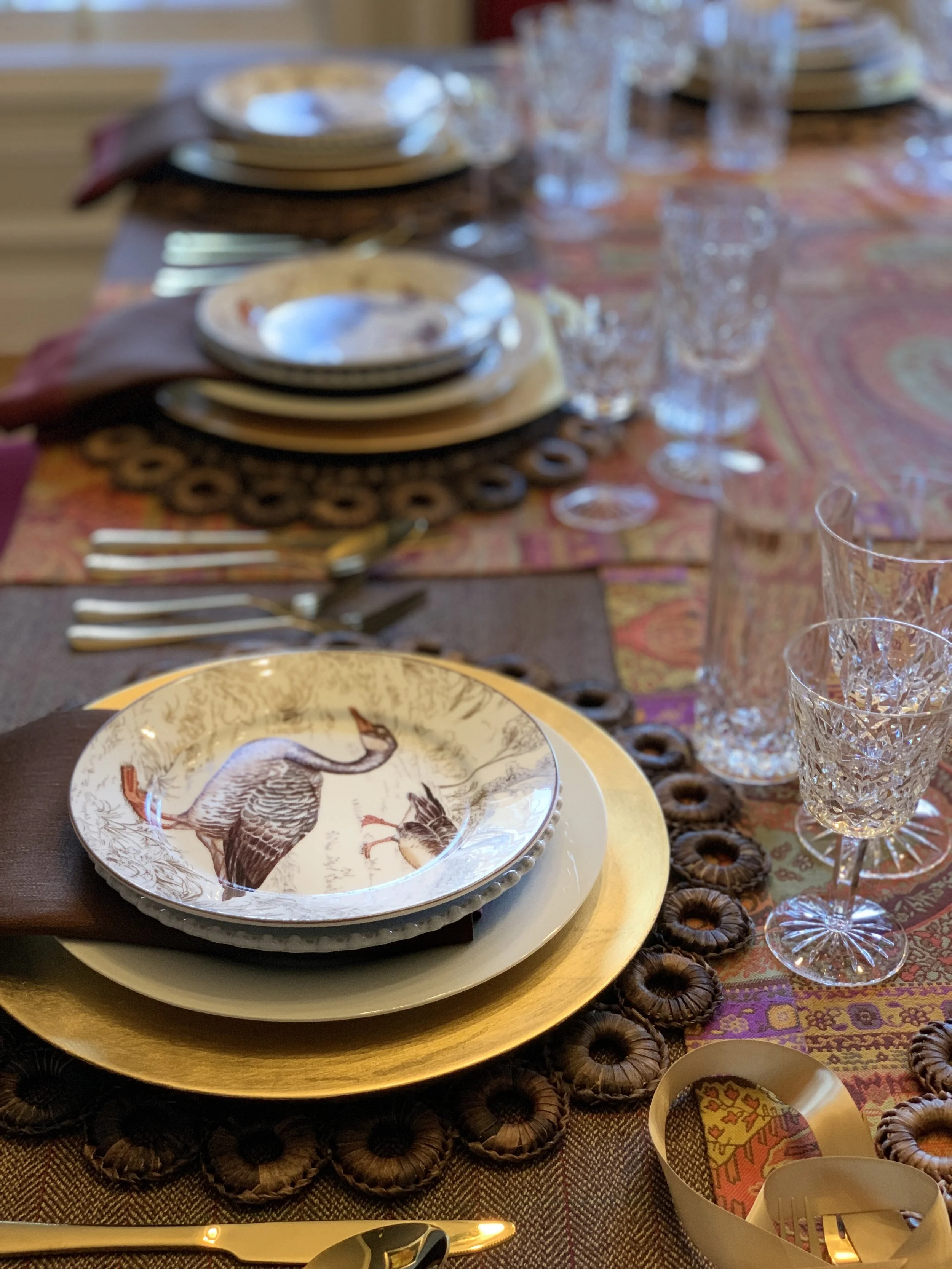
Flatware should follow the order of use, with the pieces placed neatly to the right and left of the setting. For a formal meal, you may include multiple forks and glasses. For a relaxed dinner, keep it simple.
Mixing glassware works beautifully when there is a shared element, such as etching or tone. Water glasses, wine glasses, and even coupe glasses for dessert can coexist when chosen thoughtfully.
The key is consistency in feeling, not perfect matching.
Step Back and Edit
This is the most important step.
Once everything is placed, step back. Look at the table from across the room. Is it too dark? Too heavy. Too formal. Too quiet.
Often, I find that a table needs lighting. That may mean softer florals. It may mean removing one layer. It may mean introducing fruit or greenery to break up density.
What you are really judging, standing there, is weight.
Not color exactly. Not how much is on the table either. How heavy a thing is to look at, and whether whatever sits next to it can hold its own beside it.
I set a Christmas table once, around china I would never have chosen for myself. Blue and red and gold, and blue and red together can be heavy. I was not going to buy new china, so the work was finding things light enough to sit beside it. Small ornaments that were interesting to look at up close but quiet from across the room. Blue and gold. Clear and gold. Nothing that demanded to be noticed.
I put a thing down, held it up to the one next to it, took it off, and tried something else. That went on for a while. Eventually, the table read the way I wanted, balanced and light. If you would take a look at the design it is called Home For The Holidays.
That is what editing is. Not straightening. Taking off what does not work and putting on what does, until the weights sit right together.
A tablescape evolves through editing. Just like a home. Just like life.
Add the Centerpiece Last
Now return to the center.
Choose a centerpiece that supports the mood without blocking conversation. Keep height in mind. Guests should see one another easily.
Flowers are timeless. Fruit can introduce unexpected texture. Candles add warmth and intimacy. The centerpiece is not meant to dominate. It is meant to be complete.
Optional: Place Cards and Personal Touches
Place cards are a beautiful gesture, but not always necessary. They can be simple handwritten notes or textured paper that echoes your color story.
Personal touches are what transform a table from decorative to meaningful.

Add place cards (optional). Place cards are a great way to identify each guest's place at the table. They can be simple or elaborate, depending on your preference.
Additional Layering Principles
• Mix textures such as linen, ceramic, glass, and metal
• Combine old and new pieces for depth
• Introduce height variation with candles or stacked plates
• Allow negative space so the table can breathe
• Design for comfort, not perfection
A well-layered table invites people to linger. It allows conversation to unfold naturally. It feels intentional but never stiff.
Layering two tablecloths adds depth to a table without adding clutter.
Start with the larger tablecloth. It sets the structure and determines how the table falls. The second tablecloth goes on top, smaller, often turned on the diagonal so the corners of the one beneath still show.
Pattern usually belongs on top. A plain base gives the eye somewhere to rest.
A runner is a good alternative to a second tablecloth. Laid down the center of a full tablecloth, it adds a band of color or texture and leaves more of the base tablecloth visible. Use it when a second tablecloth would feel heavy.
Press them. A pressed tablecloth is the difference between a layered and a rumpled one.
The runners on this table are Anichini, a Vermont house that has been weaving fine linens for decades. The tablecloth is one I curated myself.
How to Mix and Match Plates for a Unique Table Setting
Mixing plates come down to three things: pattern, size, and color.
Vary the sizes so each plate shows beneath the one above it. That is what creates the layered look. Vary the patterns so the stack has interest. And keep the colors related, so the whole setting still reads as one thing.
If your plates are all white, size and pattern do the work. Stack a dinner plate, a salad plate, and a dessert plate in different sizes with different edges or textures, then choose one color to bring to the table around them.
Old and new together are what make a setting feel personal. A vintage accent plate over a modern dinner plate. Something inherited beneath something you bought last year.
Then edit as you go. A refined table is one that has been adjusted throughout the process, not arranged once and left as is.
How to Choose a Color Palette That Ties Plates, Glassware, and Linens Together
Start with the plates or a single object that you love;
If you are mixing patterns, the colors in those patterns are your palette. If you have a centerpiece with color in it, a soup tureen with painted flowers, for instance, take your colors from that. I built an entire Thanksgiving table this way, taking the palette from the colors painted on a single antique tureen. You can see how it came together in Styling a Place Setting Around a Single Antique Piece.
If your plates are white, choose one color to add and build from there.
Then spread that palette across the entire table. Use the color in the napkins. Carry it into the centerpiece. Put it in the votives. Colored stemware is wonderful for this and does a great deal of work in one piece.
Two colors are usually enough, with one doing most of the talking.
What matters is that the color appears in more than one place. A color used once looks like an accident. The same color repeated throughout the table makes the design cohesive.
Vary the height of your candles while you are at it. Different heights keep the eye moving.
What Tableware Makes a Home Feel More Refined
Refinement does not come from what a piece costs.
It comes from texture and from restraint. Real linen. Weight in the flatware. One good serving piece rather than several ordinary ones. A tablecloth that has been pressed.
It also comes from editing. A table that looks refined is one that has been adjusted as it was built, with pieces removed as often as added.
And it comes from use. A cabinet of pieces saved for an occasion that never arrives is not refinement. It is storage.
Use what you love, and use it often.
Designing a Table Is Designing an Experience
When I layer a table, I am not only thinking about color or symmetry. I am thinking about how people will feel when they sit down. Will they relax. Will they feel welcomed. Will they sense that this table belongs to someone who gathered it with care.
Layering is not about impressing guests. It is about creating a space where gathering feels natural.
A table rarely looks perfect in the beginning. It becomes beautiful through patience and refinement. Through the willingness to adjust until the feeling is right.
That is the art of it.
Designing with that kind of confidence mirrors the deeper work of returning to yourself, a theme I write about in When Women Become the Village.
“Be able to set a table so that you feel like you’re dining, not just sitting and eating.
”
There is an art to layering a table. With some planning and creativity, you can easily layer a table to create a beautiful tablescape that impresses your guests.
Design with the Heart™
À bientôt,
Mary
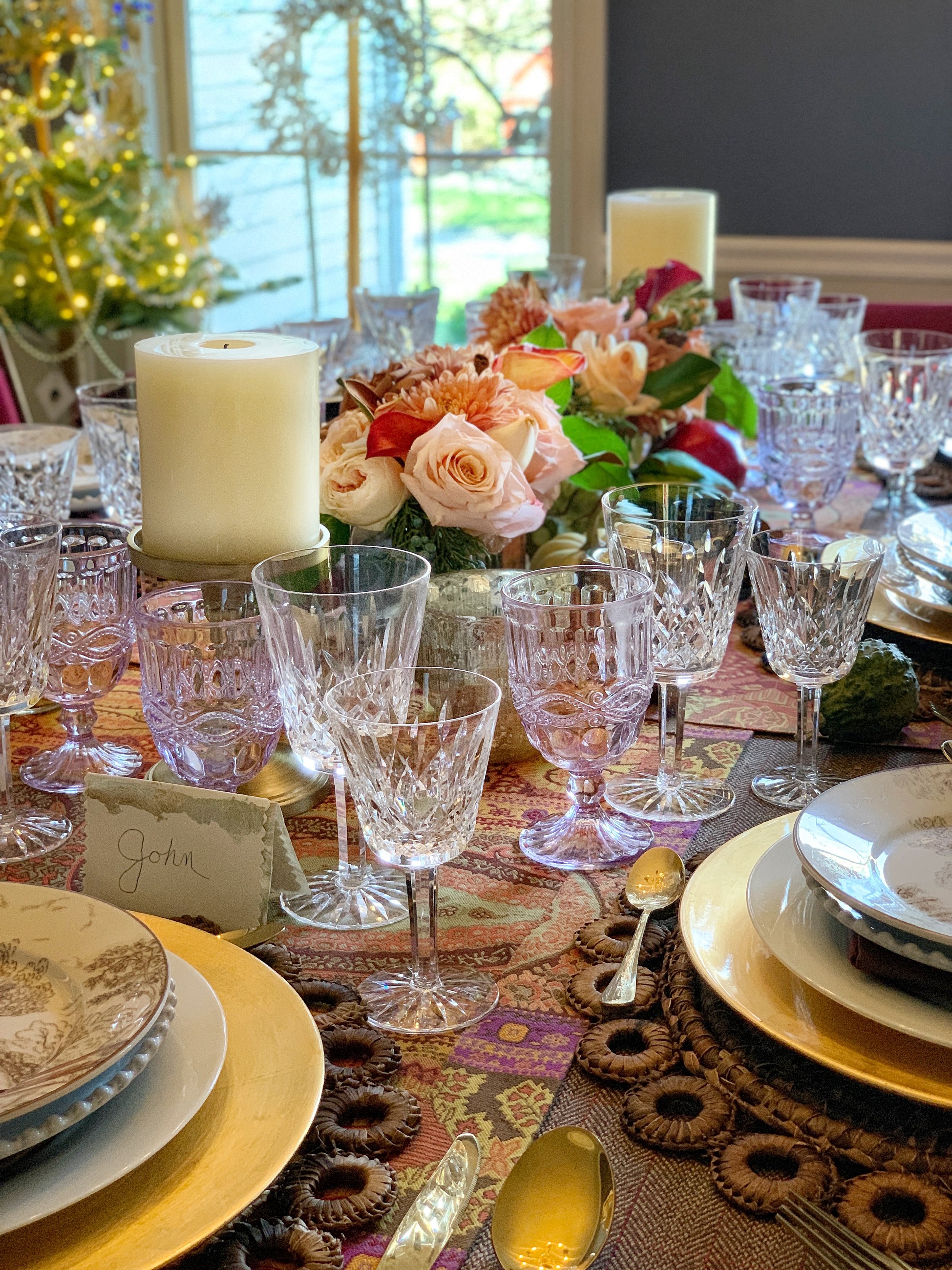
The same table later in the evening, after the overhead lights went off. This is the version I set it for.
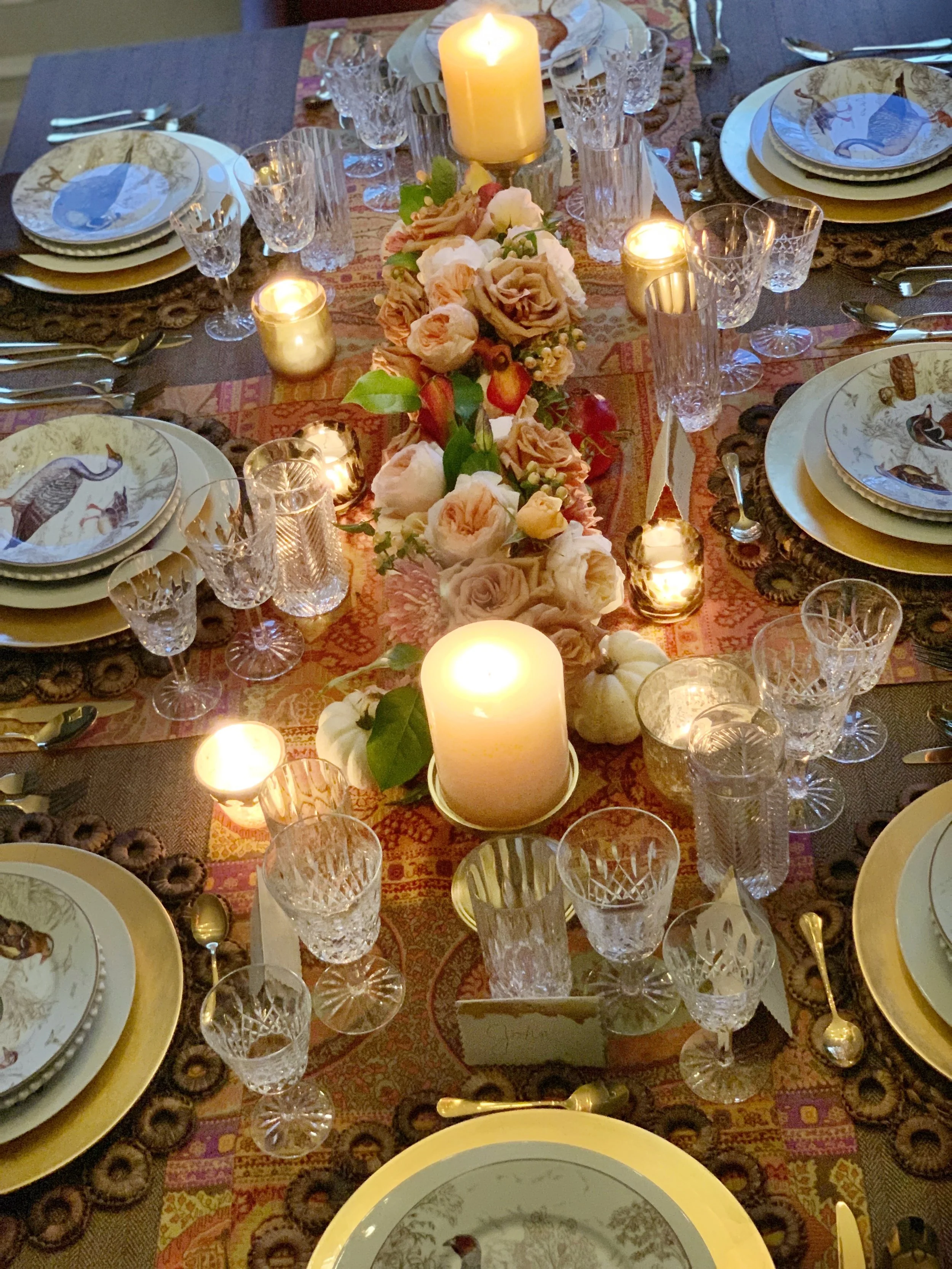
Warm lighting using votives and pillar candles

