
Biophilic Design at the Table: How to Build a Coastal Color Palette from the Ocean
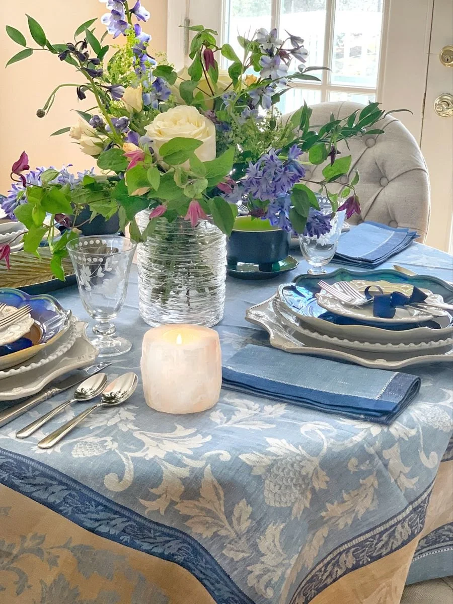
It is essential to me that while living by the coast, I bring elements from the outdoors into my home. It just feels right to me, and it just makes me happy!
What we define as beautiful is very individualistic, depending on where we call home. The colors, textures, patterns, and organic shapes found outdoors bring holistic feelings that can heal and calm our lives. Whether you live in the country or by the sea, those colors that inspire you are essential to your well-being.
Let’s talk about the Theory of Biophilia just a bit.
The theory of Biophilia proposes that human beings carry an innate love and need for the natural world. Throughout the ages, humans have always depended on our environment and other living organisms to survive, and a considerable body of research now suggests that natural light, natural materials, greenery, and views of the outdoors are associated with better mood and well-being. It remains a hypothesis rather than a settled finding, but it matches everything I have observed in my own house. So why not bring nature into our homes and commercial buildings to promote health and wellness?
The idea is not to bring in one or two plants, and you have the environment needed for wellness. It is more than that; it is a combination of fundamental principles that creates a habitat conducive to a healthy lifestyle, tailored to your taste.
There are two different features of biophilic design.
The first is the organic features depicted by things or experiences that come from nature. They don’t necessarily need to be touched, but can also be seen from afar. It incorporates natural lighting and materials, views of our surroundings, vegetation, and other natural elements.
The other feature is based on the specific geographic and cultural environment of your surroundings. It is the geology that surrounds your home.
To learn more about Biophilic Interior Design, go to my blog. The link is here.
“I go to nature to be soothed and healed, and to have my senses put in order.
”
Why the ocean appears in so many different colors
The ocean is never one color, and there is a reason for that.
Water absorbs the long wavelengths of light first, the reds and oranges and yellows, and lets blue travel furthest. That is why deep, clear water reads as blue. Add phytoplankton, and the chlorophyll in them absorbs blue and red light and reflects green, so the water turns emerald and jade. Add dissolved plant matter washed down from rivers, and it pulls toward amber and brown.
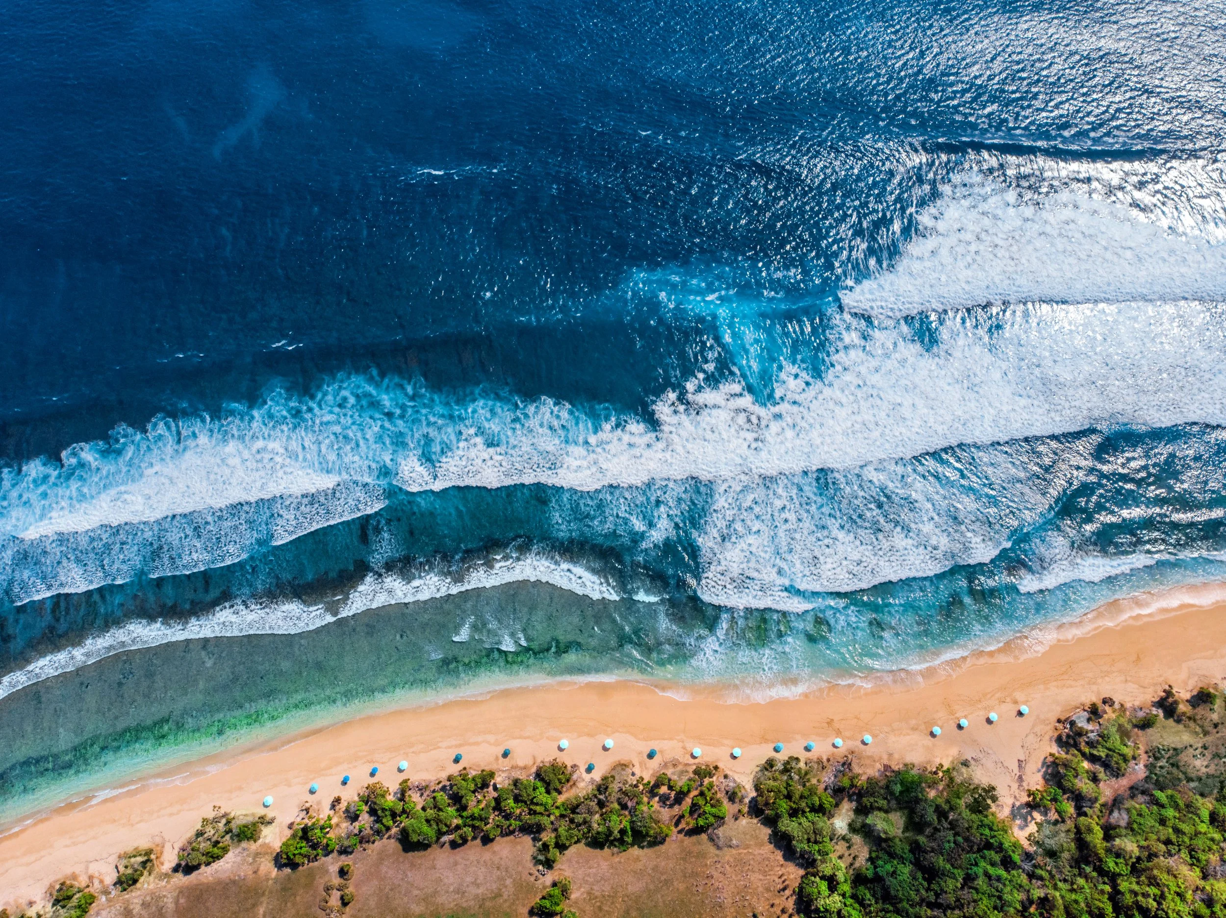
Add sediment near the shore, and you get the softer, milkier greens. In a few places in the world, an algal bloom can even turn it red.
So the sea is not a color. It is a whole palette, and nature already did the work of making those colors agree with one another.
The Plate That Held the Whole Ocean
My palette did not begin with a color chart. It began with a plate.
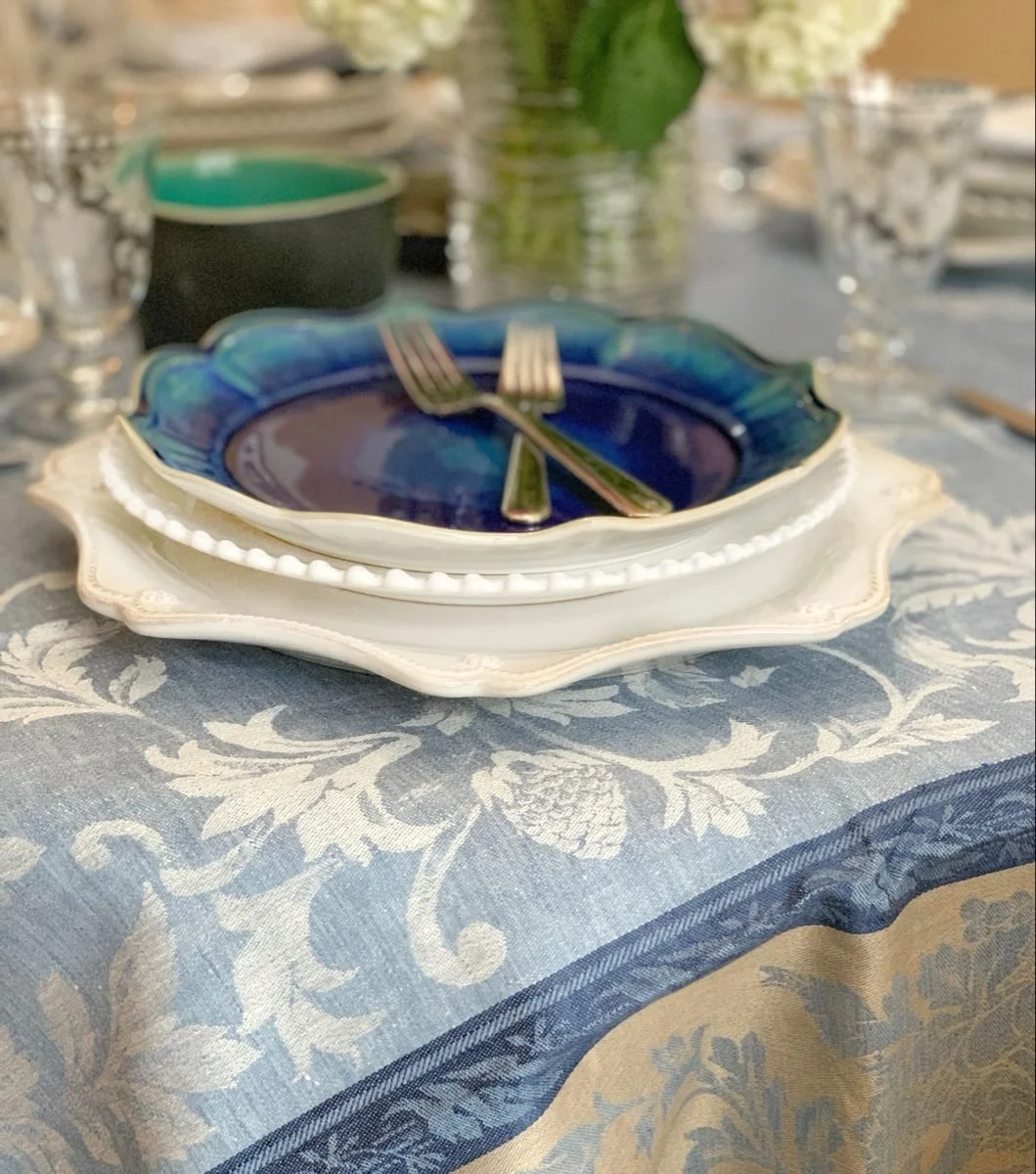
The glaze runs from aqua at one edge through to a deep, vibrant blue, and it shifts as you turn it, the way water does when a cloud passes over. I bought them because I had stood at the ocean and seen exactly that. Not one blue. All of them at once, changing across the surface depending on how deep the water was and what the light was doing to it.
That is not a poetic way of putting it. It is what is actually happening. Where the water is shallow enough for light to reach the sand and return, you get aqua and turquoise. As the bottom falls away, the warmer wavelengths are absorbed and only blue comes back, so the same stretch of sea goes sapphire, then ink. Reading the color of a bay is reading its depth.
So a table built on that range is not a table of matched blues. It is one blue at every depth, and that is why nothing on it fights anything else.
How to Build a Biophilic Color Palette for Your Table
Coastal color is genuinely its own thing, and the reason is light as much as pigment. Near water, light arrives from above and reflects back up off the surface, the air holds more moisture so everything is diffused, and the horizon is open rather than broken by trees. The result is cooler, more even, higher-key light. The same teal plate really does read differently inland.
If you have not spent time by the water, these colors can be hard to picture. So here is the range I draw from, in the order you would meet it walking from the sea back up the beach.
Deep water. Ink, indigo, sapphire. The color you only see far out, where light has stopped reaching the bottom.
Midwater. Teal and jade. Blue and green are arguing with each other. This is where my plates live.
The shallows. Aqua, pale turquoise, sea glass green. Bright and thin, almost lit from behind.
Foam and spray. Not white. Cream and a cooler bone.
Wet sand. Warm grey, taupe, a bronze note where the water has just pulled back.
Dry sand. Oatmeal and pale gold.
Dune grass. Silvered green, sage, straw. Never a true garden green. The salt takes that out of it.
Driftwood and stone. Pewter, bone, weathered grey.
And one warm accent, because the coast always has one. Rosehips, beach plum, the rust in the seaweed.
That is nine or ten distinct values, and almost none of them are the bright navy and crisp white that most people mean when they say coastal. Not a seashell anywhere. That gap is exactly why the nautical look feels like a costume and this does not.
If You Do Not Live Near Water
None of this obligates you to the ocean. Many of us have never stood at one.
The method is what transfers, not the palette. Go outside where you actually live and look for the same structure. The deep note, the mid note, the pale one, the earth colors, and one warm accent. On a prairie that is storm sky, wheat, bleached grass, limestone, and the rust of seed heads. In a wood, there is bark, moss, lichen, a bare branch, and one red berry.
Your ground has a palette. It is already coherent, because nature did the work of making those colors agree long before either of us arrived.
Botanical Coastal Mood Board

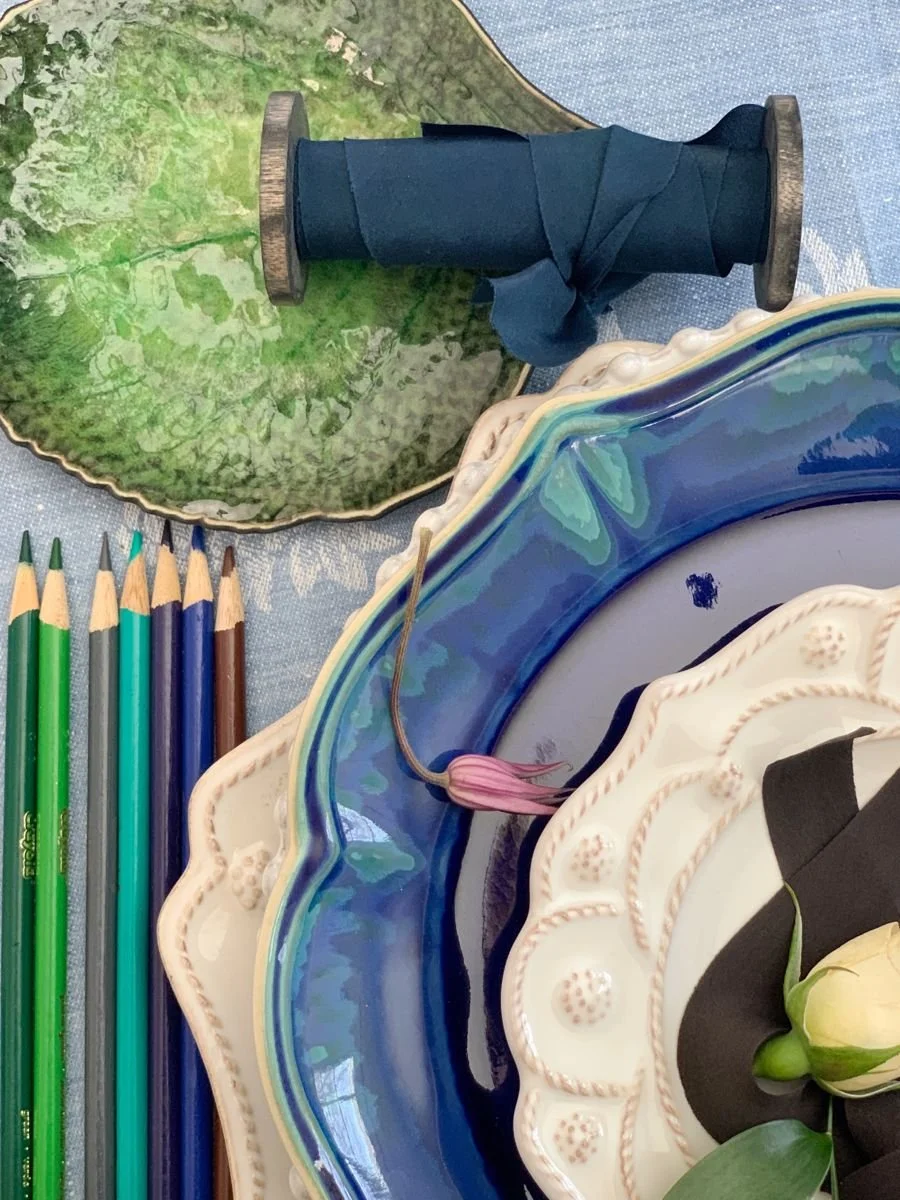
I created a mood board by bringing both photos together, using a photograph of the coastline alongside it. Beautiful hues of nature are incorporated into one table design.
The table that came out of it
I wanted a tablescape with a sea-like feel. I love the ocean, so it is no wonder that I am drawn to all the hues of blue and green.
These beautiful multi-colored plates were my inspiration for my table design. For me, they represented the deep jewel colors found in the ocean. They are also glazed to look like the deep blue water in the middle of the ocean, and I wanted to capture a little of that feeling in my tablescape.
The tablecloth is a gorgeous French linen jacquard pattern that I love. The colors are muted and bright depending on where you look at the tablecloth. I just added it to my inventory, and of course, I am keeping one for myself!
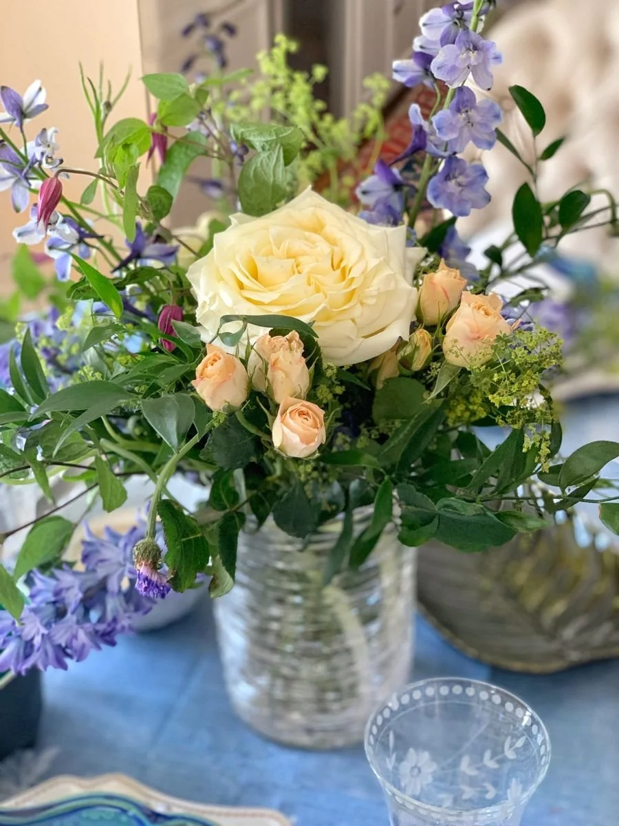
In my floral arrangement, I wanted to add greens, blues, and brown colors that we find in nature.
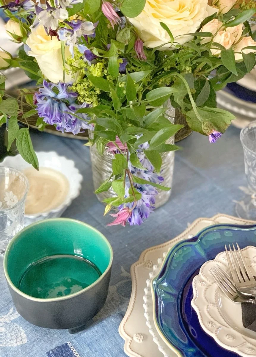
I found these lovely serving dishes at a wholesale outlet and had to have them. They are leaves of different shapes and colors.
The organic shape of this bowl is perfect for a biophilic-inspired tablescape.
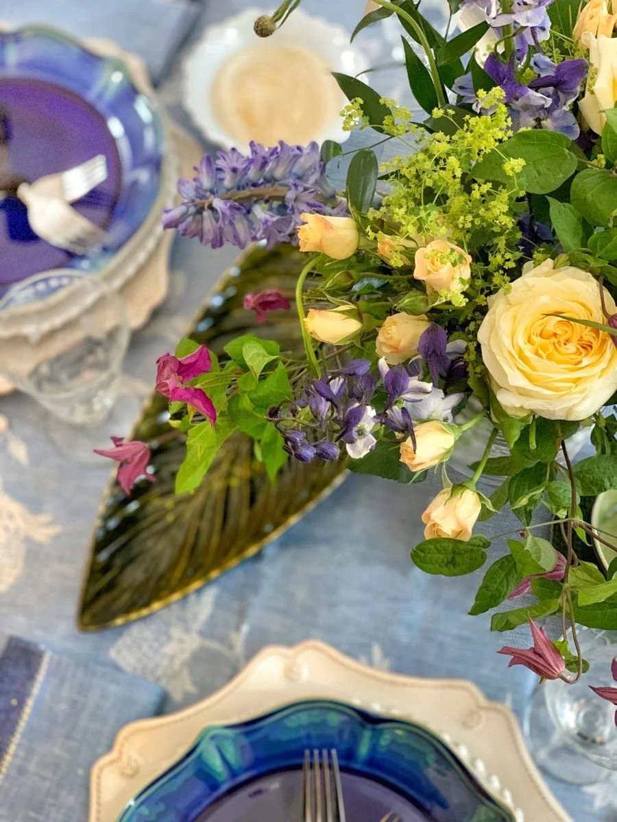
Most organic objects are not perfectly round in nature, and I love that this bowl is a bit off. The deep aqua hues are a perfect jewel tone you find in the ocean, and you'll notice the same color on the plate rim.
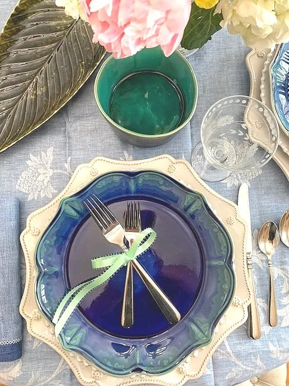
I put this picture here for a reason. I wanted to show that designing, whether for a home or a table, is an iterative process.
When I design a table, I never truly have the complete design in my head when I start. I try different color schemes and textures to see which works best. As you can see here, I added a light green ribbon to my place setting and a pink rose to my centerpiece. Once I did that, I realized it wasn’t the direction I was going in. For me, this was not organic enough, and the colors were off. I needed more natural elements on my table.
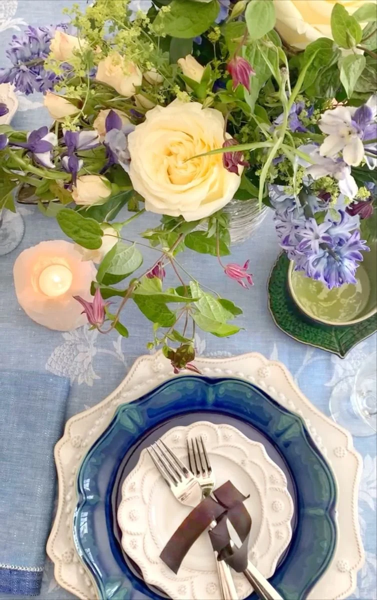
Instead, I decided to use this beautiful, raw silk, naturally dyed ribbon to add color to my place setting and give it a more natural look and feel. The ribbon is a gorgeous organic color that you would find in nature.
Natural Materials and Warm Colors
I only chose warm natural colors you would see in nature in my centerpiece. Blue is a problematic flower color to find if you use blue hydrangeas. Since they are not in season then, I chose blue delphinium and some purple hyacinth. I added a variety of muted roses and a pop of purple. The greens are a mixture of colors and textures found throughout my table.
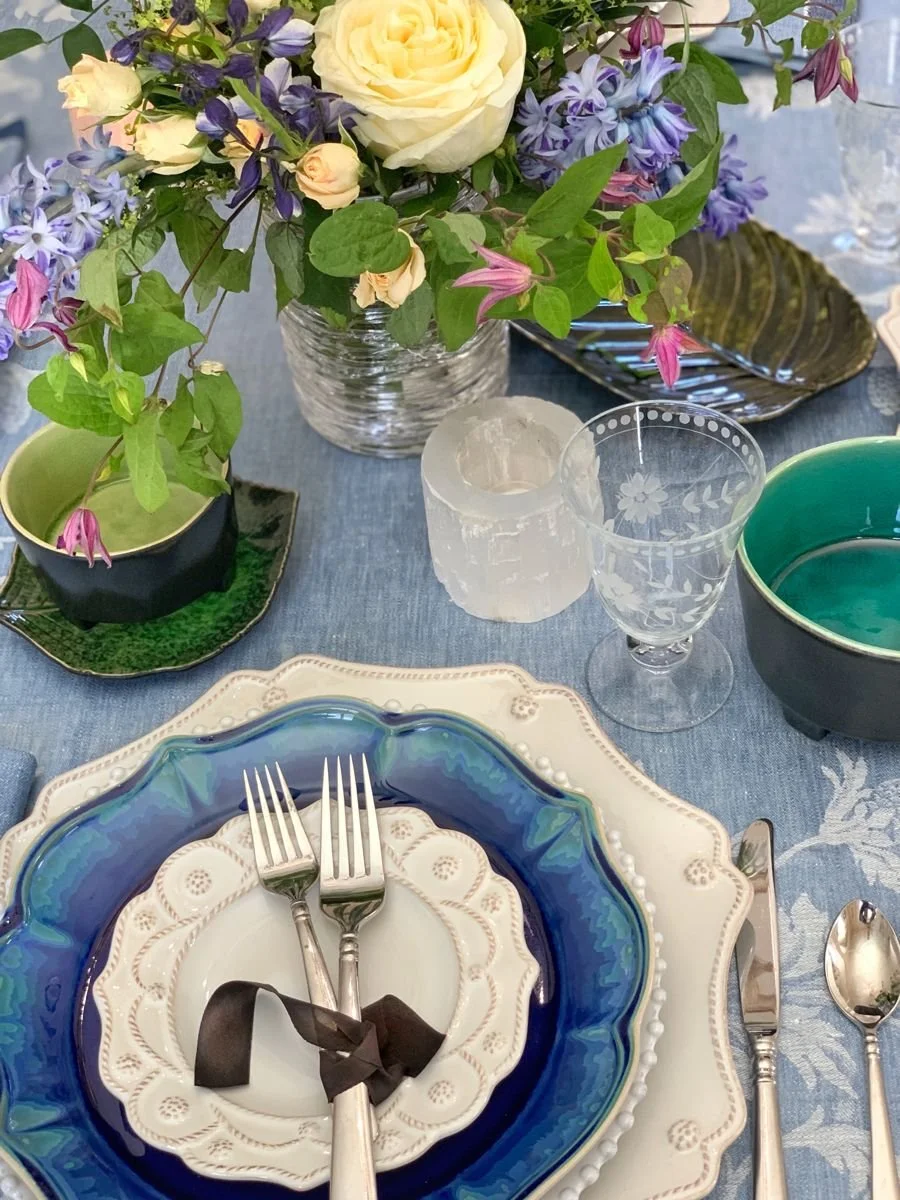
The quartz candle votive added an extra layer of texture and an organic feel to the tablescape.
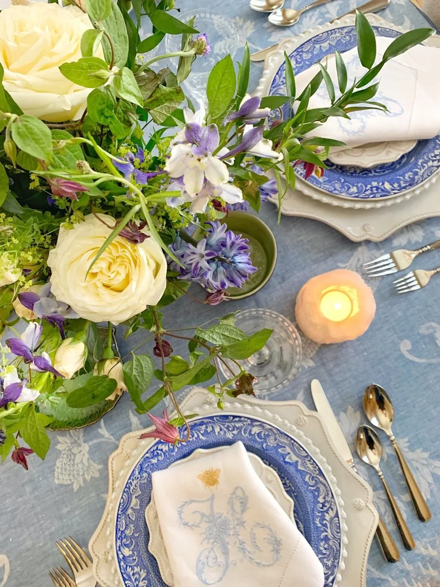
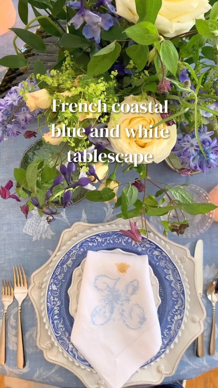
I adore monogramming, which is all the rage in the design world today. I added this linen napkin and replaced the plate with a blue-and-white Spode dish. I wanted to show how different a table design can look with just two changes. This tablescape is less organic but still has that coastal look and feel I love. It depends on your taste and what makes you most comfortable when entertaining. What feels like home to you?
If you would like to see how far this palette can be pushed, I built a more elevated version of the same idea in The New Coastal: A French-Inspired Tablescape in Jewel Tones.
My mother never used the word biophilia. She would have laughed at it.
But her house ran on it. Whatever the garden gave her went on the table. The bowl she reached for was the one that had been reached for a thousand times before. Nothing was chosen to look natural, because everything simply was. I learned all of this long before I had a word for any of it.
That is what Design with the Heart™ has always meant to me. Not decorating in a style, but designing from what is already true about your own life and your own ground. Bring the colors of the place you live to your table, and the people who sit down at it will feel it, even if they never work out why.
Welcoming friends and family to your table should be a joy and tell a small story about who you are and what you love.
À bientôt,
Mary
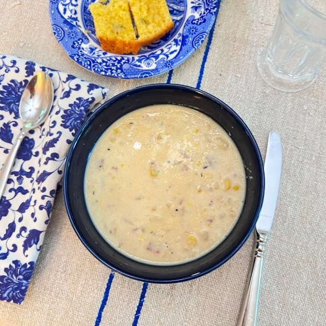

Beautiful 100% linen jacquard tablecloth - French motifs - blue-white gold - 170 x 170 cm (5’7” X 5’7”)

