Chinoiserie Blue and White with a Pop of Autumn: A Stunning Tablescape for Fall

Blue and white is the palette I come back to more than any other, and in fall it does something unexpected. Set against pumpkins and warm autumn tones, that cool, timeless blue suddenly feels cozy. This is one of my favorite tables I set all year, and I want to walk you through how it came together, starting, as it always does for me, with a single piece I love.
Why Chinoiserie Works for Fall

Let me tell you what chinoiserie actually is, because it makes you love it more. The word is French, and the style originated in 18th-century Europe, when people became so enamored with the blue-and-white porcelain arriving from China that they began making their own versions. So chinoiserie is really Europe's love letter to Chinese design, all those intricate patterns, garden scenes, and that unmistakable blue on white.
Here's why it's perfect for fall: chinoiserie is refined, but it isn't cold. Those busy, storybook patterns have a warmth and whimsy. So when you pair blue and white with pumpkins, berries, and a warm-toned runner, the two don't fight. The autumn colors thaw the blue, and the blue keeps the fall decor from tipping into rustic. It's the contrast that makes it work.
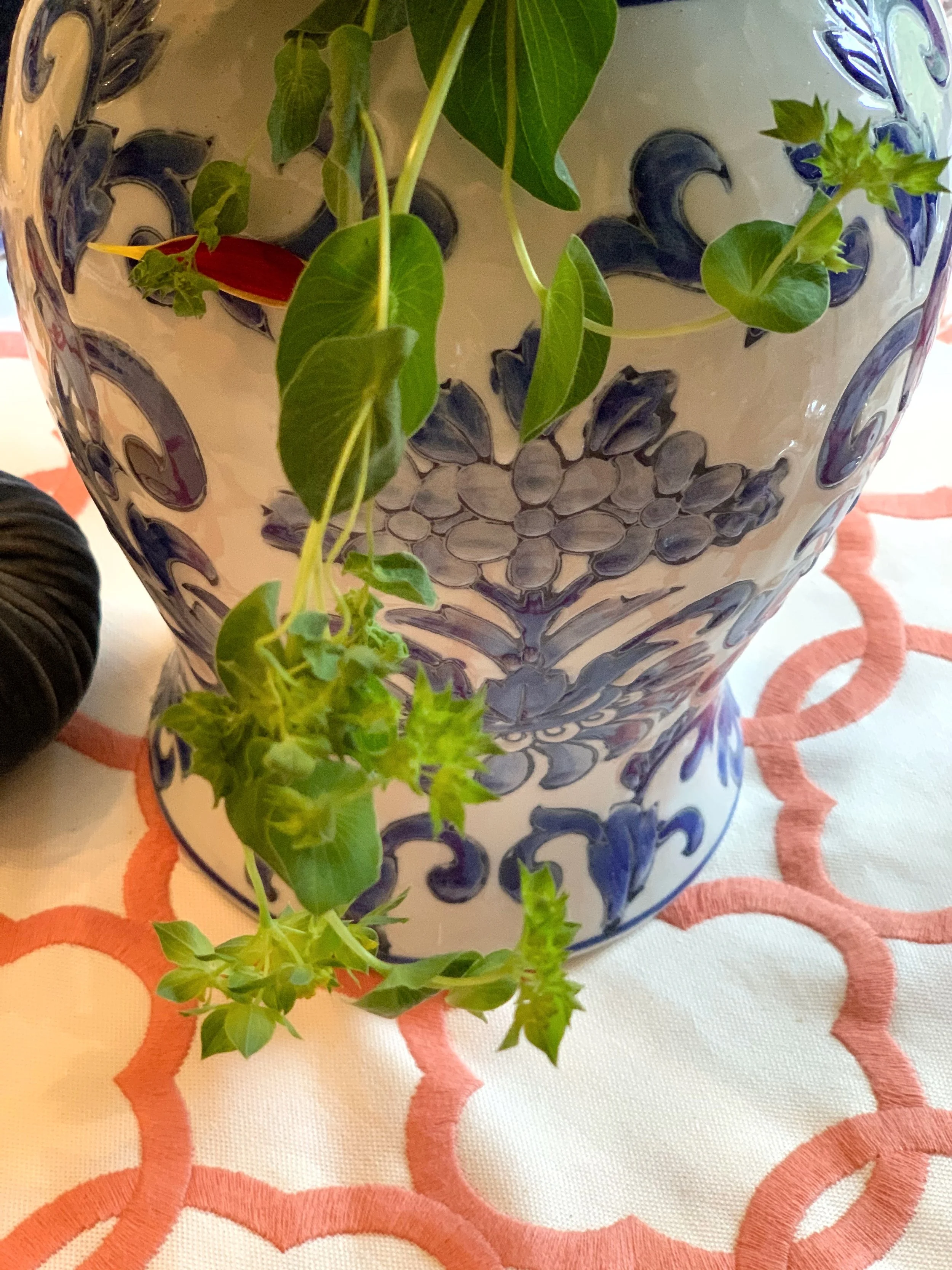
Add a few pops of autumn color: Fabric, decorative items, and other natural elements work nicely.
Start With What You Love, Then Build the Color

Every table I design starts with one piece, and this one started with a chinoiserie vase. I let its blue and white set the whole palette. This is the single best piece of advice I can give you: don't start with a color scheme in the abstract, start with an actual object you love, and let it lead. It takes the guesswork out of everything that follows.
I did exactly this with an antique tureen one Thanksgiving, taking the whole palette from the colors painted on it. You can see how it came together in Styling a Place Setting Around a Single Antique Piece.
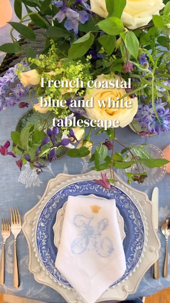
Then I laid a neutral foundation, a white base, so the blue and white had room to breathe. A busy cloth under a busy pattern is too much. White lets the chinoiserie be the star.
Add a Soft Pop of Autumn, But Keep It Restrained
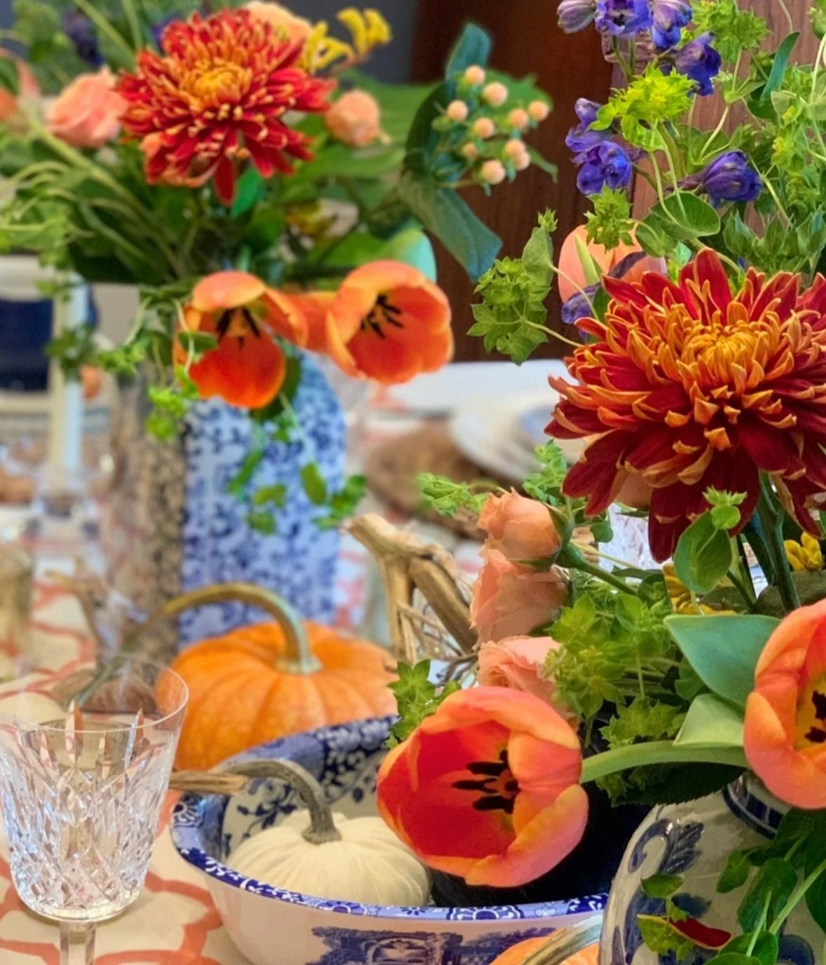
I made a runner out of soft salmon-and-white fabric, and that was my one real hit of autumn color. It's warm, it's a little dusty, and it never shouts over the blue.
If you want autumn tones that flatter blue and white, think soft: salmon, terracotta, dusty rose, muted gold, a faded rust. You also add some pumpkin-orange. The muted shades are what keep a blue-and-white fall table looking elegant rather than themed.
The Little Blue Tureens (and a Small Treat)
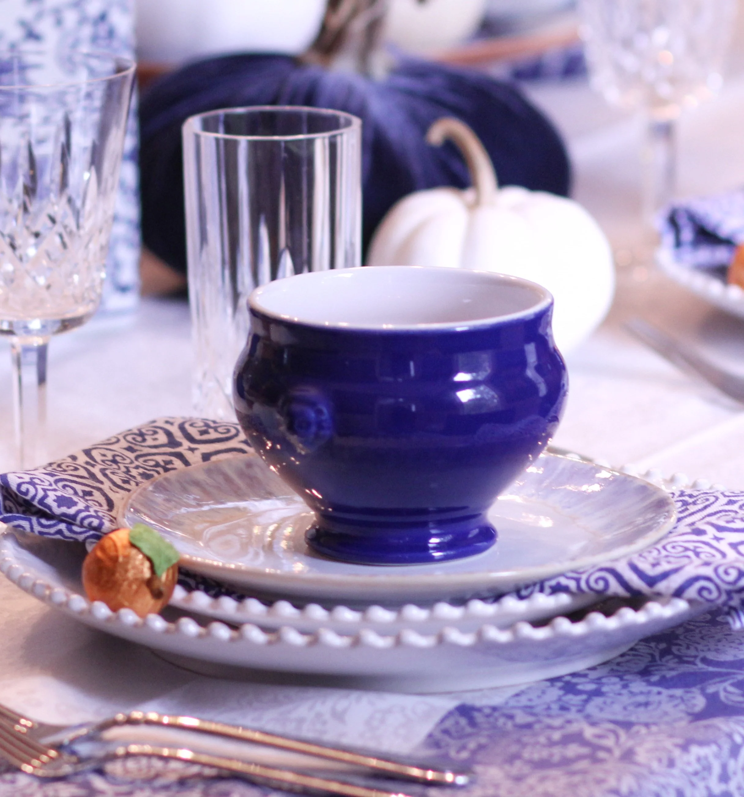
I love carrying the blue out from the center and into each place setting, so the color feels woven through the whole table, not just parked in the middle. For this one, I used little French mini blue tureens at each seat, another layer of blue, white, and blue stacked together. And inside each, a piece of chocolate, a small treat for whoever sat down, and honestly, another little spot of color. The people at my table always remember the small surprises more than the grand gestures.
Velvet Pumpkins for Texture
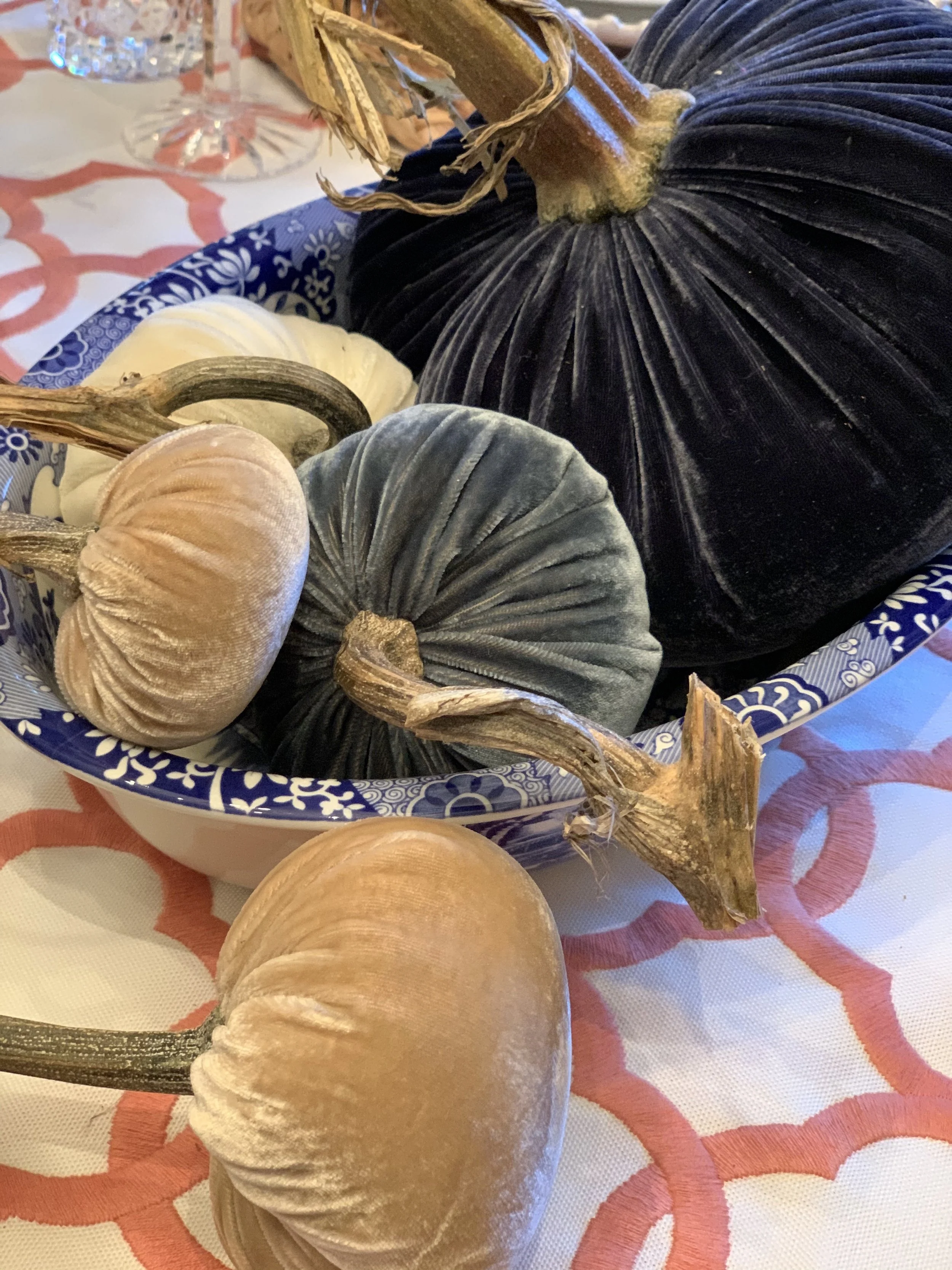
Texture is what keeps a table from looking flat, and velvet is one of my secrets for fall. I've been collecting Hot Skwash velvet pumpkins for years, and I bring them out every once in a while for Thanksgiving. That soft velvet against smooth porcelain and a real pumpkin's waxy skin, three different textures right next to each other, is what makes a table feel rich. I always mix the velvet ones in with real pumpkins and flowers so it feels natural, not staged.
Sterling Silver, Because Why Not
A little metal lifts everything. Gold or silver both work beautifully with blue and white; they add that quiet note of formality. I used my sterling silver flatware here. It's cool-toned, so it sits comfortably with the blue, but it still holds its own in a warm fall setting. Use the good silver. That's a whole philosophy of mine, but it applies here: the table is exactly the occasion it's meant for.
About That Centerpiece (and a Practical Confession)
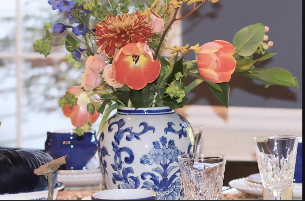
I filled my chinoiserie vase with autumn foliage, seasonal flowers, and berries for height and drama, and it was beautiful. It was also, honestly, too big to see over. So here's what I do, and you should feel free to do the same: I make the centerpiece generous and gorgeous for the photos and the arrival, and then, right before we sit down to eat, I move it to the sideboard. The pumpkins and small accents stay on the table. Nobody wants to peer around a floral arrangement to talk to the person across from them. A beautiful table still has to work.
It's All in the Details
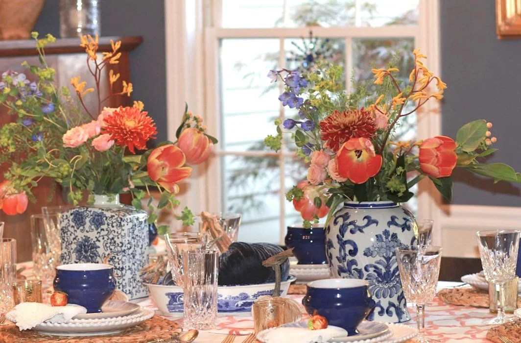
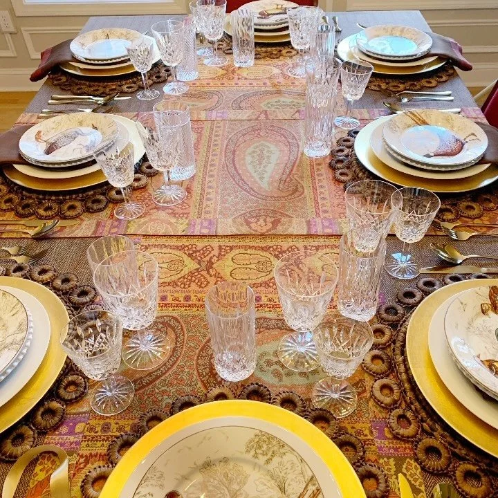
It’s all about the detail in a complete design. Carrying common colors and adding different textures throughout your table makes it more cohesive and interesting look and feel.
The thing that makes a table feel finished isn't any one grand piece. It's the repetition, the same blues turning up in the vase, the tureens, the dishes; the same soft tones echoing from the runner to the flowers to the pumpkins. Carry your colors and vary your textures, and the whole table starts to feel intentional, like it was always meant to look this way.
That's the real secret. Not more stuff. Just the same story, told in every corner of the table.
Styling a Chinoiserie Vase: What Colors to Reach For
If you want to know the real gift of a blue-and-white chinoiserie vase, it's this: it goes with almost everything. Blue and white is a neutral; quietly, it behaves like one. So once you have your vase, you can change its whole mood just by changing what you pair with it. For a soft, romantic table, reach for pinks, blush, dusty rose, and cream. For the fall look I've shown you here, warm it up with salmon, terracotta, rust, and muted gold. For something crisp and fresh in spring, pair it with greens and a clean white. For drama and a more formal table, add deep tones, plum, aubergine, a rich navy, or the shine of gold and silver. And if you ever want it to feel classic and untouched, style it with nothing but more blue and white and let it be timeless.
The trick is to let the vase stay the anchor and choose one or two accent colors to build around it, no more. Blue and white can hold a lot, but a table still wants a clear story. Pick your pairing based on the season and the feeling you're after, keep it restrained, and repeat that accent color in a few places across the table so it all feels of a piece. That is the whole art of it. One beautiful blue and white vase, and a color you choose on purpose.
A Fall Table Worth Setting
A chinoiserie blue-and-white tablescape with a pop of autumn is one of the loveliest ways I know to welcome the season. It's timeless and a little unexpected, elegant without trying too hard. With one piece you love to start from, a restrained autumn accent, some natural texture, and a bit of silver, you can set a table like this for Thanksgiving or any fall gathering.
And do use the good pieces. The season is reason enough.
To learn more about this table and how to host a Thanksgiving dinner, visit A Few Easy Steps: Hosting Thanksgiving Dinner.
To learn how to layer a table like a professional designer, visit The Art of Layering a Table: Create a Stunning Tablescape for Any Occasion
Design with your heart™️
Design with the Heart™
À bientôt,
Mary
Click on the picture below to see my video

This video is a table design that I created with inspiration from our New England Fall Foliage. The salmon table runner is a product I am designing.