The Design Edit: Fall 2024’s Muted Color Trends for Serene, Wellness-Focused Spaces
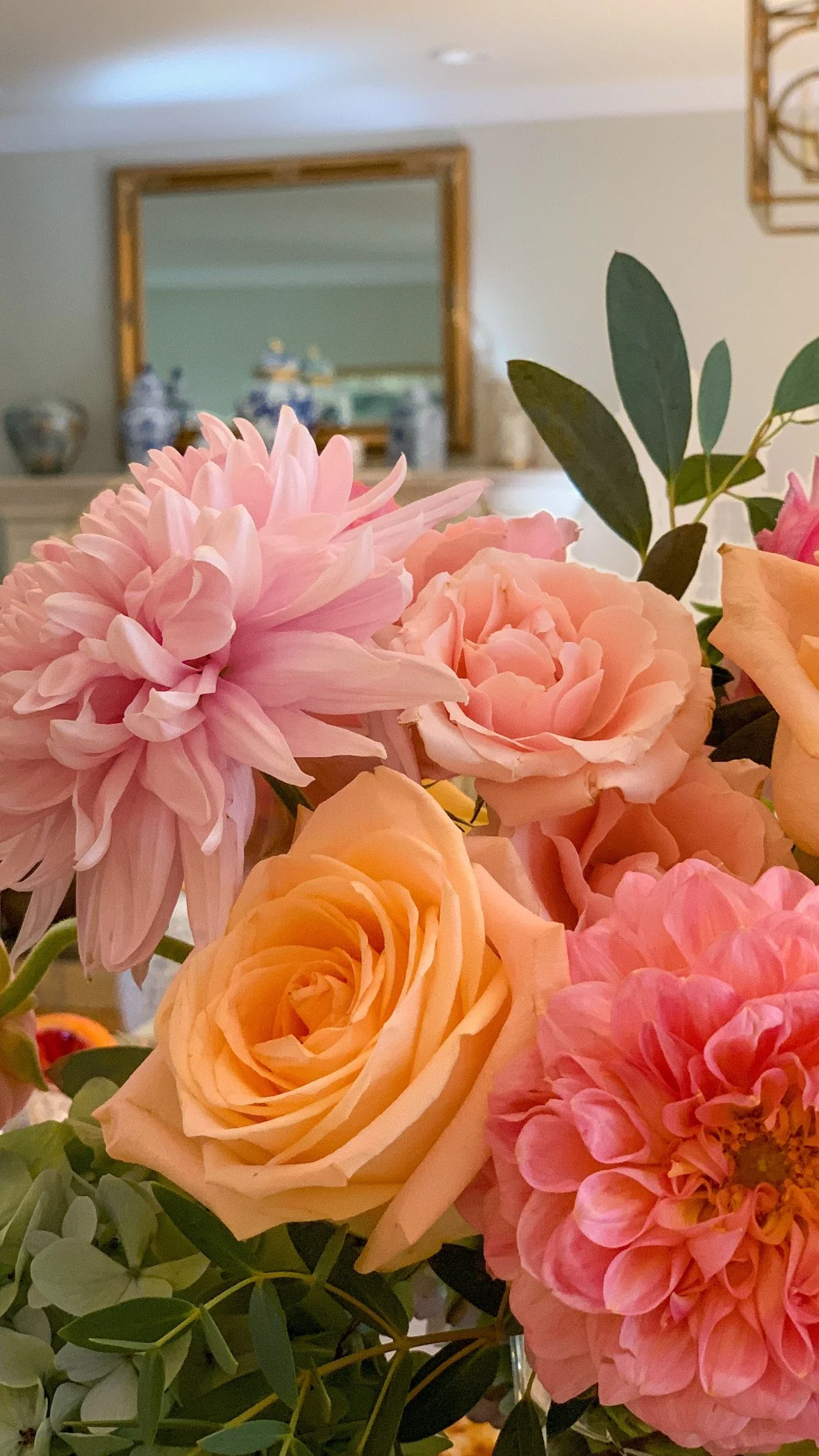
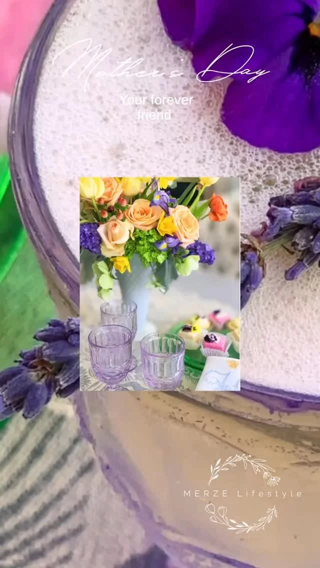
Photo by Merze Lifestyle
As the leaves start to turn, so does the design world, and Fall 2024 gives us a softer, more refined approach to autumn décor. This season, muted pastel tones are taking center stage, creating spaces prioritizing calm, wellness, and a deeper connection to nature. As part of The Design Edit, we’re curating the key elements of this trend, helping you bring these serene hues into your home in a way that feels effortlessly elegant.
The Shift to Muted Pastels
While fall typically brings to mind deep oranges, rich browns, and bold reds, 2024 takes a softer approach with shades like dusty lavender, muted blush, soft sage, and misty blue. These colors evoke a quiet sophistication, infusing spaces with a calm, understated beauty. Muted pastels reflect the season’s tranquility while maintaining a modern, light-filled aesthetic—perfect for creating serene, wellness-oriented environments.
Why Muted Colors Work for Fall
Muted tones work beautifully as they mimic the natural fading of colors outdoors during autumn. These shades are ideal for creating a calming retreat at home, drawing on the soft textures and organic influences central to this year’s design trends. They provide a timeless backdrop, making them easy to integrate into various design styles, from minimalism to bohemian to modern rustic.
Textures and Layers: Key to Wellness Design
What makes these colors even more impactful is how they interact with texture. The 2024 Fall Design Edit is all about tactile elements. Think linens, wool, natural woods, and soft upholstery that layer on the warmth and comfort of a space. Combining muted pastels with these textures gives depth and coziness to a room, transforming it into a retreat that encourages relaxation and mindfulness.
Consider a light sage green throw pillow against a soft, neutral-toned sofa or muted blush cushions nestled among textured wool and linen. The layering of these subtle elements ties this trend into the larger movement toward wellness-centered spaces. Every detail, from the materials to the colors, should evoke a sense of calm.
Biophilic Design: Bringing the Outdoors In
The connection to biophilic design is at the heart of this fall’s muted color trend—bringing nature into your home. Combined with organic materials, these pastels bridge indoor and outdoor living. Whether through artwork, greenery, or nature-inspired patterns, this trend allows you to incorporate the soothing beauty of nature directly into your interiors.
How to Incorporate Muted Pastels into Your Home
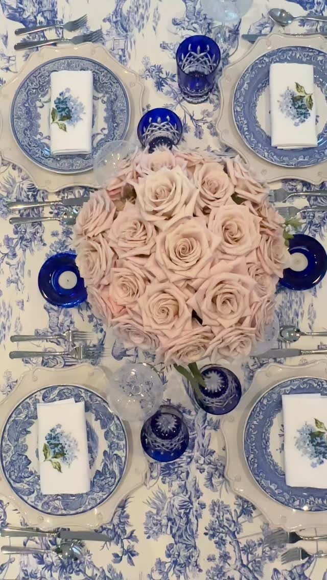
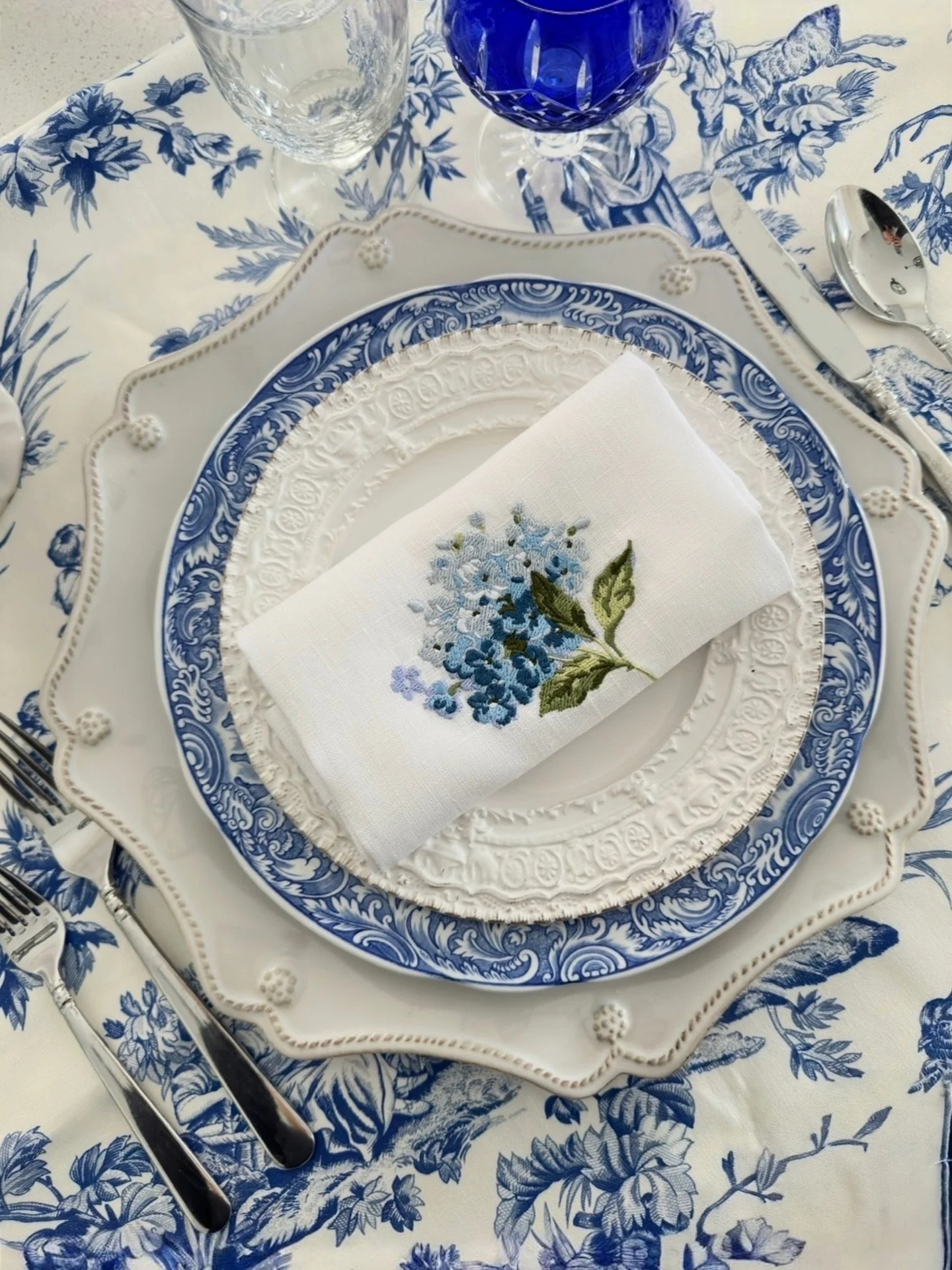
You can start with key accents: Incorporate muted pastels through accessories like throw pillows, blankets, and rugs. These pieces add subtle hints of color without overwhelming a space.
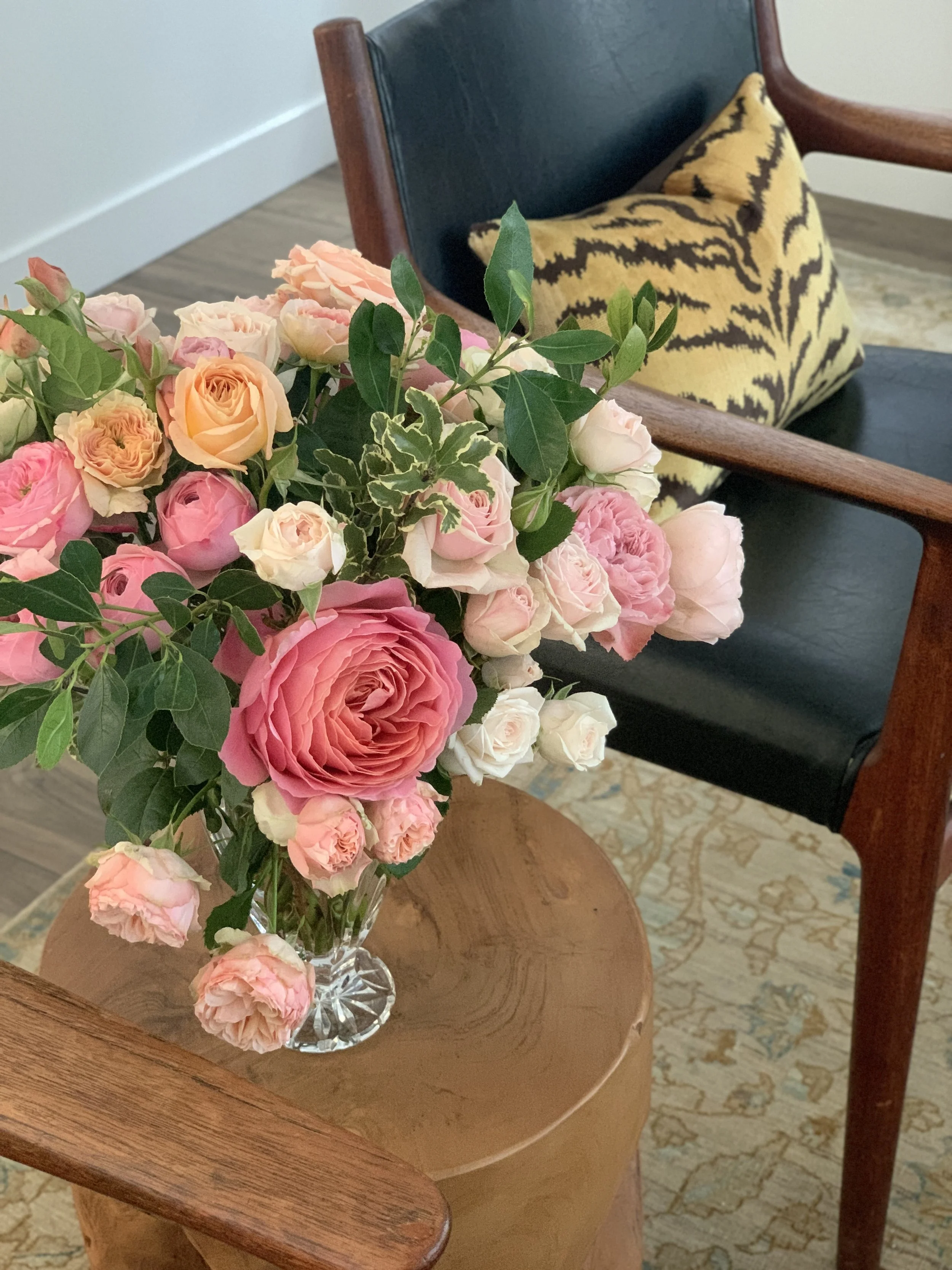
Photo and design by Merze Lifestyle
Incorporate natural elements: Plants, organic materials, and nature-inspired artwork complement the calming qualities of muted pastels, tying the space back to the trend’s biophilic roots.
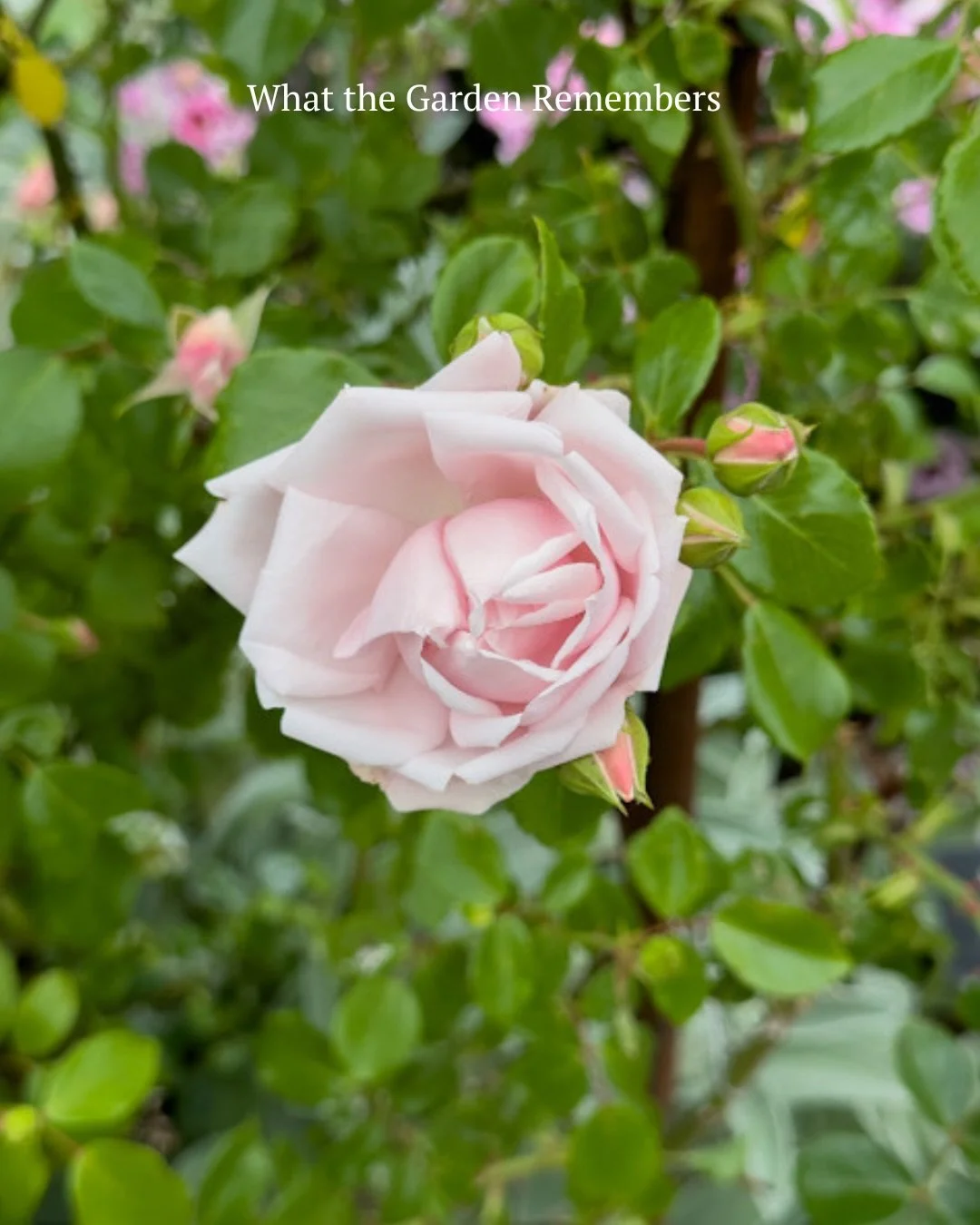
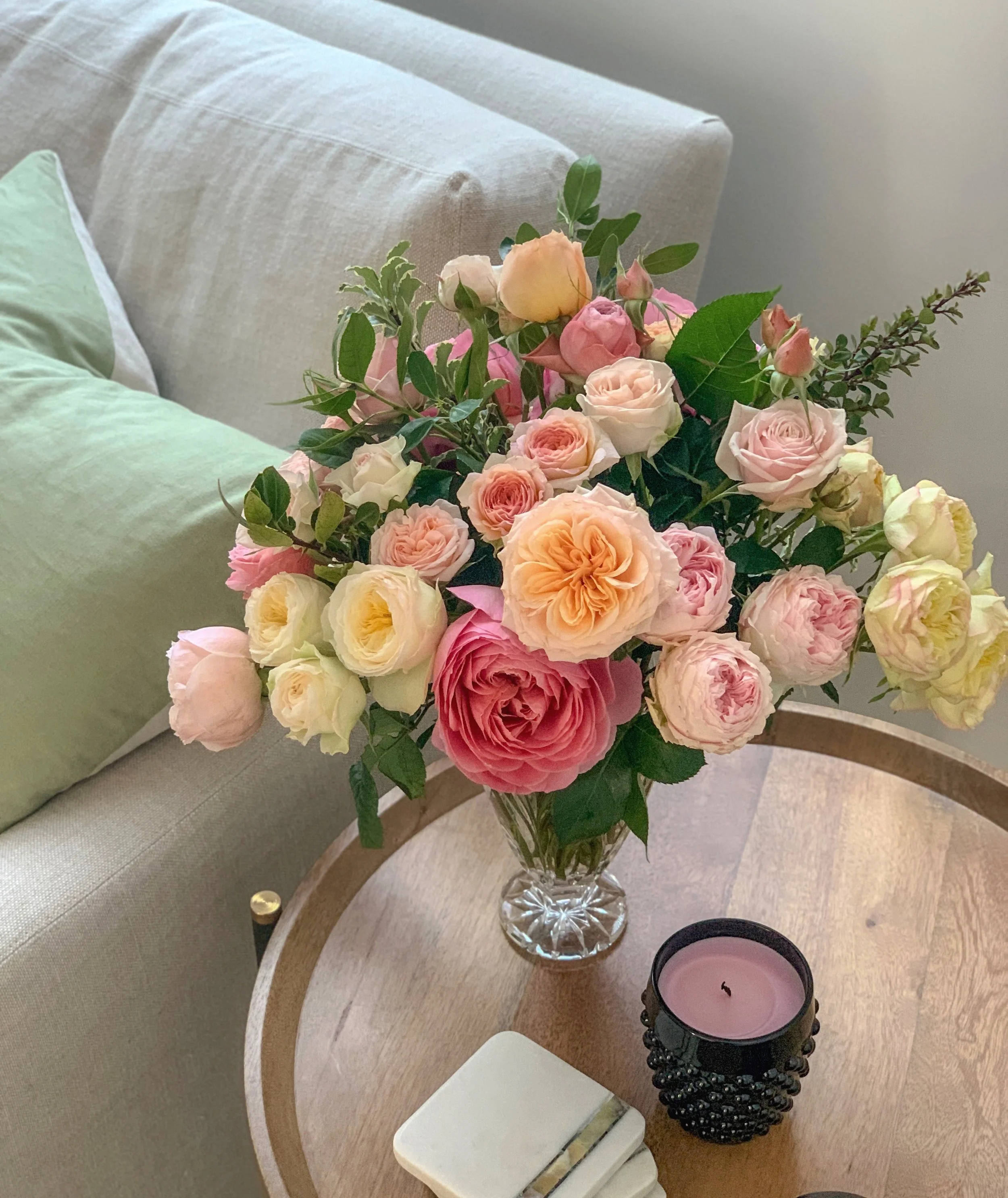
Can you imagine the evergreen scent when looking at this botanical? It feels like it came out of a forest filled with wildflowers.
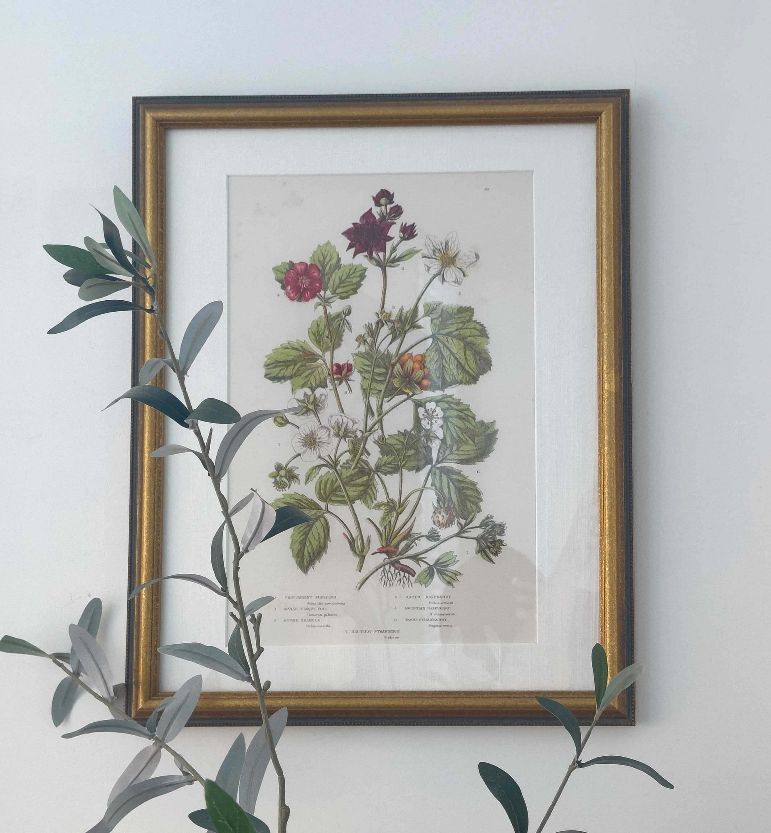
Artwork featuring botanical motifs captures the essence of fall's muted color trends by bringing the delicate beauty of nature indoors. Using shades like soft sage, lavender, burgundy, orange, and muted blues, these botanical illustrations echo the season’s natural transitions with elegance and subtlety. The gentle interplay of leaves, flowers, and stems creates a calming visual experience that resonates with the Design Edit’s focus on serene, wellness-driven spaces. By incorporating these natural elements, the artwork embraces biophilic design principles, blending the boundaries between indoor and outdoor living and filling a space with warmth and tranquility. It’s a timeless way to celebrate fall’s organic beauty while maintaining a sophisticated, soothing palette.
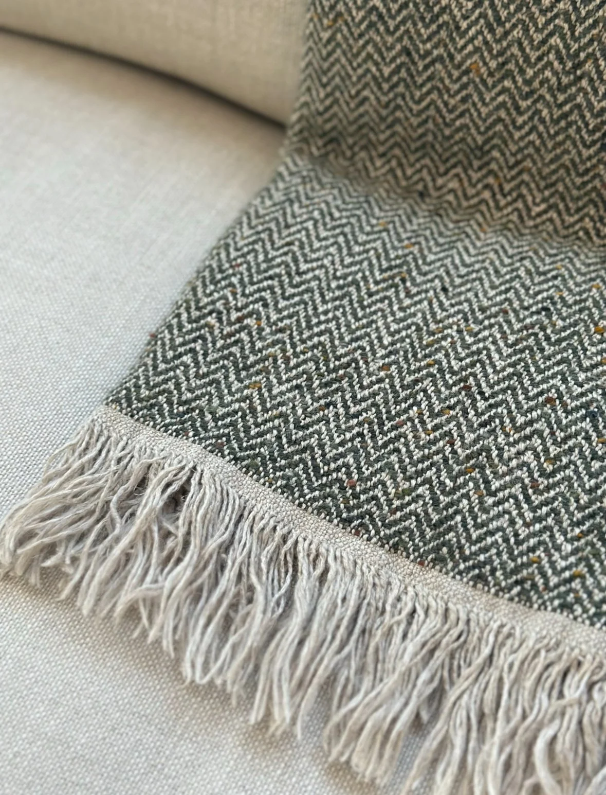
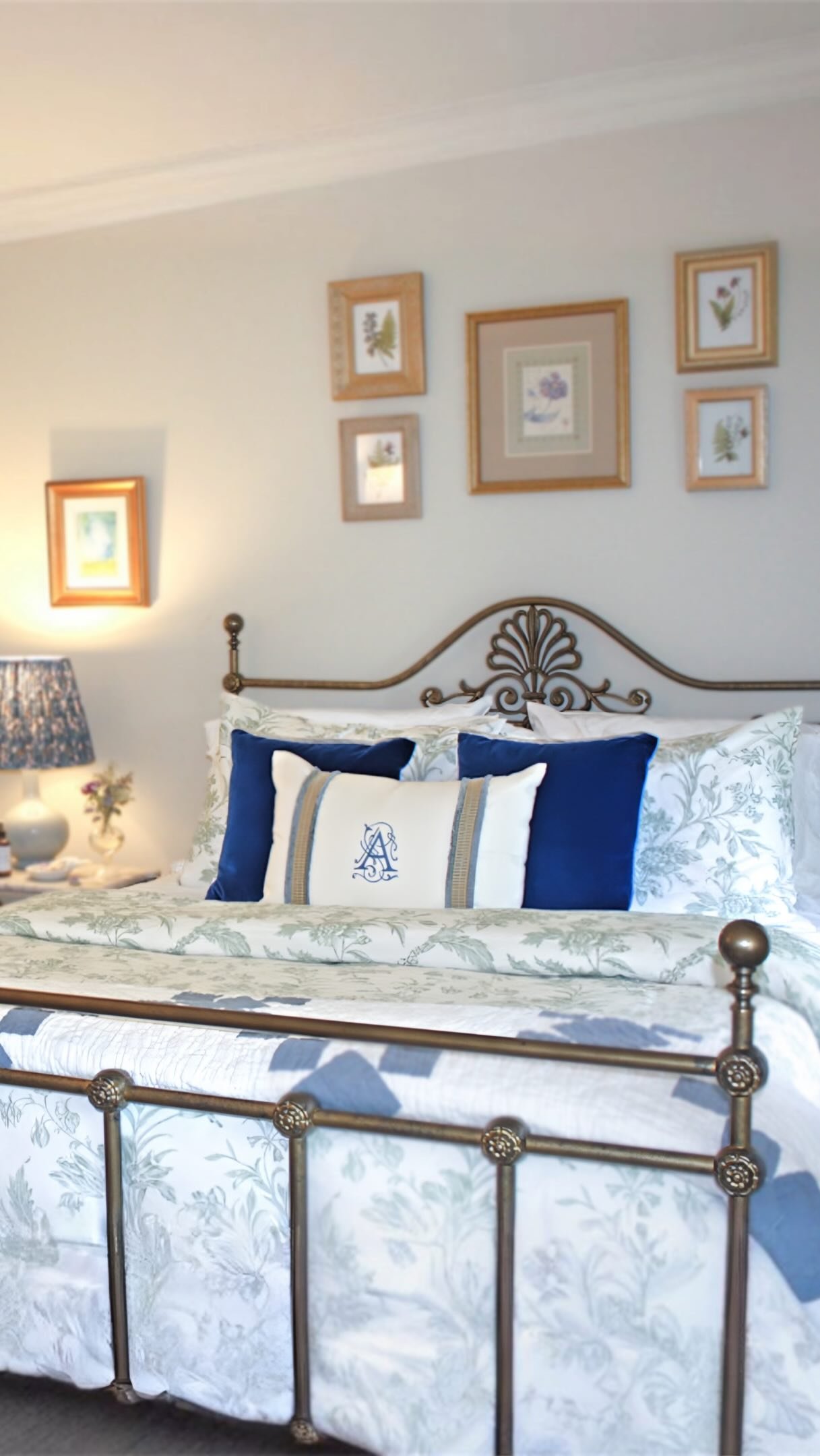
A soft linen throw in sage green and cream beautifully compliments the muted pastel palette of fall 2024. The gentle blend of these earthy tones adds an inviting layer of warmth and texture to any space, perfectly aligning with the calming wellness-centered atmosphere of this season's design trends.
The sage green reflects nature’s soft embrace, while the cream introduces a light, neutral grounding element that enhances the palette’s elegance. Together, these colors infuse a room with sophistication, seamlessly tying into the organic textures and biophilic influences that define the design edit perspective.

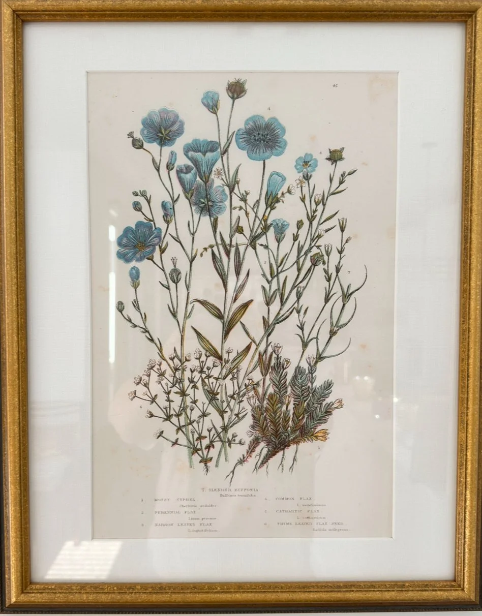
Misty blue with mauve is a great combination to show muted fall colors.
The blue and white chinoiserie jar with salmon-colored flowers brings a striking yet delicate contrast to the muted pastel palette; the crisp traditional patterns of the vase introduce a timeless, classic element while the soft salmon tones of the flowers add a gentle pop of color harmonizing with the seasons, understated hues. This blend of old patterns in organic floral accents reflects the design edits, emphasizing merging the old with the new, creating a serene, sophisticated atmosphere. The arrangement of flowers brings Nature indoors, reinforcing the trend focus on biopic design and wellness.
Layer textures: Pair these pastel hues with natural materials like linen, wool, and wood. For example, a sage-green throw pillow on a textured linen sofa or a misty blue rug beneath a wood coffee table creates a tactile, inviting space.
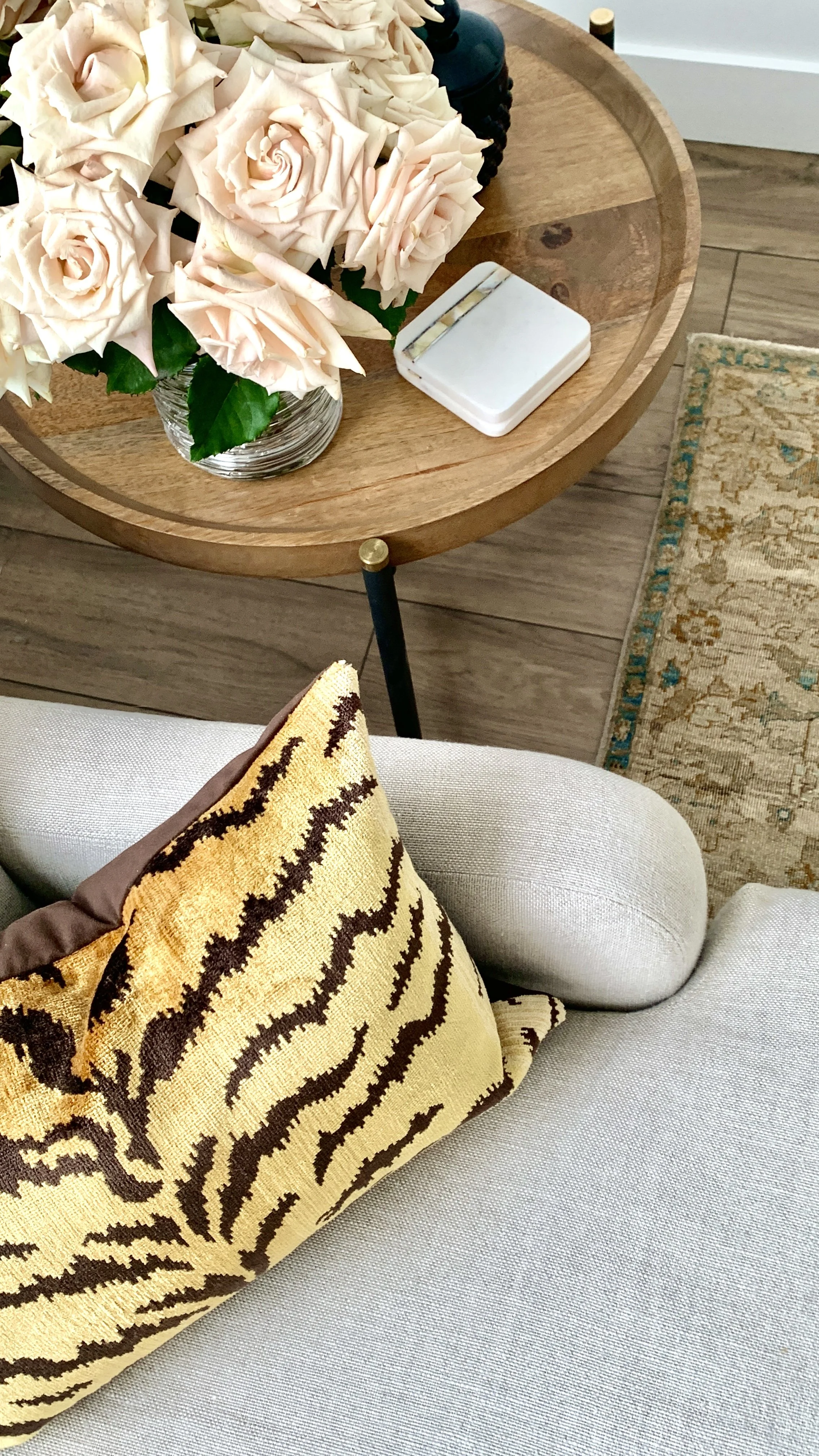
My linen sofa and round side table again incorporate the circular trends of today and organic fabrics. The cream roses and soft yellow in the pillow brings a fall vib into this space.
Blend with neutrals: Muted pastels work beautifully with deeper neutral tones such as earthy browns, soft grays, and creamy off-whites. This contrast enhances the pastels while keeping the room grounded and balanced.
“‘Muted pastels are the whispers of autumn—where warmth meets serenity, and the colors of nature blend into your home like a soft embrace. These tones invite calmness, turning any space into a quiet retreat of understated beauty and wellness.’”
The Design Edit Takeaway
The muted pastel trend for Fall 2024 offers a refreshing, serene approach to seasonal décor. Focusing on wellness, texture, and biophilic design, these colors transform your home into a calm, nature-inspired haven. By thoughtfully layering these hues and materials, you can create a space that feels both modern and timeless, inviting relaxation and fostering a sense of well-being.
Fall 2024’s muted color trends are all about serene, wellness-focused spaces. Stay tuned for more insights from The Design Edit, where we continue to curate the latest trends and show you how to incorporate them seamlessly into your home.
Design with your heart™️
Have a beautiful day, my friends!
Mary